Categories
Culture

Impressionist and Modern Art at Christie’s

I went along to the viewing of a sale of Impressionist and modern art at Christie’s in London.
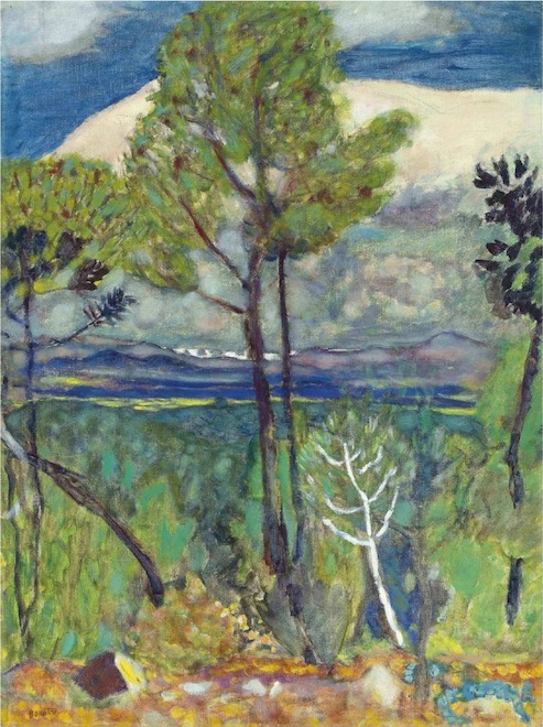
It’s always quite interesting going to see paintings at auction houses rather than the big public art galleries where I see most of my art. For a start, there’s the fact that everything has a price on it; of course they’re only estimates, but they give you a general sense of what’s hot and what isn’t.  The trends are somewhat predictable, of course; a large, stylistically distinctive painting by a Very Famous Artist goes for a lot more than a small, sketchy painting by a someone slightly less famous. The painting above,Les pins, bord de mer by Pierre Bonnard, is estimated at £150,000 – £250,000.* Which is quite a lot of money by most standards, but seems pretty modest compared to the £17,000,000 – £24,000,000 for some Monet waterlilies.

Actually, though, it’s not surprising that a large painting by Monet of his most iconic subjects is worth a fuck of a lot of money. If you’re a Russian oligarch and you put that on your wall, people are going to walk into the room and know you’ve spent shitloads of money on it.

In some ways it’s the lesser paintings which say more about the madness of art prices. Not even great artists produce masterpieces every time they pick up a brush, and there’s a plentiful supply of little sketchy paintings and ones which don’t quite work; paintings which look like they could have been done by any random weekend painter, but which go for hundreds of thousands of pounds.

A couple of other thoughts about the auction house experience. I quite like the fact that people feel free to talk, to have normal conversations at a fairly normal volume; and indeed to use their mobile phones. The sanctified hush of public art galleries, with everyone whispering to each other, can be a bit deadening.

And however artistically radical a painting may have been when it was new, seeing it surrounded by the sheen of money in an upmarket auctioneers really does strip away any last hint of anti-establishment.

* Update: it actually went for £337,250, fwiw.
Categories
Culture

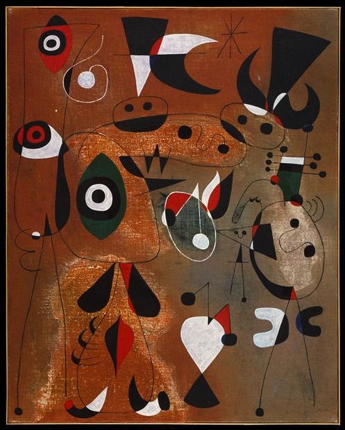
Miró at Tate Modern

Without knowing a lot about Joan Miró, I’ve always liked his work when I’ve seen it. It’s interesting the way that the work of one artist will speak to you and another won’t… so I’ve aways liked Miró, never liked Chagall.

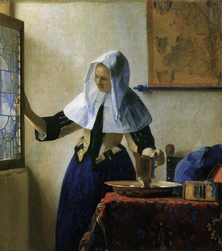
Or at least I say the work ‘speaks to you’ but that’s not the right metaphor; I don’t think it’s because the paintings are making some sort of intellectual or emotional connection. Or at least I don’t think that’s primarily what it is; it’s more to do with a basic visual aesthetic. I tend to like controlled, precise, carefully composed paintings with strong clear colours: so I like Vermeer, but find it hard to like Rubens. It’s suppose it’s a graphic design sensibility, really.

Articulating it like that does make me feel a bit shallow; taking great painters and sorting them into sheep and goats according to the most superficial and basic elements of their visual style, well, it doesn’t exactly make me a sophisticated judge. But there you go. It’s not the only factor which decides which work I like, but it certainly makes a difference.

So I was predisposed to like this exhibition. Which I did. I thought it was fabulous. Mainly because I liked all paintings, of course; but also because I didn’t know much about Miró, so it was interesting to see the chronological development of work. There was also quite a lot of biographical context, much of it related to Spanish politics — Miró’s Catalan identity, the Spanish civil war, WWII and so on. So that was all quite interesting.

But mainly I just love the paintings. I want to own all of them and have them on my walls.

» Women, Birds, and a Star, 1949. Which is in the Met, although I got the image from RMN.

Categories
Culture

Why I hate the Pre-Raphaelites*

When I was at university I overheard a conversation when someone said:

I just don’t understand how you can say you like both the Pre-Raphaelites and Vermeer.

It has stuck with me ever since. It’s just a perfect one-line bit of art criticism. It always seemed like it ought to make a great parlour game†: ‘I just don’t understand how you can say you like both x and y… fill in the blanks.’ But actually I’ve never been able to find a pair which seems as perfect as Vermeer and the Pre-Raphs.

Vermeer basically painted accurate pictures of his own time and place; carefully composed, tidied up and idealised, perhaps, but realistic, small scale, domestic. The Pre-Raphaelites‡ chose to retire to a silly fantasy world of knights and maidens which avoided the difficult complex reality of the nineteenth century — but avoided the difficult complex reality of the medieval world as well.

And Vermeer is sensual but austere; sensual in his representation of surfaces, textures, light and shadow, but stylistically austere in his classically perfect compositions and controlled, precise brushwork. While the Pre-Raphaelites are the opposite: stylistically they are lush and decorative, but the result is bloodless. Their paintings are full of decorative young men and women posturing and looking glamorous, but it’s all surface. There’s no flesh to it, not a whiff of filth.

In one of Aldous Huxley’s early novels, which are satirical portraits of London bohemia, there’s a character called Casimir Lypiatt who sees himself in the Renaissance tradition of painter-poet-thinkers, full of bombastic rhetoric about Art and Beauty and moral significance. Not everyone is as impressed with him as he is:

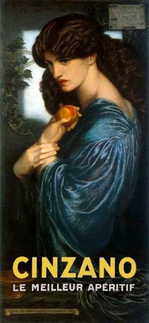
‘Number seventeen,’ said Mrs Viveash, ‘is called “Woman on a Cosmic Background.”’  A female figure stood leaning against a pillar on a hilltop, and beyond was a blue night with stars.  ‘Underneath is written: “For one at least, she is more than the starry universe.”’  Mrs Viveash remembered that Lypiatt had once said very much that sort of thing to her.  ‘So many of Casimir’s things remind me,’ she said, ‘of those Italian vermouth advertisements.  You know – Cinzano, Bonomelli and all those.  I wish they didn’t.  This woman in white with her head in the Great Bear….’ She shook her head.  ‘Poor Casimir.’

Presumably Huxley, writing in 1923, was not thinking of the pre-Raphaelites. But that description is brutally spot on.

Vermeer took the small and mundane and made it something hypnotic; the Pre-Raphaelites took a grand mixture of ideas, ideals, myth and history, and made a lot of pretty posters.

* OK, maybe ‘hate’ is a bit strong. But, you know, linkbait innit.

† Actually, thinking about it, a truly dreadful parlour game. A mildly interesting intellectual exercise, maybe.

‡ Yes, I know, I’m lumping them all together in a rather lazy way. But although the exact details varied from painter to painter, and some were better than others, I think the broad argument applies to all of them.

Categories
Culture

Watercolour at Tate Britain

I actually went to see this exhibition about a week or so ago, but I’ll just jot down some belated impressions. It is, as the title suggests, a historical survey of watercolour painting, from the medieval to the present.

There are only a handful of medieval pieces, bits of illuminated manuscript, which just serve as a reminder that, although they are not what we usually think of as ‘watercolour’, that is technically what they are.

The exhibition makes the interesting point that originally watercolour was mainly seen as an adjunct to drawing: a work would be drawn in pencil or ink and then effectively coloured in, sometimes just with a few hint of colour to liven the drawing and sometimes in a more thorough way. So many of the early pieces are technical works of one kind or another: costume designs for Elizabethan masques, maps, plans of fortifications, as well as a few specific uses like portrait miniatures.

That technical aspect leads on to what is probably my favourite room of the exhibition, a room of scientific illustrations; especially botanical illustrations but also birds and mammals. Many of these were lent by the Natural History Museum or Kew, which is a clear sign that they were not originally created as Art, but they are gorgeous things. It even included some lovely C19th paintings of rock types — each one is a lump of rock on a plain white background, and they look like an elegantly minimalist conceptual art project.

After that we get into watercolour as an artistic medium in its own right. This includes plenty of ‘typical’ watercolours — landscapes, basically — but also a variety of paintings chosen at least partially to challenge that stereotype. So we have a room of war paintings, a room of ‘visionary’ paintings, a room of exhibition watercolours (i.e. large-scale C19th narrative paintings designed to compete with oil paintings for gravitas), and a room of contemporary work using watercolour.

My single biggest problem with the exhibition is that C19th British painting is not something I particularly enjoy. And that was the golden age of watercolour. So the aesthetic of the paintings was more off-putting than anything to do with watercolour as a medium. The exhibition watercolours seemed particularly pointless. I don’t like Victorian narrative painting and find the Pre-Raphaelites exceptionally noxious; seeing them painted in watercolour instead of oils didn’t make them any more likeable. Especially since there was no obvious attempt to make a virtue of the different medium: rather they seemed to be straining to make watercolours look as much like oil as possible.

And some of the paintings had clearly faded, which is the great technical problem of watercolour as a medium. There’s nothing much you can do about that, but it is a pity. There was a painting of some sun-drenched imperial outpost (Egypt? India?) which just didn’t look very hot, and I think it had probably faded a bit. So the shadows weren’t as dark, and the tones weren’t as warm.

As you can tell, I wasn’t blown away. But every room had something of interest and something covetable. And every so often there was a painting which was gorgeous and which could only have been done with watercolour: liquid and light and translucent. So it’s well worth a visit.

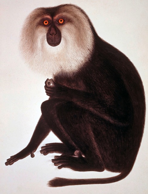
» The painting of the Lion-haired macaque, Macaca silenus, is by an unknown Chinese artist working for John Reeves, who employed locals to paint the specimens he was collecting while working in Canton from 1812-1831. That particular work is not in the Tate, though they do have a different monkey from the Reeves collection, lent by the NHM.

Categories
Culture

Cave of Forgotten Dreams 3D

This is the Werner Herzog documentary about the Chauvet cave paintings in France. It was definitely worth seeing, but mainly, I think, for the incredible paintings themselves, rather than anything Werner Herzog brought to the project.

It is probably the best use of 3D I’ve seen, because although I’ve seen photos of the paintings at Chauvet and Lascaux, the photos tend to flatten out the image; you get very little sense of the highly irregular shape of the cave walls and the way that the paintings are shaped around the contours of the rock. The 3D film really did make all the difference and was very effective.

Which is an unusual view for me, because I basically think that 3D is a rubbish technology. In most circumstances it’s little more than a gimmick, and it seems to be technically rather bad anyway: I find that it looks unnatural and exaggerated, it’s often slightly shimmery or glitchy, it doesn’t work properly if you tilt your head to one side, and it tends to give me a headache. I don’t know if the problem is that I’m wearing prescription glasses under the 3D ones, but that seems to be a lot of downside for very little upside.

Even in this film, I think it would have been better to save the 3D for the places where it really mattered — i.e. looking at the cave paintings. An interview with a paleontologist sitting in an office does NOT need to be in 3D, thank you very much.

And even in the scenes inside the cave, it became clear that some of the film had not been filmed in 3D, but faked up as 3D in post-production. This was particularly egregious in a scene where two scientists were standing in front of a cave painting and talking about it, and something looked very weird; I suddenly realised that when they had faked the 3D, they had cut out the two figures rather carelessly and cut out a big chuck of the surrounding wall as well; so there was a big blob of cave wall which was in completely the wrong visual plane, floating in front of the wall around it.

Such technical gripes aside, the paintings were beautiful and fascinating. And there were all sorts of snippets of fascinating information, like the great scratches on the walls which had been left by cave bears sharpening their claws. Or the two stags painted on top of each other which carbon dating revealed were painted 5000 years apart. I mean, really, 5000 years! What does it mean that there was such staggering cultural continuity?

I was also interested that there was no sign of human habitation in the cave; presumably they used it as a ritual site, or something. It’s all guesswork, of course. There also no humans among the paintings, apart from one image apparently of a woman’s pubic triangle and legs, similar to the famous ‘Venus’ figurines. And no pictures of birds, incidentally; it’s all big game: cave bears, cave lions, horses, antelope, woolly rhino, mammoth, hyena, aurochs.

Of course we have so little of their lives to draw on, so what does survive gains enormous, inflated importance. The paintings are the most vivid connection we have to those people 35,000 years ago, and so we can’t help having them as central to our idea of their lives; but we don’t know whether they were similarly important to the people who painted them. The film did show a few objects found at other sites of the same period that provide a few hints at a broader life; Venus figurines, animal carvings, and most extraordinarily a flute which had been meticulously reconstructed from over 30 tiny fragments of ivory. But mainly we are left with a lot of stone tools and the cave paintings. Anything made of wood, or gut, or hide is long gone, let alone the stories they told, the music they played, the food they cooked.

Categories
Culture

Jan Gossaert at the National Gallery

I went along to this with little knowledge and few preconceptions and on the whole was pleasantly surprised. I’ve said before I particularly like the Northern Renaissance for its more medieval aesthetic compared to the Italians. That’s actually less true of Gossaert; a lot of his figures have that contorted quality that I associate with, say, Michelangelo; of being posed in rather uncomfortable-looking positions with pronounced foreshortening. They also have a kind of fleshiness which relates to the Italians but also seems to make him a precursor of painters like Rubens and Jacob Jordaens.

The portraits stood out for me; which, come to think of it, is often the case in these exhibitions. I guess that’s partially because of their human interest — they are the most gossipy kind of painting — and partially because the relatively constrained format strips away many of the things modern audience find off-putting about older paintings. I think there are various reasons why religious paintings and history paintings are not to modern taste, some of it to do with the subject matter, but also the style. Whereas a straightforward head-and-shoulders portrait, the subject looking out of the canvas, is probably the single genre of painting which carries through most directly from the Renaissance to now.

So there was certainly stuff to enjoy — not least some fantastic Dürer engravings and woodcuts which were in there for context — but I can see why Gossaert’s not as well known as some of his contemporaries. He was clearly a wonderful painter, but he just lacks the extra something to make him stand out. And the ways in which he is different from his contemporaries probably make him less to modern taste rather than more. Certainly less to my taste.