I’ve been reading The Elements of Typographic Style by Robert Bringhurst. When I ordered it, I noticed the mild coincidence that the author has the same name as the chap who translated the poetry of the Haida (the native inhabitants of the Queen Charlotte islands in the Pacific Northwest). As it turns out, though, it’s the same man. Which certainly explains why the books of Haida poetry are so attractively designed.
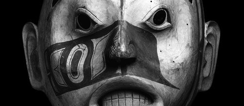
Alderwood mask of a woman of high rank, possibly Djiláquons. Haida, around 1830; in the British Museum.
It’s an impressive combination of talents, but there is a natural fit between poetry and typography. After spending all that time choosing and arranging words, what poet wouldn’t want them physically arranged on the page with equal care?
The parallel is marked: it’s all about the combined effect of a thousand tiny decisions. The poet and the typographer have to believe that every tiny tweak matters, that no detail is unimportant.
Now, with powerful computers at home, we all have the possibility of being our own typographers. But one thing that’s clear, reading the book, is that it’s not as simple as it sounds. There’s a lot more to it than choosing the least ugly font that came with your computer, picking a type size and a line height and letting the computer do the work. The point this was really brought home to me was where he argues convincingly that digital fonts often come from the foundries insufficiently precisely kerned, and that you will probably need to spend a couple of days with each new typeface manually adjusting the kerning so that even unusual letter pairs found in words like Ypres, Rwanda or Vázquez will be properly spaced.
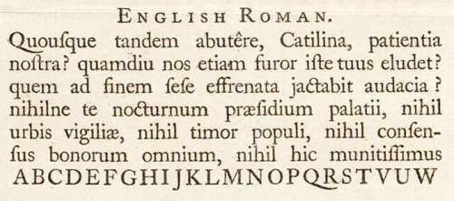
A section of a specimen sheet printed by William Caslon; from Wikipedia.
Even so, there is a lot of information and advice in the book which can be used even for the normal user of Microsoft Word; about choosing the right type size and measure, arranging the text block on the page, and creating headers which are harmonious with the body type, for example.
This is one field where the internet lets us down, of course. I can specify a typeface – from a very limited range I can rely on the reader’s computer to have – a type size, a line height and a line length, but I can’t control the way your system and browser deal with the kerning, anti-aliasing or any of the other nuances that completely transform the appearance it will have on your screen. Still, even here, some knowledge of typography can only help, and the technology is moving fast.
It’s an interesting, readable and, as one would hope, very attractive book. The Haida poetry is fascinating as well, but that would need a post to itself, methinks.