-
Nice typography essay.
Tag: typography
Helvetica, the movie
I went to see Helvetica today. It is, as the name suggests, a documentary about the typeface, which is 50 years old this year.

I enjoyed it. My usual feeling with factual-type documentaries like this (as opposed to narrative-type documentaries like, say, Spellbound) is that they are very slow; that given the same amount of information in written form, you could take it in about ten times quicker. There was something of that in Helvetica, but it’s a visual subject, so it’s well-suited to film. It’s always good to see people talking enthusiastically about their particular area of expertise, and between them the interviewees and the film-makers did a good job of communicating what’s special about Helvetica and placing it in its historical context. It is undoubtedly a remarkably good typeface although the more I saw it over and over again on screen, the more it started looking a bit dated. Not so dated as to be unusable; it’s surely good enough to be a permanent part of the repertoire for hundreds of years. Just a bit tired.
I think you’d need some degree of interest in graphic design to enjoy the film, but you probably don’t need to be a die-hard type geek. My biggest complaint is actually with the cinema; they had the sound too loud and gave me a headache.
The Elements of Typographic Style
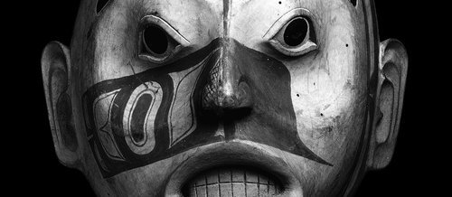
I’ve been reading The Elements of Typographic Style by Robert Bringhurst. When I ordered it, I noticed the mild coincidence that the author has the same name as the chap who translated the poetry of the Haida (the native inhabitants of the Queen Charlotte islands in the Pacific Northwest). As it turns out, though, it’s the same man. Which certainly explains why the books of Haida poetry are so attractively designed.

Alderwood mask of a woman of high rank, possibly Djiláquons. Haida, around 1830; in the British Museum.
It’s an impressive combination of talents, but there is a natural fit between poetry and typography. After spending all that time choosing and arranging words, what poet wouldn’t want them physically arranged on the page with equal care?
The parallel is marked: it’s all about the combined effect of a thousand tiny decisions. The poet and the typographer have to believe that every tiny tweak matters, that no detail is unimportant.
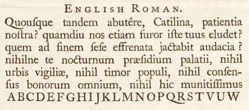
Now, with powerful computers at home, we all have the possibility of being our own typographers. But one thing that’s clear, reading the book, is that it’s not as simple as it sounds. There’s a lot more to it than choosing the least ugly font that came with your computer, picking a type size and a line height and letting the computer do the work. The point this was really brought home to me was where he argues convincingly that digital fonts often come from the foundries insufficiently precisely kerned, and that you will probably need to spend a couple of days with each new typeface manually adjusting the kerning so that even unusual letter pairs found in words like Ypres, Rwanda or Vázquez will be properly spaced.

A section of a specimen sheet printed by William Caslon; from Wikipedia.
Even so, there is a lot of information and advice in the book which can be used even for the normal user of Microsoft Word; about choosing the right type size and measure, arranging the text block on the page, and creating headers which are harmonious with the body type, for example.
This is one field where the internet lets us down, of course. I can specify a typeface – from a very limited range I can rely on the reader’s computer to have – a type size, a line height and a line length, but I can’t control the way your system and browser deal with the kerning, anti-aliasing or any of the other nuances that completely transform the appearance it will have on your screen. Still, even here, some knowledge of typography can only help, and the technology is moving fast.
It’s an interesting, readable and, as one would hope, very attractive book. The Haida poetry is fascinating as well, but that would need a post to itself, methinks.
The Campaign for Better Smilies
Smilies used to really irritate me. But I’ve been persuaded. So much online communication now is chit-chat, banter and small talk. And informal conversation is driven as much by tone of voice as by actual words. A real example. Someone leaves a nice comment on this blog, and I don’t really have anything to say in reply but want to acknowledge the comment. This seems too curt:
Thanks.
This seems too effusive:
Thanks!
So what I often use is this:
Thanks :)
Which seems a genuinely useful thing to be able to do. It’s just a bit friendlier. But you’ll notice WordPress hasn’t converted that into a smiley, because I have in fact turned smilies off. They’re just too ugly. These are the ones that ship with WordPress:

They’re not the most horrible smilies ever, but I didn’t spend hours tweaking and fine-tuning the design of the site just to clutter it up with yellow cartoon faces. What I like about the classic emoticon is that it’s visually unobtrusive but clear. It is in fact like punctuation, which I think is the state all smilies should aspire to. But emoticons are limited. I know that people have expended endless ingenuity in coming up with ways to convey everything from ‘laughing hard while covering mouth with hands’ to ‘silent resignation’, but they tend to be large, ambiguous and, of course, obviously cobbled together out of other symbols. What I want is for fonts come with a range of emoticons designed to match the font. The most important one is a smile; the other ones I’ve found most useful in internet forums are ‘confused’ ‘roll eyes’ and ‘grin’, but they might as well include the other obvious ones: ‘angry’, ‘sad’ and ‘winking’ at least.
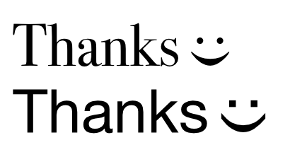
They don’t even have to be designed to look like faces; conceptually these similar to the exclamation mark and the question mark, and a similarly arbitrary symbol would be fine. But since emoticons and smilies are currently in widespread use, they seem like a good starting point. Perhaps something like this:

I am, obviously, not a type designer, but you can see what I’m trying to do. The more complex symbols, like confused or roll-eyes, would need a bit more ingenuity, but humans are nothing if not ingenious.
Can you tell I’m short of inspiration for napowrimo? And, btw, if WordPress is going to insert curly quotes, I wish it would bloody well get them right. The automatic formatting seem to be screwed up in several ways since the release of WP2.1, and it’s really irritating. [angry smiley could go here]
Fun with type
I’ve been playing with these very cool typefaces.
