Categories
Me Nature Other

Sparrow!

I was reading in the garden today and heard a distinctive chirp: there was a female house sparrow on the bird feeder. Once, this would have been normal, but British house sparrow numbers have plummeted in the past few years; the sparrow population of London declined 75% between 1999 and 2004. It was the first one I’ve seen here for years.

No-one quite knows why they disappeared. Loss of nest sites because of changing roofing materials? Loss of hedging? Less waste ground? Inevitably some ‘bird lovers’ blame sparrowhawks and magpies, or cats or squirrels; equally inevitably some people have tried to blame it on mobile phone masts. It seems difficult to account for the suddenness and scale of the decline by any obvious change in the environment, and it’s tempting to suggest disease; but honestly we don’t know.

Food Fight!, originally uploaded by ScottCatskill.

There’s a particular poignancy because Londoners have long identified with the house sparrow as the ‘cockney sparra’. In Victorian London, when the air was murk and anything left in one place for too long was gradually covered in a layer of flaky soot, and city gardeners had to choose their flowers from species which could survive the pollution, there weren’t many birds found in the heart of the city. But the sparrows were there, nesting in the gutters and tiled roofs and any little nook in the brickwork which would offer them enough space to build a nest out of sweet papers and cigarette butts. The very character of them—drab, scruffy, gregarious, chirpy, impudent, noisy, tuneless, and given to squabbling and shagging in public—makes them seem like proper London birds.

Behind the most ancient part of Holborn, London, where certain gabled houses some centuries of age still stand looking on the public way, as if disconsolately looking for the Old Bourne that has long run dry, is a little nook composed of two irregular quadrangles, called Staple Inn. It is one of those nooks, the turning into which out of the clashing street, imparts to the relieved pedestrian the sensation of having put cotton in his ears, and velvet soles on his boots. It is one of those nooks where a few smoky sparrows twitter in smoky trees, as though they called to one another, ‘Let us play at country,’ and where a few feet of garden-mould and a few yards of gravel enable them to do that refreshing violence to their tiny understandings.

—from Dickens’s The Mystery of Edwin Drood

The idea that the house sparrow is a cockney bird is admittedly parochial. Sparrows are found nearly everywhere there are people. And they are only found where there are people; they have become so closely tied to human habitation that no-one knows quite what habitat the ancestral sparrows preferred, or what part of the world they lived in. I like to think that sparrows started hanging out around people at about the moment some Mesopotamian farmer built the first granary, and they’ve been with us ever since, hopping around our barns and farmyards, our parks, markets and pavement cafés; nesting in our thatch, under our tiles, and in our lamp-posts.

Little bandit,……, originally uploaded by Hans Viveen.

I also feel a certain kinship in the fact that house sparrows, like the other species that have hitched a ride with humanity—rats, pigeons, cockroaches—have been successful because, like us, they are generalists. They are adaptable. They may not be exquisitely adapted to efficiently exploit a particular evolutionary niche, but provide them with a new environment like a city, and they find a way to thrive while other species are left stuck in their evolutionary rut.

When the sparrows disappeared from this bit of London, I didn’t consciously notice them go. But when I’m staying somewhere that does have them—if I’m woken in the morning by their chirping, if they try to steal the crumbs from my morning croissant—there is a sense of order restored. Deep down, I feel that a house without sparrows is lacking something important. I know that people in the Americas and Australia, for whom the house sparrow is an invasive, non-native species, may not feel the same way. But to me, the sparrows are our companions, our familiars, our symbionts.

I just hope that today’s was the first of many.

Categories
Culture Other

Anthony Gormley at the Hayward

Last week I went to Blind Light, the Gormley show at the Hayward. Gormley must be the third most famous artist in Britain, I should think*, particularly on the back of two spectacular public works: Angel of the North and Another Place.

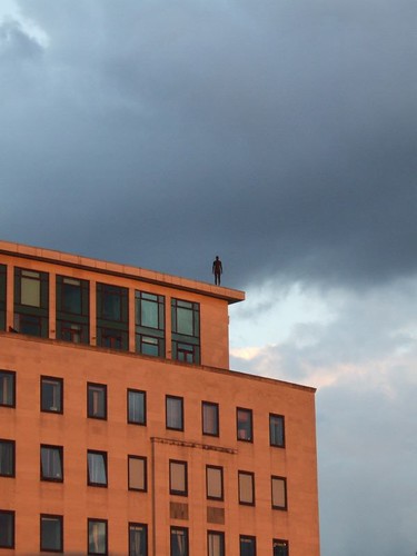
For those of you who don’t know his work—foreigners and the like—he has produced an endless series of variations of the human form; his visual signature is a blank-faced statue, standing rigid with its hands by the sides. I believe most of them are cast from his own body, but any distinctive characteristics are removed to leave a generic male form. The two works I’ve linked to above give you an idea of how he varies the basic template. To accompany the current exhibition, he has created another such installation: a number of life-size male figures, cast in bronze, positioned on rooftops and other prominent places over a 1.5 km radius, all facing towards the gallery.

0706290002, originally uploaded by domeheid.

This installation, titled Event Horizon, is a joy in itself; you start seeing the figures as you walk to the gallery, and then from the various exterior spaces of the gallery you can scan the rooftops of London to look for more of them. All these mute figures watching from the rooftops are almost rather creepy—it’s very Doctor Who—but mainly it adds a touch of magic to some very mundane buildings and creates a striking relationship between the exhibition and its surroundings.

Part of what makes it so good is the sheer scale. It must have been a major undertaking just identifying places to put them, negotiating with the owners of the buildings, and getting them into position. You could imagine an artist doing the same thing but being content to just place half a dozen figures on nearby buildings. Gormley has placed 31 figures (according to Wikipedia); some are so far from the gallery that you can’t even be certain that you’ve identified them correctly.

That commitment, I think, is typical of the artist. With someone whose work has quite such a consistent theme running through it, there’s a risk of them being a one-trick pony, but Gormley doesn’t just have lots of ideas for how to develop his basic theme; he develops and executes those ideas thoroughly. My most frequent irritation with contemporary art is when I feel that it’s under-developed. Half baked. I don’t get that with Gormley.

It helps of course that, being human ourselves, we tend to find the human form endlessly fascinating.

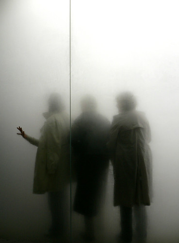
The most striking work inside the gallery is called Blind Light; it’s a glass-walled box, about 10m square, which, with the help of ultrasonic humidifiers and flourescent lights, is filled with bright white fog. Once you enter, visibility is down to a couple of feet, sound is muffled, the floor is wet underfoot; I only walked across the box and then turned round to walk back to the entrance, but still got lost enough that I had to feel my way along the wall to find the door again. Meanwhile, from the outside, you see people’s figures appear as ghostly shadows in the mist.

people in the mist

blind light by _imax, used under a by-nc-nd Creative Commons licence.

What I found most striking was the disjuncture between the immersive, disorientating strangeness of being inside the box and the relative mundanity of what it looks like from the outside. Intellectually you know what it will be like, and you can see other people stumbling around in the mist, but it doesn’t quite prepare you for actually being in there. In a sense this feels like a trick; yes, it’s an intense experience being unable to see where you’re going. Does that mean it has artistic worth or is it just a fairground ride with an arty blurb attached to it?

One point to make is the way it relates to the other work in the exhibition; the box obscures people’s individuality and turns them into shadowy versions of Gormley’s blank-faced statues. And when you’re in there, you become very aware of your own body and your relationship with your surroundings. In the same room there’s a work from 1991 called Sense, a block of concrete with a couple of holes that turn out to be just the ends of a body-shaped void in the block. A model of Gormley’s body was cast in wax, the concrete was poured around it, and then the wax melted to leave the empty space. Blind Light is like a live-action version of the same thing; everyone who walks into it carves out a body-shaped hole in the mist.

There were lots of other works as well which I haven’t touched on; this slideshow from the Telegraph gives you some idea.

*Hirst and Emin.

Categories
Culture Other

London 2012 logo reactions

As regular readers probably know, I’m an enthusiastic supporter of the London Olympics. But I’ve always had my own particular private worry about them. Not transport problems or cost overruns; no, what I’ve always had a nagging worry about is the opening ceremony.

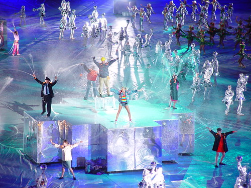
There have been two big international sporting events held in the UK in the past 15 years: Euro ’96 and the 2002 Commonwealth Games. From an organisational point of view, both were a great success. But the opening ceremonies were cheesy, incoherent, unimaginative, clichéd. Half-baked. Second-rate. And my worry was that not just the opening ceremony, but the whole style, everything that the world will remember about the London Olympics other than the sport, might end up the same way: naff and a bit amateurish.

DSC03132, originally uploaded by Dean Morris.

There are plenty of people in the UK who know how to put on a show, whether it’s an exhibition, a rock concert, a West End musical or a royal funeral. For that matter, the fabulous opening ceremony for the Athens Olympics was done by a British company. But none of that creativity seems to survive contact with the government. Whether politicians just have bad taste, or it’s the clammy hand of design by committee that ruins everything, I don’t know, but the record doesn’t inspire much optimism. The ultimate example is the Millennium Dome. It was always an event in search of a reason for existing, and the cost of the thing wasn’t exactly going to endear it to anyone, but much of that would have been forgiven if the experience of visiting it had been exciting and stimulating. Or glamorous, or awe-inspiring, or shocking, or moving. Instead, it was overwhelmingly mediocre. I had a pleasant enough day out there with my family, but it was completely unwowful and unmemorable.

I was cautiously optimistic about London 2012, though. The team seemed to be very focussed and professional, the bid logo was certainly the best of the competing cities, and the videos for the bid presentation in Singapore were very polished and even quite witty. And beach volleyball on Horseguards Parade, where the PM will be able to watch it from the windows of 10 Downing Street, is a stroke of genius. So I had a sense of shock and a feeling that all my worst fears had come true when I saw that the new logo is, basically, ugly:

London 2012 logo

Not only is it garish and lopsided, it looks so dated. And not generically old-fashioned, but quite specifically dated. My immediate associations were Max Headroom and the original Channel 4 logo; other people have mentioned Smash Hits, the video for Money For Nothing, MTV, and the titles for Saved By The Bell. In other words, there’s an immediate association with the cheesier end of 80s yoof culture.

Now I have a certain nostalgic fondness for the 80s, and I know the decade is quite trendy at the moment, but it seems a bizarre note to strike for the 2012 Olympics. And what worries me even more than the retina-scarring gaudiness of it is that note of cheesiness. The Olympics is never going to be cutting-edge and hipper-than-thou; it’s too big, too old, and too establishment for that. But it should be possible to do it with a bit of panache.

Well, I’ve been reading some of the commentary on design blogs—there’s a couple [1, 2] among the daily links in the previous post—and although everyone seems to have the same initial reaction of startled revulsion, some people have, after a little thought, offered some defences of the design. There seem to be three basic points:

1) Technically speaking, it’s a very flexible design. It scales well, it works well in black and white and a variety of colour schemes, and it will work not just in print and on screen but on baseball caps, polystyrene cups and just about any other medium. Which wouldn’t make up for any of its other failings, but is worth noting.

2) At least it doesn’t include a picture of Big Ben. More broadly: Olympic logos are generally forgettable, clichéd and bland. This one is surprising, striking, and, presumably, memorable. It has had an immediate impact, and although that initial impact has been negative, it is at least a strong reaction. And people will get used to the design in time. Possibly.

3) Most interestingly: it’s not just a logo. Because it is so visually striking, it sets up a visual signature which will be able to be carried through into all kinds of materials: TV ads, posters, banners, volunteer uniforms and so on. It really is, as the committee stressed, a brand rather than a logo.

These arguments have not quite won me over. ‘At least it’s not bland’ is a bit too much like saying ‘don’t you see? It’s ugly on purpose.’ Which just might be so clever it loops round to stupid again. And while I can see the virtues of a coherent visual style for the Games, the idea of the whole of London being plastered with lurid jaggedy shapes for the next seven years doesn’t fill me with an overwhelming sense of joy.

But at least it’s given me something to think about and a sense that, just possibly, there’s some method to the madness. Perhaps they know what they’re doing, perhaps it’ll all be OK; perhaps we won’t be looking back at the Games in 20 years time with a visceral cringe of embarrassment.

Categories
Culture Other

Two Lives by Vikram Seth

Two Lives is a biography of Seth’s great-uncle and aunt. They met in the 30s in Berlin when Shanti Seth was studying dentistry and took lodgings with the (Jewish) Caro family. Henny Caro was one of the daughters of the house and at the time was engaged to someone else; but after the war they eventually got married and lived together in London.

In one way of another their lives and those of their friends touch on many of the key historical moments of the C20th, but most centrally the war and the Holocaust. I’m reluctant to give too many details because I think he intentionally reveals them slowly.

Seth writes well, of course, and I found it an engaging enough book. I still slightly wonder whether it would have been published if it wasn’t written by a famous novelist, though. Not because it’s badly written or not worth reading, but because it seems to lack focus somewhat. He started writing it after the death of Henny, intending really to write a book just about his uncle but found a stash of letters, mainly between Henny and her German friends after the war. So Shanti’s story is based on direct interviews as an old man, while hers is pieced together from old letters, and they don’t quite mesh, somehow. In fact, considering they were married for several decades, there’s an odd feeling that their lives as told in this book don’t overlap that much.

I don’t know. I’m not sure that the whole is more than the sum of the parts. Mind you, those parts are are often very good: interesting, moving, well written.

(this post also appears in my ‘What I’ve been reading‘ section)

Categories
Other

London sports day

A free idea for the people at London 2012 to engage with the public and generate positive vibes: a London sports day, held somewhere like Hyde Park. Invite people from all London’s community groups (schools, churches, mosques, clubs and societies; as broad a range as possible) to take part in a big day-long jamboree of sport. The idea would be to try and create an atmosphere somewhere between a school sports day and a country fair, with candy-floss and ice-cream and toffee apples. In fact, if you could get people from London’s many ethnic communities to organise all kinds of different street food, so much the better.

There should be some proper events, but also lots of events like egg-and-spoon, three-legged races, sack races, wheelbarrow races, throwing the cricket ball, wellie wanging, keepy-uppy, a greasy pole, standing long jump, London skittles, tug-of-war, barrel-rolling and so on. Have lots of events going on at the same time so people can wander from one to another. And you should get exactly the same kind of medal for winning the silly events as the serious ones. Or you could have serious events but keep it informal; have an all-comers 100m competition, where anyone who turns up on the day and puts their name down (or as many as they have time for) can compete. If you processed them quickly enough – say heats at five minute intervals, with only the outright winner going through to the next round – you could get through a lot of entrants in a day*. It would be important to have events for both adults and children, but not silly events for children and proper ones for adults; we want to see Seb Coe doing a sack race.

It might also be fun to have Olympians doing demonstration events like archery and judo, but the focus should be on participation by ordinary Londoners. The point would be to celebrate sport for the sheer fun of it and its potential as an inclusive community event. Not too much hard sell about why the Olympics is going to be a good thing; just try to make sure everyone has a great time and that the London 2012 logo is visible on all the leaflets and stands.

*actually, doing the maths suggests this might not be practical. hey-ho. You might be able to do something like an all-comers discus; everyone can queue up to get one throw, the longest over the course of the day wins.

Categories
Other

Hurray for the London Olympics!

I really feel like London was cheated out of a cheerful honeymoon period of harmless excitement between winning the bidding for the 2012 Olympics and the start of the inevitable gloomy stories about spiralling costs. Cheated because, of course, it was the morning after we won that a bunch of devout young men from Leeds hijacked the news agenda.

It was always going to cost more than predicted — it’s a big capital project run by policitians. That’s what happens. And it was always inevitable that there would be a lot of whining from dismal killjoys. But the enthusiast, pro-Olympic side of the argument lost all its momentum just as it should have been drawing people in, and so we’re going to have the six years of gloomy pronostication without having had the chance to enjoy the initial moment.