Categories
Culture

Exhibition roundup: History is Now, Marlene Dumas, & Cotton to Gold

The South Bank Centre is marking 70 years since the end of WW2 with a collection of events entitled Changing Britain. The Hayward Gallery’s contribution is an exhibition History Is Now: 7 Artists Take On Britain.

Filtering collective history through their individual perspectives, seven British artists of different generations and backgrounds – John Akomfrah, Simon Fujiwara, Roger Hiorns, Hannah Starkey, Richard Wentworth and Jane and Louise Wilson – each curate distinct sections of the exhibition and provide their unique ‘take’ on recent British history.

As you might imagine, it’s a bit of a mixed bag. John Akomfrah has selected a whole range of films from the Arts Council Film Collection, which I pretty much skipped, because who has the patience to watch seventeen different pieces of video art in a row? I hope some people do, but not me. Roger Hiorns has put together a whole exhibition of material related to the BSE crisis, arranged chronologically, and I found it really interesting to go back and revisit that period but I’m not sure I was responding to it as art — whatever that means. The only reason it couldn’t have been an exhibition at the Science Museum is that contemporary art has a willingness to be more boring — or at least dense and text-heavy — than a traditional museum would dare.

evil-banalbig

The two I enjoyed most were Hannah Starkey and Richard Wentworth. Hannah Starkey selected 70s, 80s and 90s photography from the Arts Council Collection, which she juxtaposed with commercial photography in a somewhat heavy-handed but still effective way. So glossy ads for fashion and booze were contrasted with grimy, peeling 1980s unemployment offices and so on. I don’t know if that contrast was absolutely necessary — the photographs would have been effective on their own — but it was still good. Richard Wentworth’s was the most crowd-pleasing section. To quote the blurb: ‘Through his eclectic selection of objects, artworks and artefacts Wentworth takes us from post-war austerity to the optimism of the 1950s and into the gloom and paranoia of the Cold War.’ So there was some art by people like Ben Nicholson, Barbara Hepworth, and Henry Moore, lots of press clippings, lots of old books which were thematically appropriate but also appealing for their mid-century graphic design, various objects like a 1950s TV, and most dramatically a decommissioned anti-aircraft rocket launcher out on the balcony.

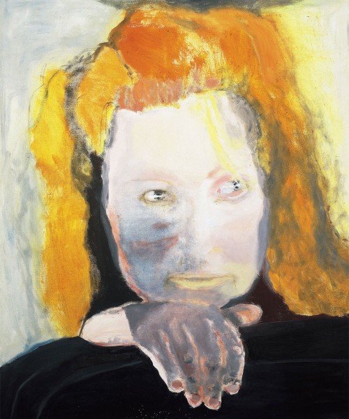
Meanwhile at Tate Modern they have Marlene Dumas: The Image as Burden. Marlene Dumas is a South African artist who paints rough, blobby paintings, nearly all of people. I enjoyed it much more than I expected because the Tate have done a terrible job of marketing it. Or at least a terrible job of marketing it to me. All the pictures I’d seen made her work look dismal and unattractive, and quite a lot of it is a bit like that: lacking immediate visual appeal (which is not the same as being bad, but doesn’t make me rush to go and see it). Particularly, there are paintings in black ink which are dark and grey and miserable looking. But actually her larger oils are much more likeable, and some of them are even quite colourful. I didn’t come out of the exhibition as her biggest fan, but I certainly liked it more than I thought I would.

And at Two Temple Place is Cotton to Gold: Extraordinary Collections of the Industrial North West. In the 19th and early 20th centuries, there were some people in Lancashire making a hell of a lot of money from cotton mills and other industry. And some of them put that money into collecting historical manuscripts, or old coins, or beetles, or Turner watercolours, or Japanese woodcuts… With the result that there are apparently some particularly notable regional museums up there. But for the moment a lot of those coins and beetles and whatnot have been lent to Two Temple Place.

It’s an enjoyable kind of exhibition to visit: the building is attractive, entry is free, and if one cabinet leaves you cold, well, the next one will have something completely different. Last year they had a similar exhibition of items from the various University of Cambridge collections; I think that one was better, with more varied and more remarkable exhibits, but Cotton to Gold is enjoyably eclectic in the same way.

» The painting is Evil is Banal, Marlene Dumas, 1984. Collection Van Abbemuseum, Eindhoven, The Netherlands. © Marlene Dumas. Photo credit: Peter Cox, Eindhoven, The Netherlands.

Categories
Culture

Sigmar Polke at Tate Modern

I finally got round to visiting the Sigmar Polke retrospective at Tate Modern — it ends on Sunday — and it was enjoyable. Not so much because I absolutely loved the work; I liked quite a lot of it, but if there was another Polke exhibition next year, I wouldn’t be excited to see it. No, it was a good exhibition to visit because the work was varied, and going through thirteen rooms of work you’re lukewarm about, it helps if at least each room is a bit different.

Sigmar_Polke_Freundinnen-1

So it started off with some Pop Art-esque commentary on consumerism and mass culture; there was work playing with the idea of the artist as Artist/egomaniac (with titles like Polke as Astronaut, and Polke as Drug-Pulverized Polke in a Glass Pipe); and commentary on the idea of Modern Art (“Malevich looks Down on Pollock”); then a 1970s hippy phase when he travelled around India and Afghanistan, took lots of drugs and made collages of pornography and psychedelic paintings with references to magic mushrooms, Alice in Wonderland and Mao; a series of watchtower paintings which used a stencilled design of a hunting watchtower to reference both Nazi prison camps and the Iron Curtain; there were some big paintings using unusual materials like neolithic stone tools and meteorite dust… and so on.

I’m often aware how much my reaction to works of art is dependent on factors which are extrinsic to the work itself: if the exhibition is too small, I might get all the way through it without ever getting into the right mindset. If it’s too big, it doesn’t matter what they put in the last few rooms, because my concentration will be gone — something that happened at the Late Turner exhibition at Tate Britain recently. It’s much more difficult to engage with the work if the gallery is too crowded, or there are lots of small works so you are constantly in mini queues to look at them, or if there’s a group of schoolchildren bringing out the terrible acoustics of big unfurnished rooms. Or you can simply be in a bad mood or a good one.

In the case of the Polke, the exhibition was almost too big; but it wasn’t too busy, the works were large and varied, and the schoolchildren were old enough to keep their voices down, so it was a pleasant experience. But there’s something odd about reviewing an art exhibition as though it was a bed and breakfast (a little bit cold in the Turbine Hall, but lovely views of the St Paul’s…).

Anyway.

One other thing I thought was interesting was a curatorial decision. On the website the blurb says:

He worked in off-the-wall materials ranging from meteor dust to gold, bubble wrap, snail juice, potatoes, soot and even uranium, all the while resisting easy categorisation.

It’s the ‘snail juice’ I want to pick out. In the exhibition itself it calls it something like ‘dye made from crushed snails’. But when you read the label next the painting in question, it turns out to be Tyrian Purple. That is, the highly prized dye of classical antiquity that was used by the Romans to colour their ceremonial togas. Which is indeed made from crushed snails; but referring to it that way, without any hint of the cultural context, seems, you know, weird.

» The image is Girlfriends, 1965/66, from the Froehlich Collection, Stuttgart. See lots more of Polke’s work in this review of the exhibition when it was in New York.

Categories
Culture

Damien Hirst at the Tate

So I went along to see the big Damien Hirst show at Tate Modern.

It rather lacked the element of surprise; whatever Hirst’s other qualities, he is a great self-publicist, so anyone living in the UK with an interest in art is already very familiar with his work. His earliest student pieces were new to me; apart from that I think there was only one work in the whole exhibition which I didn’t immediately recognise.

I didn’t come out of this feeling very enthusiastic. Sometimes you go into a big retrospective, and seeing all the work together makes it more powerful: because you can see the threads running through the work, or the development, or you absorb the artist’s aesthetic and gain a deeper sense of what they’re trying to do which you don’t get from individual paintings.

I think the opposite is the case with Damien Hirst. His work often works well in a mixed exhibition: it has a clear, simple quality to it and a designery aesthetic which helps make it stand out when it needs to compete for your attention. But when you put a whole lot of his pieces together, it starts to seem obvious and corporate and a bit dull.

You can see why Hirst became so commercially successful: his work is instantly recognisable, easily produced in large quantities, and looks modern without being too difficult or threatening. Just as Abstract Expressionism was the perfect art for big corporations in postwar America, when they needed something modern looking to hang in the lobbies of their shiny new glass and steel office buildings, so Hirst was the perfect artist for the time before the crunch. Ideal for people who find themselves with a startling amount of money but who don’t have much confidence in their own taste. Like Prada or Bentley or Patek Phillipe.

And why not, after all. He didn’t create the madness of the art market, he just did a very good job of exploiting it. And he’s used his money to build up his own big collection of contemporary art, which I believe he’s planning to open to the public. So I approve of that.

And despite the grumpy tone of this post, I don’t dislike his work — but seeing a whole load of it one place made me like it less rather than more.

» The picture is Psalm 23: Dominus regit me. Butterflies and household gloss on canvas, 2008.

Categories
Culture

Grayson Perry: The Tomb of the Unknown Craftsman

Grayson Perry has curated an exhibition at the British Museum that combines his own work — ceramics, textiles, ironwork — with objects from the museum collection. Which must have been *the most fun ever*. I mean seriously, I’ve spent hours browsing the BM’s collection online, looking for things to post to Tumblr, but how much more fun to actually wander around the stores, talking to the experts, poking around in drawers and cabinets, and actually handle everything, with an open-ended brief to find anything which is beautiful, or interesting, or funny.

In fact, if it had just been stuff from the collection with some commentary from Perry, that would be enough to make a very interesting exhibition, because he always writes well and interestingly about art and he clearly has an excellent eye.

But the inclusion of his own work does work well. His work always combines a seriousness with humour and absurdity, and its presence affects the way you look at the other objects. Human beings often are absurd, after all, and museums aren’t always the best places to bring that out. For that matter, museums don’t always do seriousness very well. I mean, they’re good at dry, academic seriousness, but they don’t necessarily create the environment for human seriousness.

And in turn it gives you some insight into how he sees his own art to see the things he’s chosen to show alongside his work, and the themes he arranged the exhibition around: pilgrimage, magic, sexuality, maps and so on. And since I haven’t said so explicitly yet: Perry’s work is interesting and attractive in its own right.

So, yeah, a playful, entertaining exhibition full of striking, interesting and beautiful things. Go and see it.

» The image is of a painted wooden figure of a dancing Bes holding a tambourine, standing on a lotus. It’s Egyptian, from about 1800BC. It is from the BM, but it wasn’t in the exhibition.

Categories
Culture

Twombly, Poussin, Emin and Hungarian Photographers

A bit of an exhibition round up. This is not, as you might think, four exhibitions, because at Dulwich Picture Gallery at the moment they have a combined Cy Twombly/Nicolas Poussin exhibition. Which might seem like a rather odd choice at first glance, since they lived 330 years apart and one of them painted highly controlled classical paintings and the other did scrawly abstracts.

But there is a kind of logic to it. Both of them moved to Rome at the age of about 30, both use lots of classical references in their work, and Twombly specifically referenced Poussin in several paintings, most notably by painting a large group of four paintings called the Four Seasons, a subject Poussin painted 300 years earlier.

And while I don’t think it was exactly revelatory to see them together, it’s always interesting to explore these kind of comparisons, as an intellectual parlour game if nothing else. I guess you could argue that the Poussins brought out a controlled, restrained quality in the Twombly, for example, but it’s rather an elaborate way to make such a straightforward point. I did find myself warming to Poussin more than usual, though. Clearly he’s a great painter, but generally I find his work a bit sterile. But being displayed among modern paintings did at least make the paintings seem a bit fresher.

Meanwhile the Hayward is holding a retrospective of Tracey Emin. I went into it with mixed feelings. She has attracted so much bone-headed mockery from the media over the years that I’ve always felt the need to stick up for her… despite not actually liking her work that much. But seeing it all together it does hold up pretty well. The caricature is that she just splurges her personal life uncontrollably into her work for shock value; and that’s not completely unfair. But of course the execution is what matters, just as a confessional memoir could be good or bad could be good or bad depending on who wrote it. And at her best — some of the appliqué blankets, the video work — Emin’s work is sensitive and intelligent. On the other hand, by the time I had gone all the way round the exhibition, it was also starting to feel a bit repetitive. So she’s still not exactly my favourite artist, but I enjoyed the show well enough.

And at the Royal Academy is an exhibition of C20th Hungarian photography. Why Hungarian photography? Well, because five of the most notable photographers of the C20th — Brassaï, Robert Capa, André Kertész, László Moholy-Nagy and Martin Munkácsi — were all Hungarian. So they provide the core of the exhibition, but other, less famous people are included as well. In some ways the exhibition is about Hungary, with striking photographs recording the various wars political upheavals that engulfed the country, but it also includes many taken in other countries: Brassaï photographs of Paris nightlife, or Kertész shots of New York.

If there is anything distinctively Hungarian about the work, I couldn’t particularly see it. It did feel very European, somehow, and it reminded me again how much my idea of Europe was shaped by the Iron Curtain growing up. Austria ended up on one side of it and was therefore a ‘real’ European country; Hungary was on the wrong side and was part of some shadowy other Europe. And 20 years after the fall of communism, that sense of them not being part of the European mainstream still lingers. I don’t know how much that’s just me showing my age; people just out of university now, who were two three when the Berlin Wall came down, hopefully see the continent rather differently.

Anyway, geopolitics aside, the exhibition is definitely worth going to because it has some very fine photographs in it.

» The Triumph of Pan is by Nicolas Poussin; Hotel International, 1993, © Tracey Emin; Greenwich Village, New York, 30 May 1962 is by André Kertész.

Categories
Culture

‘The Cult of Beauty’ at the V&A

The Cult of Beauty: The Aesthetic Movement 1860-1900. I’m tempted to sum up the exhibition as ‘The Pre-Raphaelites and their furniture’, given my recent post about how much I dislike the Pre-Raphaelites. But actually the exhibition is rather broader than than that. The Pre-Raphs do feature heavily, but it’s also the Arts and Crafts movement, Japonisme and so on; lots of Whistler, William Morris, a bit of Aubrey Beardsley, and designers like Christopher Dresser and Edward William Godwin.

And although most of this stuff is not to my taste, the V&A does this kind of exhibition superbly well. The quality of the exhibits is extremely high (I would expect nothing less), and it is always interesting to see fine art and decorative art from the same cultural moment displayed together; so often we see paintings hanging in plain, austere galleries, with no context but each other.

All the things that annoy me about the Pre-Raphaelites annoy me much less when it comes to furniture and ceramics and wallpaper. My problem with them, essentially, is that they are superficial: flashy, decorative, overly obvious. And the way that the paintings tend to pick other ancient or exotic cultures and reduce them to a stylistic quirk actually offers a clear parallel with the ‘Japanese’ furniture of the time. But it doesn’t bother me because after all, the decorative arts are, well, decorative. The moment you make a table which tries to do anything other than provide a stable flat surface, or a pot which does anything other than hold water, you are in the world of decoration and surface. Which isn’t intended to belittle those things: I’m fascinated by design, I love beautiful objects and I think that anyone who works to make sure that the objects around us give us pleasure is doing something very important.

But it says something about my different relationship with ‘fine art’ that I actually find Pre-Raphaelite paintings almost offensive. They irritate me in a way I can’t say I’ve often been irritated by a wardrobe or a candlestick, however ugly or ill-conceived I might think it is. I might be similarly annoyed by an object which doesn’t work properly because of bad design, but not usually by simple ugliness. What exactly that says about me… I’m not sure.

The figure who sits slightly oddly at the centre of this exhibition is Whistler. He seems stylistically apart the other artists; his paintings are exercises in understatement and control, and instead of scenes from myth and legend, he mainly paints people in houses. There’s a painting in the show (no doubt called something like Symphony in White) of a girl in a white dress. Apparently, when other people offered ingenious interpretations he insisted that, on the contrary, it was just what it looked like: a girl in a white dress standing in front of a white curtain.

So it’s tempting to see him as out of place in this exhibition, to think that really he should be over in some other gallery, maybe with the Impressionists. But clearly he is part of the same movement. There’s a room he designed for someone’s house (or at least a projection of it you can walk into) and it is full of the typical aesthetic motifs: peacocks, sunflowers, bamboo, blue and white porcelain. In his hands it’s rather lovely, I think; a lot of the interiors in the exhibition look like they would be claustrophobically busy — decorative knickknacks arranged on decorative furniture in front of elaborately patterned wallpapers and richly coloured patterned fabrics. Whistler uses the same motifs and while the result is still pretty full-on, with lots of strong colours and decoration everywhere, it is relatively cohesive and elegant. Even so, it’s hard to reconcile the richly decorative style with the simplicity of his paintings.

Although, having said all that, the exhibition did provide a good example of why the whole concept of ‘good taste’ should be treated with suspicion. In about the second or third room there was a group of paintings by Albert Joseph Moore. In some ways they are fairly typically Pre-Raphaelite: blank-eyed women with indistinguishable faces lounging around wearing ‘classical’ robes in a generically exotic interior. But the palette is all restrained pastels, and composition is carefully balanced and designed around a strict grid system. And I found myself thinking that’s a bit more like it, because they were more ‘tasteful’. But that seem like a pretty dismal way of thinking. To prefer the anaemic, milquetoast, decaffeinated version because it’s more restful: well, it’s not exactly going to produce art which is ambitious and interesting.

It is a fascinating conflict: I do think our lives would be hugely improved if more of the things around us showed evidence of good taste. Buildings, household appliances, packaging, signage, clothes, websites, books, posters, furniture… we are surrounded by things which are ugly or just mediocre. Which make our lives just slightly worse rather than better. But I also think that good taste is the great enemy of creativity and individuality, a stifling force that needs to be continually pushed back against. Especially since it is very difficult to separate an even somewhat objective idea of ‘good taste’ from simple social conformity.

» The vase is designed by Walter Crane, the sideboard by E.W. Godwin, the sconce by Thomas Jekyll, the wallpaper by William Morris, and the teapot by Christopher Dresser. The two paintings are Arrangement in Grey and Black, No. 2: Portrait of Thomas Carlyle by Whistler, and Reading Aloud by Albert Joseph Moore.