Categories
Culture

Alexander McQueen at the V&A

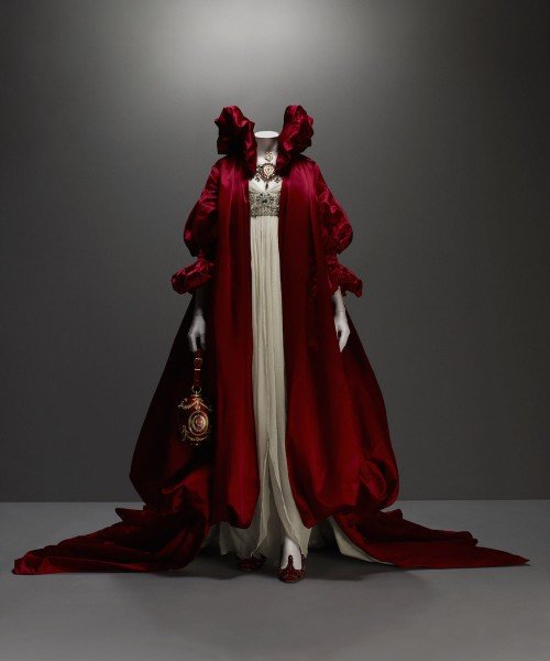
I went to see the McQueen show at the V&A — ‘Savage Beauty’, the same one that was previously at the Met — and it was terrific: enormously varied and inventive, with loads of striking and interesting stuff to look at. Being a bit sleep-deprived after staying up late to watch the election results come in (and what a depressing vigil that turned out to be), I did find it all a bit oppressive by the end; too much visual stimulus, loud music, dark rooms and spotlights. It’s the feeling I get when I’ve been in a supermarket for too long.

mcqueen

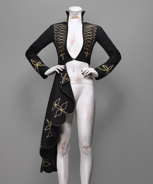
Still, the frocks were great. Like a lot of haute couture, much of it is spectacular but barely wearable, and it’s tempting to call it ‘theatrical’, although in fact theatre rarely has this kind of spectacular costume; and film perhaps even less so. It reminded me how terrific the Jean-Paul Gaultier costumes are in Fifth Element; it would be great if more films had that kind of extravagant visual aesthetic. Imagine a superhero movie with the costumes designed by Alexander McQueen, instead of the blandly, generically ‘cool’ versions that the studios manage to produce. Or one of the new Star Wars movies, or the Lord of the Rings; movies set in alien worlds where anything is possible, and with enough money to actually make these kind of incredibly labour-intensive costumes… wouldn’t it be great if they were just able to be a bit stranger, and more extravagantly individual?

McQ.342.EL

I was slightly uncomfortable with some of the tribal-influenced collections though; I’m generally a bit wary of claims of cultural appropriation, just because throughout history, culture has always been invigorated by the mixing together of influences from different traditions. I understand why people are uncomfortable with white European fashion designers using ‘exotic’ influences in their designs in a rather unthinking way, but I think it can be done in a way which is fairly innocent — although as a white European man perhaps I’m just showing my biases.

However: taking a load of imagery from indigenous African and South American peoples, lumping it all together as ‘tribal’, combining it with animal imagery and throwing around a lot of rhetoric about primitivism and the noble savage… that is definitely the wrong way to do it.

McQ.2001a–e_McQ1110_Rom_national_AW08_Look42_037-f2LOWRES.AV0.EL

» Images all from the Met website for the exhibition and © Sølve Sundsbø / Art + Commerce.


Categories
Culture

‘The Cult of Beauty’ at the V&A

The Cult of Beauty: The Aesthetic Movement 1860-1900. I’m tempted to sum up the exhibition as ‘The Pre-Raphaelites and their furniture’, given my recent post about how much I dislike the Pre-Raphaelites. But actually the exhibition is rather broader than than that. The Pre-Raphs do feature heavily, but it’s also the Arts and Crafts movement, Japonisme and so on; lots of Whistler, William Morris, a bit of Aubrey Beardsley, and designers like Christopher Dresser and Edward William Godwin.

And although most of this stuff is not to my taste, the V&A does this kind of exhibition superbly well. The quality of the exhibits is extremely high (I would expect nothing less), and it is always interesting to see fine art and decorative art from the same cultural moment displayed together; so often we see paintings hanging in plain, austere galleries, with no context but each other.
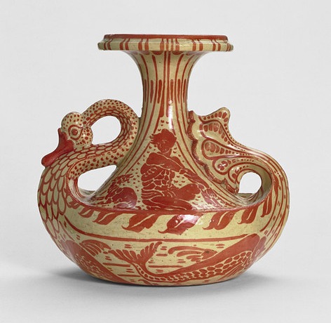
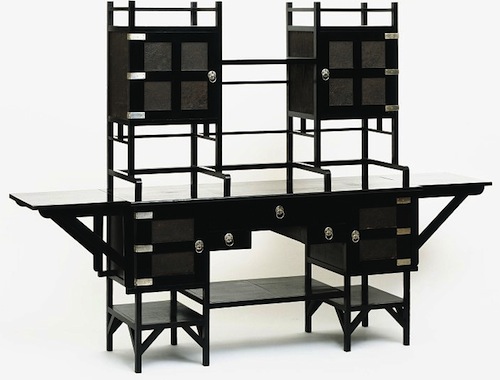
All the things that annoy me about the Pre-Raphaelites annoy me much less when it comes to furniture and ceramics and wallpaper. My problem with them, essentially, is that they are superficial: flashy, decorative, overly obvious. And the way that the paintings tend to pick other ancient or exotic cultures and reduce them to a stylistic quirk actually offers a clear parallel with the ‘Japanese’ furniture of the time. But it doesn’t bother me because after all, the decorative arts are, well, decorative. The moment you make a table which tries to do anything other than provide a stable flat surface, or a pot which does anything other than hold water, you are in the world of decoration and surface. Which isn’t intended to belittle those things: I’m fascinated by design, I love beautiful objects and I think that anyone who works to make sure that the objects around us give us pleasure is doing something very important.

But it says something about my different relationship with ‘fine art’ that I actually find Pre-Raphaelite paintings almost offensive. They irritate me in a way I can’t say I’ve often been irritated by a wardrobe or a candlestick, however ugly or ill-conceived I might think it is. I might be similarly annoyed by an object which doesn’t work properly because of bad design, but not usually by simple ugliness. What exactly that says about me… I’m not sure.
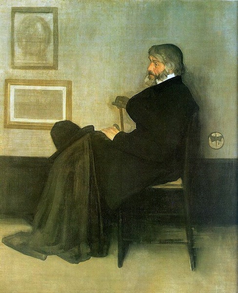
The figure who sits slightly oddly at the centre of this exhibition is Whistler. He seems stylistically apart the other artists; his paintings are exercises in understatement and control, and instead of scenes from myth and legend, he mainly paints people in houses. There’s a painting in the show (no doubt called something like Symphony in White) of a girl in a white dress. Apparently, when other people offered ingenious interpretations he insisted that, on the contrary, it was just what it looked like: a girl in a white dress standing in front of a white curtain.

So it’s tempting to see him as out of place in this exhibition, to think that really he should be over in some other gallery, maybe with the Impressionists. But clearly he is part of the same movement. There’s a room he designed for someone’s house (or at least a projection of it you can walk into) and it is full of the typical aesthetic motifs: peacocks, sunflowers, bamboo, blue and white porcelain. In his hands it’s rather lovely, I think; a lot of the interiors in the exhibition look like they would be claustrophobically busy — decorative knickknacks arranged on decorative furniture in front of elaborately patterned wallpapers and richly coloured patterned fabrics. Whistler uses the same motifs and while the result is still pretty full-on, with lots of strong colours and decoration everywhere, it is relatively cohesive and elegant. Even so, it’s hard to reconcile the richly decorative style with the simplicity of his paintings.
Although, having said all that, the exhibition did provide a good example of why the whole concept of ‘good taste’ should be treated with suspicion. In about the second or third room there was a group of paintings by Albert Joseph Moore. In some ways they are fairly typically Pre-Raphaelite: blank-eyed women with indistinguishable faces lounging around wearing ‘classical’ robes in a generically exotic interior. But the palette is all restrained pastels, and composition is carefully balanced and designed around a strict grid system. And I found myself thinking that’s a bit more like it, because they were more ‘tasteful’. But that seem like a pretty dismal way of thinking. To prefer the anaemic, milquetoast, decaffeinated version because it’s more restful: well, it’s not exactly going to produce art which is ambitious and interesting.
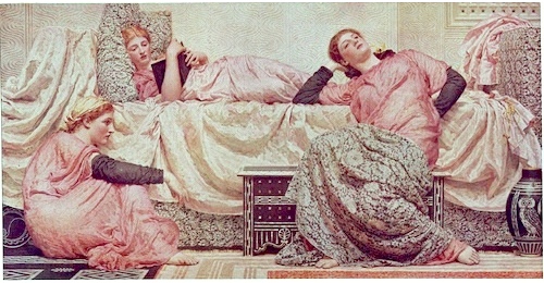
It is a fascinating conflict: I do think our lives would be hugely improved if more of the things around us showed evidence of good taste. Buildings, household appliances, packaging, signage, clothes, websites, books, posters, furniture… we are surrounded by things which are ugly or just mediocre. Which make our lives just slightly worse rather than better. But I also think that good taste is the great enemy of creativity and individuality, a stifling force that needs to be continually pushed back against. Especially since it is very difficult to separate an even somewhat objective idea of ‘good taste’ from simple social conformity.

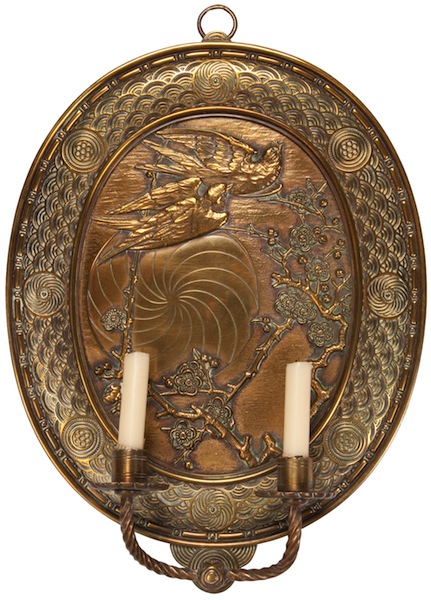
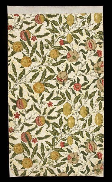
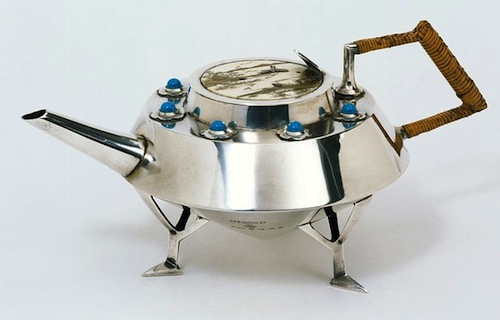
» The vase is designed by Walter Crane, the sideboard by E.W. Godwin, the sconce by Thomas Jekyll, the wallpaper by William Morris, and the teapot by Christopher Dresser. The two paintings are Arrangement in Grey and Black, No. 2: Portrait of Thomas Carlyle by Whistler, and Reading Aloud by Albert Joseph Moore.

Categories
Culture

‘Diaghilev and the Ballets Russes’ at the V&A

I went along to the Diaghilev exhibition at the V&A. He’s kind of an interesting figure to name an exhibition after, since he was an impresario, rather than an artist or designer, or even a composer or choreographer. But under his stewardship, the Ballets Russes really does seem to have been an extraordinary focal point for European culture. I’m a complete philistine about music and ballet, so none of the choreographers meant anything to me, and the only dancer I’d heard of was Nijinsky; but even I’ve heard of composers like Prokofiev, Satie and of course Stravinsky. And even I know that the first performance of The Rite of Spring is one of the significant cultural moments of the twentieth century.

And I’m slightly less of a philistine about art, so I’ve definitely heard of some of the people who designed sets and costumes for him: Pablo Picasso, Henri Matisse, Georges Braque, André Derain, Giorgio de Chirico, Natalia Goncharova, Coco Chanel. And apparently Joan Míro and Salvador Dalí as well, although neither of them featured in this exhibition. And that’s apart from some, like Léon Bakst, who are specifically known for their design work for the ballet. It is a hell of a list.

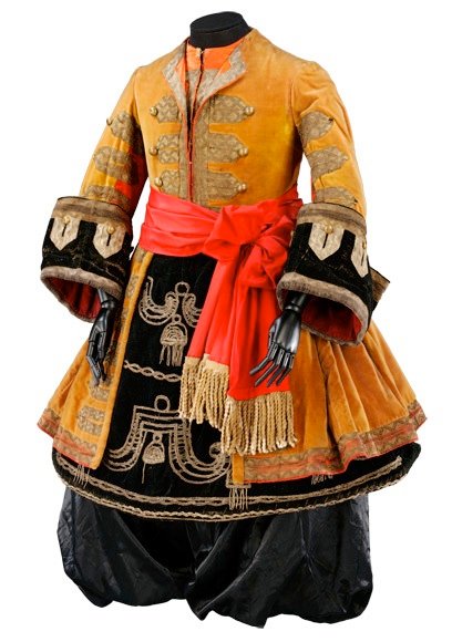
And it’s a fun exhibition: lots of cheery colours, and gorgeous costumes that have a battered glamour to them; and costume designs, which are often even more appealing than the costumes themselves. And the single largest item in the V&A collection: the back cloth for one of their ballets.

I also checked out the Raphael tapestries. Pope Leo X commissioned Raphael to design a set of tapestries with scenes from the lives of St Peter and St Paul, to hang in the Sistine Chapel, and one of the treasures of the V&A is the Raphael cartoons: i.e. the full size painted designs which the weavers worked from. To coincide with the current Pope visiting the UK, the Vatican has lent four of the actual tapestries to hang alongside the paintings for a bit.

And they’re quite interesting to see, although they have rather fallen victim to changing tastes. The Raphael cartoons have always been regarded as some of the most important bits of Renaissance art in Britain, but I don’t think I’m alone in finding them a bit unsympathetic. It’s not just the subject matter, although that doesn’t help; there’s something about these monumental groups of posed figures that is just a tiny bit, um, boring. Maybe it’s the self-conscious grandeur of them; these really are the Catholic equivalent of Socialist Realism. Then again, if Stalin had had people like Raphael and Michelangelo available, Socialist Realism might have been pretty fabulous.

» Top: costumes for female dancers in The Rite of Spring. Designed by Nikolai Roerich, 1913. Bottom: costume for a ‘Negro Lackey’ from The Sleeping Princess. Designed by Léon Bakst, 1921.

Categories
Culture

Physical tumbling

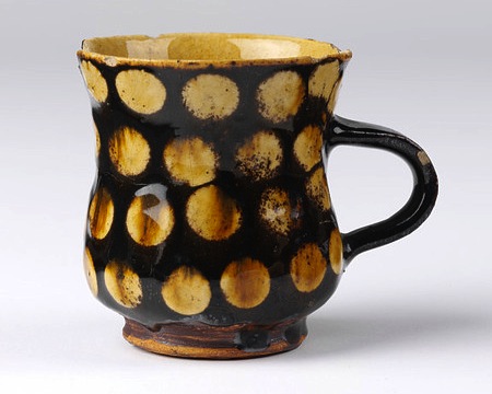
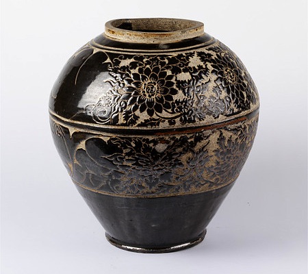
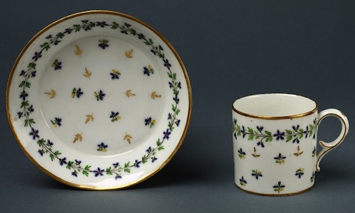
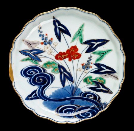
I went along to the V&A today to check out the second phase of their new ceramics display. The first phase was arranged by technique and theme; the new bit is by place and date. Some of the displays have helpful information, but much of it is effectively the collection being stored in plain view: all-glass cabinets with shelf after shelf of ceramics packed five or six objects deep.

It means that they’re not always as easy to see properly, and there’s no accompanying information, but it’s a way of making as much of the collection visible as possible: over 26,500 pieces in the new section, apparently.

I’ve actually spent a lot of time recently browsing the V&A’s collection online find things to post to A London Salmagundi. It was a healthy reminder that, although it’s marvellous that they are making such an effort to digitise their collections, and no matter how endlessly fascinating it is searching through museum collections online, there’s nothing quite like being close enough to appreciate the actual physicality of an object: the textures, the way it catches the light.

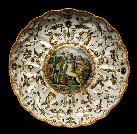
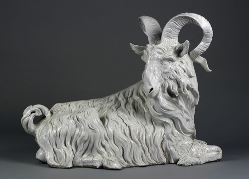
Or even more basic, the size. I posted this picture of a porcelain goat made by Meissen in 1732, and it’s a striking image; but nothing about that picture prepares you for the fact that it is over two foot long. Nearly life size — for rather a small goat, at least. Apparently it weighs 25kg.

Unfortunately the technology is not yet there for me to have a physical tumblelog. Although having an image blog is a kind of curation, I can’t, sadly, actually choose real objects and put them in front of my readers.

I suppose the closest I could come would be if the V&A gave me a long display case and the licence to roam the museum, picking out objects. Then I could put each new choice at one end of the case and shift all the rest a few inches further along; and as each one reached the other end, I would take it out and put it back where it belonged.

In fact, if anyone from the V&A is reading this: have your people call my people. Let’s see if we can work something out.

Categories
Culture

Exhibition roundup: Nash, quilts, Moore

Dulwich Picture Gallery currently has an exhibition of the English painter Paul Nash, best known I guess for his work as a war artist in both world wars. I know I first encountered him at school, when we were doing Wilfred Owen or Robert Graves or someone.

This exhibition did include some of that work, but also provided a bit of context for me. It was certainly interesting to see the kind of surrealist/symbolist paintings he did, often of the English landscape, when it wasn’t wartime. But it wasn’t really to my taste; it didn’t trigger that acquisitive urge. All else being equal, I am drawn to paintings which use strong, clear colours and sharply defined forms: Vermeer, El Greco, Matisse. Provençal Van Gogh rather than Flanders Van Gogh. Paul Nash is kind of the opposite: grey-brown tones and splodgy brushwork.

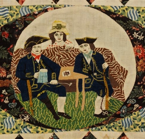
Meanwhile, the V&A has its first exhibition of British quilts, Quilts 1700-2010. I went to see it at an evening event in aid of Fine Cell Work, a charity that teaches prison inmates to do needlework as a rehabilitation exercise. There’s a quilt in the exhibition made by inmates with FCW; it is given context by a quilt made in a Japanese POW camp and one made by inmates on a prison ship who were being transported to Australia in 1841. Not surprisingly, the exhibition is keen to tease out this kind of social history from the quilts, but the other pleasure of it is just the extremely high quality of work on show. I’m fairly familiar with this stuff — my mother is a keen quilter — but they really have put together some great pieces.

The curator of the exhibition has managed to seriously annoy my mother by coming out with stuff like this in the Guardian:

Curator Sue Prichard thinks this enthusiasm is partly due to the global downturn. “I started on this project in 2004. Now there is a huge revival of interest in traditional crafts. There are a lot of women out there who are really keen to learn new skills and step away from their computer and their Blackberry.”

or in the Times:

Ms Pritchard said she hoped that the museum would inspire a revival of the craft through workshops that would teach people traditional techniques.

Because if there’s one traditional craft which didn’t need a revival, it’s quilting. That’s what appeals to me about quilting; it’s a genuinely living tradition, a vernacular art form which is thriving. It doesn’t need to be supported by government grants, it’s not the preserve of a handful of obsessive enthusiasts. Quilt shows are big business; indeed, the V&A’s exhibition is their most successful ever in terms of advance ticket sales. If there’s one criticism I have of the exhibition, it’s that it doesn’t give much sense of the liveliness of that current tradition. That gripe aside, it’s well worth visiting.

And finally Henry Moore at Tate Britain. Henry Moore was perhaps the biggest name in British art in the mid-C20th century, but he’s probably been rather out of fashion for a couple of decades, so it’s quite interesting to see this big show at the Tate.

Rather like the Paul Nash, I can’t say this particularly excited me, though it had its moments. Moore’s sculptures are often quite appealing as objects, with their curves, and the textural qualities of the materials; but it often feels like they are attractive in the same way as a weathered tree stump. Don’t get me wrong, I like a weathered tree stump as much as the next person, but I kind of feel that art could aim a bit higher than that.

The most interesting bits were probably the famous drawings of people sheltering in the Underground during the Blitz. Even though he makes the people look so much like his own sculptures, they have more impact than the sculptures themselves. They seem to hit a sweet spot between sculptural dignity and living humanity. There were some fine pictures of coal miners at work that managed the same trick.

Some of his post-War sculpture had some of the same human vulnerability and oddness, a bit of edge to it; but generally he seems to have reverted to weathered tree stump territory. Perhaps his greatest strength was a knack for producing sculptures that really worked as public art: large scale, impressive, and just about modern enough while unlikely to offend anyone.

Categories
Culture

Exhibition round-up

Sorry for the slight hiatus; it was a combination of the cricket and Dragon Quest: the Chapters of the Chosen. But there’s a pause in the cricket*, so I’ll just quickly round up a few of the things I’ve been to see recently.

Firstly, the big Baroque exhibition at the V&A, which I went to see a few weeks ago and actually closed yesterday. This is exactly the kind of exhibition that the V&A does a superb job with, and I was glad I went, but I couldn’t work up much enthusiasm for it because, well, it’s the Baroque. It’s the aesthetic of wealth and power, of an exquisitely crafted, gilded boot stamping on a human face forever. I didn’t warm to it.

There were interesting items and impressive ones, but not many were likeable; almost none triggered the acquisitive itch in me. The slight exception was actually a video reel of Baroque buildings. Craftsmen obviously struggled to capture the grandeur, ambition and megalomania of the Baroque in something like a  candlestick or a side-table — although it didn’t stop them trying — but if you’ve got a whole church to work with, or a palace or an opera house, you can produce something magnificent.

And I suppose you can argue that once you’ve got your church or your palace, you need some suitably pompous candlesticks and side-tables to match the decor. I still can’t get excited about going to look at them in a museum.

yogi

A more enjoyable exhibition was BM’s Garden and Cosmos: The Royal Paintings of Jodhpur. These are paintings that are in a style that I associate with Persian miniatures — and of course the Mughals were Persians, more or less — but on a much large scale.

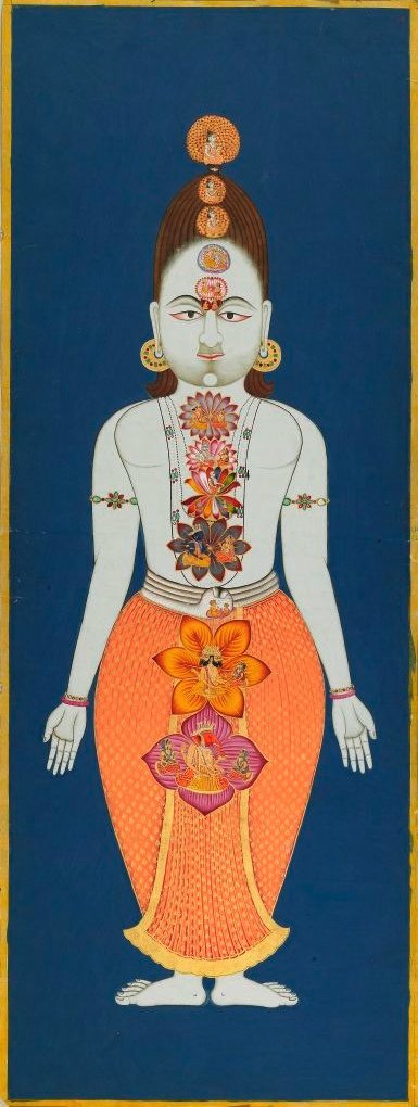
Different Maharajas commissioned different works. The exhibition starts with paintings of court life, mainly represented here as lounging around in the palace garden surrounded by scantily clad women. Then as, we move into scenes from Hindu mythology — some of them looking remarkably like the first paintings except with Shiva sitting in a garden instead of the Maharaja of Jodhpur, but others with more dramatic subjects from the Ramayana. And then it shifts into a more esoteric, mystical tradition within Hinduism, with paintings of the creation of the universe from nothingness, spiritual maps of the universe, symbolic maps of the human body with chakras and so on.

The pictures were attractive, never a bad thing, as well as being interesting. And the attempts to represent the unrepresentable were beautiful and more successful (whatever that means) than most Western equivalents I can think of.

I also went to the Royal Academy Summer Exhibition (“now in its 241st year!”). It’s always slightly more enjoyable than I expect; apart from anything else, it’s always interesting to go to an art exhibition where everything has a price marked on it. Vulgar of me, I know. But there’s just so much of it that you’re suffering from fried brain by two thirds of the way through.

And on the subject of art prices, check out this link: ‘If Famous Architecture Were Priced Like Paintings, a Le Corbusier Would Cost the Same as the Entire American GDP‘.

*after a heroic win for England at Lord’s, the first time we’ve beaten the Aussies there for 75 years. I could probably find quite a lot to say about the first two matches in the series — that 75-year losing streak is a fascinating subject in itself — but let’s stay on topic.

»The picture is Chakras of the Subtle Body, 1823, © Mehrangarh Museum Trust.