Categories
Culture

Watercolour at Tate Britain

I actually went to see this exhibition about a week or so ago, but I’ll just jot down some belated impressions. It is, as the title suggests, a historical survey of watercolour painting, from the medieval to the present.

There are only a handful of medieval pieces, bits of illuminated manuscript, which just serve as a reminder that, although they are not what we usually think of as ‘watercolour’, that is technically what they are.

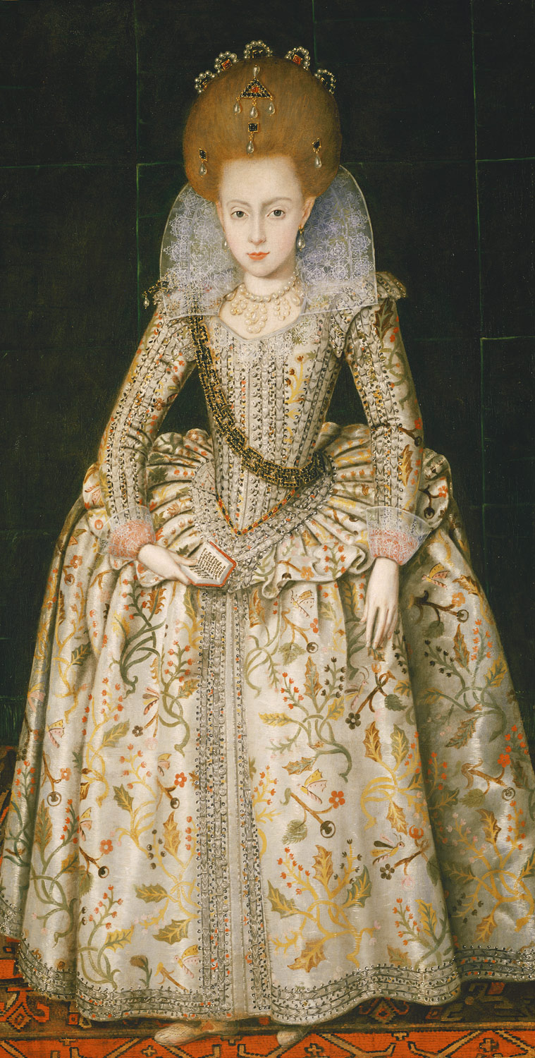
The exhibition makes the interesting point that originally watercolour was mainly seen as an adjunct to drawing: a work would be drawn in pencil or ink and then effectively coloured in, sometimes just with a few hint of colour to liven the drawing and sometimes in a more thorough way. So many of the early pieces are technical works of one kind or another: costume designs for Elizabethan masques, maps, plans of fortifications, as well as a few specific uses like portrait miniatures.

That technical aspect leads on to what is probably my favourite room of the exhibition, a room of scientific illustrations; especially botanical illustrations but also birds and mammals. Many of these were lent by the Natural History Museum or Kew, which is a clear sign that they were not originally created as Art, but they are gorgeous things. It even included some lovely C19th paintings of rock types — each one is a lump of rock on a plain white background, and they look like an elegantly minimalist conceptual art project.

After that we get into watercolour as an artistic medium in its own right. This includes plenty of ‘typical’ watercolours — landscapes, basically — but also a variety of paintings chosen at least partially to challenge that stereotype. So we have a room of war paintings, a room of ‘visionary’ paintings, a room of exhibition watercolours (i.e. large-scale C19th narrative paintings designed to compete with oil paintings for gravitas), and a room of contemporary work using watercolour.

My single biggest problem with the exhibition is that C19th British painting is not something I particularly enjoy. And that was the golden age of watercolour. So the aesthetic of the paintings was more off-putting than anything to do with watercolour as a medium. The exhibition watercolours seemed particularly pointless. I don’t like Victorian narrative painting and find the Pre-Raphaelites exceptionally noxious; seeing them painted in watercolour instead of oils didn’t make them any more likeable. Especially since there was no obvious attempt to make a virtue of the different medium: rather they seemed to be straining to make watercolours look as much like oil as possible.

And some of the paintings had clearly faded, which is the great technical problem of watercolour as a medium. There’s nothing much you can do about that, but it is a pity. There was a painting of some sun-drenched imperial outpost (Egypt? India?) which just didn’t look very hot, and I think it had probably faded a bit. So the shadows weren’t as dark, and the tones weren’t as warm.

As you can tell, I wasn’t blown away. But every room had something of interest and something covetable. And every so often there was a painting which was gorgeous and which could only have been done with watercolour: liquid and light and translucent. So it’s well worth a visit.

» The painting of the Lion-haired macaque, Macaca silenus, is by an unknown Chinese artist working for John Reeves, who employed locals to paint the specimens he was collecting while working in Canton from 1812-1831. That particular work is not in the Tate, though they do have a different monkey from the Reeves collection, lent by the NHM.

Categories
Culture

‘Rude Britannia’ at Tate Britain

I went along to Rude Britannia, the Tate’s exhibition of ‘British Comic Art’. Which was likeable enough, although much of the ground covered is pretty obvious: Hogarth, James Gillray, Thomas Rowlandson, Gerald Scarfe, Steve Bell, Spitting Image, Donald McGill, Viz. Bits of Punch, Aubrey Beardsley, Beryl Cook. There are also some pieces from the contemporary fine art world: the Chapman brothers, Sarah Lucas, Grayson Perry.

All of which is somewhat interesting and even sporadically amusing — although both 200-year-old social satire and wryly humorous conceptual art tend to be quiet-smile-funny rather than uncontrollable-belly-laughter-funny.

I suppose the suggestions is that there is some kind of overarching narrative about the British sense of humour or the British approach to art, but I’m not completely convinced. I guess if you were not British and were encountering all this material together for the first time, you would come away with a somewhat coherent overall impression: a kind of anarchic vulgarity which attempts to undermine anyone’s attempts at self-importance. Scatological humour and knob gags not just for their own sake but also because they are the enemy of dignity.

» Donald McGill, A Stick of Rock, Cock?
British Cartoon Archive, University of Kent
© Donald McGill Archive

Categories
Culture

Exhibition roundup: Nash, quilts, Moore

Dulwich Picture Gallery currently has an exhibition of the English painter Paul Nash, best known I guess for his work as a war artist in both world wars. I know I first encountered him at school, when we were doing Wilfred Owen or Robert Graves or someone.

This exhibition did include some of that work, but also provided a bit of context for me. It was certainly interesting to see the kind of surrealist/symbolist paintings he did, often of the English landscape, when it wasn’t wartime. But it wasn’t really to my taste; it didn’t trigger that acquisitive urge. All else being equal, I am drawn to paintings which use strong, clear colours and sharply defined forms: Vermeer, El Greco, Matisse. Provençal Van Gogh rather than Flanders Van Gogh. Paul Nash is kind of the opposite: grey-brown tones and splodgy brushwork.

Meanwhile, the V&A has its first exhibition of British quilts, Quilts 1700-2010. I went to see it at an evening event in aid of Fine Cell Work, a charity that teaches prison inmates to do needlework as a rehabilitation exercise. There’s a quilt in the exhibition made by inmates with FCW; it is given context by a quilt made in a Japanese POW camp and one made by inmates on a prison ship who were being transported to Australia in 1841. Not surprisingly, the exhibition is keen to tease out this kind of social history from the quilts, but the other pleasure of it is just the extremely high quality of work on show. I’m fairly familiar with this stuff — my mother is a keen quilter — but they really have put together some great pieces.

The curator of the exhibition has managed to seriously annoy my mother by coming out with stuff like this in the Guardian:

Curator Sue Prichard thinks this enthusiasm is partly due to the global downturn. “I started on this project in 2004. Now there is a huge revival of interest in traditional crafts. There are a lot of women out there who are really keen to learn new skills and step away from their computer and their Blackberry.”

or in the Times:

Ms Pritchard said she hoped that the museum would inspire a revival of the craft through workshops that would teach people traditional techniques.

Because if there’s one traditional craft which didn’t need a revival, it’s quilting. That’s what appeals to me about quilting; it’s a genuinely living tradition, a vernacular art form which is thriving. It doesn’t need to be supported by government grants, it’s not the preserve of a handful of obsessive enthusiasts. Quilt shows are big business; indeed, the V&A’s exhibition is their most successful ever in terms of advance ticket sales. If there’s one criticism I have of the exhibition, it’s that it doesn’t give much sense of the liveliness of that current tradition. That gripe aside, it’s well worth visiting.

And finally Henry Moore at Tate Britain. Henry Moore was perhaps the biggest name in British art in the mid-C20th century, but he’s probably been rather out of fashion for a couple of decades, so it’s quite interesting to see this big show at the Tate.

Rather like the Paul Nash, I can’t say this particularly excited me, though it had its moments. Moore’s sculptures are often quite appealing as objects, with their curves, and the textural qualities of the materials; but it often feels like they are attractive in the same way as a weathered tree stump. Don’t get me wrong, I like a weathered tree stump as much as the next person, but I kind of feel that art could aim a bit higher than that.

The most interesting bits were probably the famous drawings of people sheltering in the Underground during the Blitz. Even though he makes the people look so much like his own sculptures, they have more impact than the sculptures themselves. They seem to hit a sweet spot between sculptural dignity and living humanity. There were some fine pictures of coal miners at work that managed the same trick.

Some of his post-War sculpture had some of the same human vulnerability and oddness, a bit of edge to it; but generally he seems to have reverted to weathered tree stump territory. Perhaps his greatest strength was a knack for producing sculptures that really worked as public art: large scale, impressive, and just about modern enough while unlikely to offend anyone.

Categories
Culture

Chris Ofili at Tate Britain

Chris Ofili is a contemporary British artist who is, I suppose, best known for using balls of elephant dung in his paintings. Indeed I’ve been well-disposed towards Ofili for years, ever since The Daily Mail or some other self-consciously philistine rag decided to be terribly outraged when he was nominated for the Turner Prize. It’s always irritating when hard-nosed tabloid journalists pretend to have the delicate sensibilities of Victorian spinsters, but it particularly irritated me because actually elephant dung is really very innocuous stuff: I remember reading about palaeontologists in Africa having ‘snowball’ fights with elephant dung, which gives you an idea of how harmless it is. They eat lots of dry vegetable matter and it passes through them barely digested, emerging almost as tightly-bundled balls of hay.

In retrospect, this quibble about the particular characteristics of elephant dung was rather missing the point. Especially since when you look at the early paintings he clearly was being intentionally provocative; for example, one of the titles is 7 Bitches Tossing their Pussies Before the Divine Dung. And several works with ‘shit’ in the title, like the distinctly creepy little sculpted head, made with elephant dung, dreadlocks and human teeth, called Shithead. And the painting of the Virgin Mary surrounded by snippets cut from pornographic magazines. Indeed, if you’re an artist who wants to shock people the Daily Mail* provides a valuable service; it must be difficult to find anyone easily offended in the world of contemporary art.

Not that the dung is just there to wind people up; it’s also a symbol of Ofili’s African background. Apparently he started using elephant dung after a trip to Zimbabwe, along with a dot-painting style inspired by cave paintings in the Matobo hills. The style developed into elaborate paintings that combine paint with collage, sequins, resin in layer after layer, and the effect is both decorative and very visually engaging: there’s a lot to look at in these paintings. The major theme is, broadly, images of black identity: hip-hop and blaxploitation movies provide a lot of the visual cues. These paintings really are gorgeous as objects, which always helps.

Over time his paintings got less aggressively confrontational and more, um, spiritual, I guess. But he still kept developing that style, with the dots and the elephant dung and so on, in various different ways, until recently he clearly felt he had taken it as far as it could go, because his latest paintings are quite different, much more straightforward, painted with big sweeps of colour. I’m sorry to say I wasn’t really keen on these new works: they didn’t have the same visual impact and they just felt a bit insubstantial to me. But it will be interesting to see where he goes with them, because he’s a talented man.

* And, incidentally, Rudy Giuliani.

» The Adoration of Captain Shit and the Legend of the Black Stars 1998 © Chris Ofili. Courtesy Victoria Miro Gallery, London

Categories
Culture

Van Dyck at Tate Britain

I went to see the van Dyck exhibition at Tate Britain the other day. I can’t say I was very excited by the prospect, but I’m a member and it seems silly to miss exhibitions I can get into for free. Perhaps especially if you’re English, Anthony van Dyck seems like the most establishment figure possible; court painter to Charles I, and primarily associated with grand portraits of aristocrats, above all the famous propaganda images of Charles himself. Which was what I expected and what I got: the least introspective portraits imaginable. People in shiny clothes standing around looking solid and respectable. I bet if Bernie Madoff ever produced any publicity material with his picture in, he found a photographer to make him look like that: with a sheen of prosperity, but carefully not allowed to look too exciting. Designed to conceal as much as it showed.

My favourite picture was actually one by Robert Peake the Elder, included to show what English court portraiture was like before Van Dyck, which normally lives in the Met in New York.

Gorgeous, innit. I’m not suggesting, btw, that this painting offers any more psychological insight than van Dyck does, just that I prefer it stylistically. I also preferred some of the later picture influenced by van Dyck, including some by Joshua Reynolds and Peter Lely. Most of van Dyck’s own work left me cold, although his self-portrait and his portrait of his wife have a bit more spark to them.

Categories
Culture

Francis Bacon at Tate Britain

I went to see the Bacon exhibition at Tate Britain today. And I enjoyed it, if enjoyed is the right word for work which is quite so bleak. He was an atheist who made a habit of painting crucifixions; and without the theology, a crucifixion is just a man being tortured to death.

Study of a Baboon 1953

So there were lots of trapped, screaming, contorted and frequently eviscerated figures, brutally unflattering portraits, and distinctly unhealthy-looking flesh. Which makes the work sound like some kind of chaotic stream of consciousness, but actually it seems tightly controlled: figures isolated in large plains of colour.

» Study of a Baboon, 1953, © The Estate of Francis Bacon/DACS 2008. Digital image © 2008, The Museum of Modern Art, New York. James Thrall Soby Bequest, 1979. Taken from the exhibition website, which is excellent as usual at the Tate.