Categories
Other

iTunes 11 for Mac running at 100% CPU when just playing music

Just in case this saves anyone else a few minutes of boring googling: the solution was to log out of the iTunes store and log back in again.

Details:

iTunes on Mountain Lion was being very unresponsive and beachballing, despite not apparently doing anything except playing music, and Activity Monitor said it was using 100% of one of the CPUs.

The CPU activity would drop right down when I stopped the music and jump up again when I restarted it. After searching around on the Apple support forums, I saw the suggestion to log out of my iTunes Store account; it seemed unlikely to work, since I didn’t have the store open… but it did. And I was able to log in again without the problem returning (yet! *crosses fingers*). Hope this helps someone.

Categories
Other

Apple Maps update

I was pretty scathing about Apples new maps for a variety of reasons: business listings which were mispelled, years out of date or hundreds of metres from where they should be, building outlines that aren’t properly aligned with the street layout, and a whole lot of stuff which is just missing: not just shops but schools, post offices, churches, park names, art galleries.

But the thing I thought was completely unforgiveable was all the missing train and tube stations, including major London stations like Wimbledon and Tottenham Court Road. And there really were a lot of gaps; for example, of the four stations with Wimbledon in the name — Wimbledon, South Wimbledon, Wimbledon Park and Wimbledon Chase — three were absent.

Having complained about it, it seems only fair to report that the stations are reappearing! In fact I think all the ones I’ve checked are now back on the map. There are two things about that I find reassuring: that the maps are improving at all, but also, the fact that the stations seem to have been fixed before a lot of the other problems suggests that someone at Apple has the right priorities.

I think it’s quite interesting, incidentally, the way we’ve been spoiled by Google, to the point where I expect the map on my phone not just to have streets and train stations, but bars and restaurants and cinemas and so on. After all, I managed for most of my life with paper maps that marked none of that stuff — not least because they just didn’t have space for them, unlike zoomable electronic maps. It’s a mark of the scale Apple’s cock-up that they didn’t just fail in comparison to Google: their maps are often inferior to an old fashioned A-Z. Those maps wouldn’t have your local hairdresser, but they did usually have useful landmarks like schools, churches, hospitals, nature reserves and so on.

But the main thing is: Apple’s maps are still pretty feeble in this part of the world, but at least there are signs of improvement. Who knows, in a year they might be as useful as an A-Z, and in two years they might be as useful as Google.

Categories
Other

Bad Pharma by Ben Goldacre

Ben Goldacre’s previous book, Bad Science, was effectively an adaptation of his Guardian columns of the same name, and although it wasn’t a straightforward compilation, it had something of the same character: a bit of a grab-bag of subjects, held together by the broad theme of bad science and bad science journalism, with a emphasis on trying to entertain as well as inform.

This is a more focussed book. And a drier one, which you may or may not think is a good thing, depending on your tolerance for the occasionally clunky attempts at wackiness and humour that characterise a lot of popular science writing.

Personally I thought Bad Pharma did a good job of taking a potentially tough subject and presenting it in a clear, engaging way. It’s not, btw, a tough subject because it is full of difficult science or complicated statistics, but because it’s a book about institutional and bureaucratic failings within the healthcare industry. Institutional structures, bureaucracy, regulation, professional standards: this is not the sexiest subject matter. But Goldacre did a good job of convincing me that it was important enough that I should keep reading, and making it readable enough that I was able to do so.

The book follows all aspects of the life of a drug — the way it is developed, tested, licensed, marketed, prescribed — and talks through all the ways that biases get into the system and distort medical practice. There is plenty of evidence that these distortions make healthcare worse and more expensive; the only question is how badly. But the same processes that distort the science make it impossible to accurately judge the damage.

The pharmaceutical companies are the major villains of the piece, unsurprisingly; they are the ones doing badly designed trials, hiding the results of trials with flattering outcomes, paying academics to put their names to ghostwritten articles, and spending twice as much on marketing as they do on R&D. But as Goldacre points out, they are only able to get away with it because of repeated failures by everyone else involved: regulators, governments, journals, professional bodies, patient groups, and so on. All of whom have been at the very least complacent, and often suffer from deep conflicts of interest, since the drug companies seem to be the only people in the whole system who actually have a lot of money to throw around. So they spend a lot of money advertising in the medical journals, they donate money to patient groups, they sponsor conferences and training for doctors.

It’s a worrying book, which deserves to be widely read.

» Doctor Themed Cupcakes is © Clever Cupcakes and used under a CC attribution licence.

Categories
Other

Apple’s new maps: yes, they really are terrible.

I really use the maps on my phone a lot. I’ve found it to be the most surprisingly transformative aspect of having a smartphone: never feeling lost.

So I was slightly worried about Apple replacing Google’s maps in the new version of iOS, but I assumed they knew what they were doing. That it might not be perfect, but it would probably be good enough. So I updated the system.

Obviously the first thing you look at is your own street. And it was a bit disconcerting. The first thing I noticed was a ‘restaurant’ which was actually a food shop and has been out of business for perhaps seven years. There is also an antique shop which no longer exists, and a food shop marked as a petrol station. A car repair place is 250m from where it should be. Completely missing are two restaurants, a café/delicatessen, a clothes shop, a gift shop, a car repair place, a barbers and a post office. And the local primary school.

To be fair, there also four businesses listed correctly.

Now, I don’t actually need every little clothes shop marked on the map, and the data being a year or two out of date is not such a big deal, but still, that’s an awful lot of wrong in a small area. As a comparison, Google has all the businesses marked, up to date and in the right places.

And it’s not a fluke. For example, the ‘food shop marked as a petrol station’: that’s true all over London and seemingly the rest of the UK as well. Almost everything marked with a little petrol pump icon is actually a food shop — although I have also found oil companies, a wholesale kerosene supplier, and a nuclear fuels company. And it’s not just the icons which are wrong; a search for ‘petrol station’ or ‘gas station’ dutifully returns a list of local food shops:

If you’re wondering what real petrol stations are marked as, I checked a few nearby ones; one was marked as a mechanic, two were missing completely.

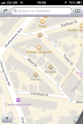
Irritating but not fatal is the fact that the outlines of buildings in Central London don’t align properly with the roads:
And my favourite find so far is something called the National History Museum in South Kensington.

However, I don’t use maps on the phone as a business directory, primarily. It would be helpful if things like petrol stations, post offices and ATMs were correctly marked, and it’s a step backward that they aren’t; but what really matters is whether I can use the maps for basic navigation. But there’s a bigger problem than a few missing businesses. I checked a few places I regularly visit. If you don’t know the area, it may not be obvious what’s wrong with this picture (apart from yet another corner shop marked as a petrol station):
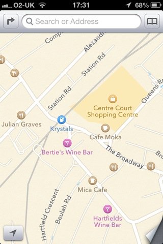
The clue is ‘Station Road’. Yup, that map is centred on Wimbledon station. There should be a National Rail station, a London Underground station and a tram station marked there — not that Apple’s maps give you any way to distinguish between train stations and tube stations.

Richmond rail and underground stations are also missing. So is Bookham station in Surrey. So is Lambeth North underground. And Notting Hill Gate. And West Dulwich.

I should emphasise: I haven’t done an exhaustive search of London’s transport network, I just checked a few places I happen to use fairly regularly. And without trying very hard I’ve found six missing stations.

A map having a bit less detail, or missing a few restaurants: that’s mildly annoying. Not being able to find petrol stations and post offices: genuinely inconvenient.  But a map with a significant percentage of train stations missing is severely broken. Broken enough that you can no longer rely on it for anything important.

I suppose I should just be grateful that the roads themselves seem to be mainly in the right places — but I suspect we mainly have Ordnance Survey to thank for that, after they released so much data under Creative Commons-type licensing.

Categories
Other

Opening Ceremony thoughts

I’ve worried openly about the chances of London putting on a good Opening Ceremony, so I guess I should post a reaction: it’s a thumbs up (phew!).

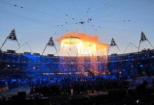
I thought the whole opening movement from bucolic hobbitshire through the Industrial Revolution to the forging of the Olympic Rings was superb: genuine spectacle and theatre. I loved the pouring of the iron sequence: you can imagine so many opening ceremonies where the commentator intones ‘and this represents the pouring of the iron from the furnace’ while dancers in orange jumpsuits run along in a line, but Danny Boyle managed to come up with a theatrical effect that genuinely looked like molten metal, without any need for interpretation.

The other stand out moment was the lighting of the flame, which was a really striking image.

In between there were inevitably a few lulls, but probably less than most of these events. There were some bits that were maybe a bit too parochial, but I guess if they play well at home and help whip up enthusiasm for the Games, that’s no bad thing.

I liked the fact that it felt quite personal and quirky: the content clearly hadn’t been handed down from on high by a government with a point to prove. And I liked that it was sometimes quite dark, as these things go: so the opening section was on one level a celebration of the Industrial Revolution, but it was harsh, grimy, smoky, and the image of the British countryside being torn apart was intentionally brutal. And when it came to celebrate children’s literature, it wasn’t Winnie the Pooh and Mrs Tiggywinkle, it was Voldemort and the Child Catcher. There can’t be many times that night terrors have featured in an opening ceremony.

Some moments of real theatre, some humour, some touching moments, very few boring or cringeworthy bits: wahey, let the Games begin.

» The photo (of the rehearsal, as it happens, not the actual ceremony), is © Hannah Webb and used under a CC by-nd licence.

Categories
Other

The Olympics is a delightful oasis of non-corporate sport

I’m not being sarcastic; well, not entirely.

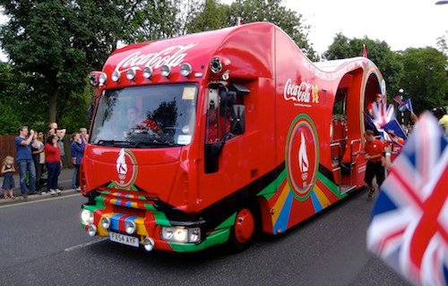
We’ve had months of angry coverage about the heavy-handed brand management put in place to appease the corporate sponsors of the Olympics: how ATMs at Olympic venues will only accept Visa, and McDonalds have an exclusive right to sell chips in the Olympic Park, and the torch relay is accompanied by a rolling advertisement for Coca-Cola, and you may be turned away from the events if you arrive wearing a T-shirt with a rival corporate logo.

So it’s worth pointing out that one reason they are so heavy-handed about asserting their branding rights is that there is no advertising in the venues themselves. When the sport finally starts, the athletes will not be competing in front of a backdrop of hundreds of corporate logos: just a lot of pink and blue London 2012 branding.

Which is a stark contrast to, say, Premier League football, where the players wear shirts with the team sponsor’s logo printed much bigger than the club badge, and the entire pitch is ringed by an enormous continuous pulsating distracting animated advertising billboard. Or Test cricket, which has advertisements spray-painted on the outfield, and all along the boundary rope, and the boundary boards, and the stumps, and the players’ bats, and the back of the umpires’ shirts, and the scoreboards, and where a 150-year-old cricket ground pisses on its own history by calling itself the Kia Oval.

I’m not necessarily suggesting that, if they were allowed to plaster the Olympic stadium with their own logos, so they knew they would be seen by the hundreds of millions of people watching on TV, the sponsors would relax their iron grip over every other aspect of Olympic branding. I’m sure they would like to have their cake and eat it. And it doesn’t justify the heavy-handed, joyless way their branding rights have been enforced.

But at least we should take a little pleasure in the fact that the winner’s podium is not going to have a Coke logo on it. The medal ribbons are not going to be Samsung-branded. There is not going to be a gigantic Procter & Gamble logo spray painted on the grass where the javelins land. Because if the Olympics was a normal modern sporting event, all that stuff would be true.

» ‘Olympic Torch Relay Day 64 Green Lanes 010‘ is © David Holt and used under a CC by-sa licence. The post-match interview is from an Indian Premier League cricket match. ‘Post match interview with AB De Villiers‘ is © Royal Challengers Bangalore and used under a CC by-nc-sa licence.