Categories
Other

Apple Maps update

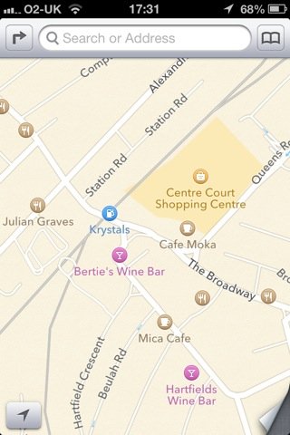
I was pretty scathing about Apples new maps for a variety of reasons: business listings which were mispelled, years out of date or hundreds of metres from where they should be, building outlines that aren’t properly aligned with the street layout, and a whole lot of stuff which is just missing: not just shops but schools, post offices, churches, park names, art galleries.

But the thing I thought was completely unforgiveable was all the missing train and tube stations, including major London stations like Wimbledon and Tottenham Court Road. And there really were a lot of gaps; for example, of the four stations with Wimbledon in the name — Wimbledon, South Wimbledon, Wimbledon Park and Wimbledon Chase — three were absent.

Having complained about it, it seems only fair to report that the stations are reappearing! In fact I think all the ones I’ve checked are now back on the map. There are two things about that I find reassuring: that the maps are improving at all, but also, the fact that the stations seem to have been fixed before a lot of the other problems suggests that someone at Apple has the right priorities.

I think it’s quite interesting, incidentally, the way we’ve been spoiled by Google, to the point where I expect the map on my phone not just to have streets and train stations, but bars and restaurants and cinemas and so on. After all, I managed for most of my life with paper maps that marked none of that stuff — not least because they just didn’t have space for them, unlike zoomable electronic maps. It’s a mark of the scale Apple’s cock-up that they didn’t just fail in comparison to Google: their maps are often inferior to an old fashioned A-Z. Those maps wouldn’t have your local hairdresser, but they did usually have useful landmarks like schools, churches, hospitals, nature reserves and so on.

But the main thing is: Apple’s maps are still pretty feeble in this part of the world, but at least there are signs of improvement. Who knows, in a year they might be as useful as an A-Z, and in two years they might be as useful as Google.
Categories
Other

Apple’s new maps: yes, they really are terrible.

I really use the maps on my phone a lot. I’ve found it to be the most surprisingly transformative aspect of having a smartphone: never feeling lost.

So I was slightly worried about Apple replacing Google’s maps in the new version of iOS, but I assumed they knew what they were doing. That it might not be perfect, but it would probably be good enough. So I updated the system.

Obviously the first thing you look at is your own street. And it was a bit disconcerting. The first thing I noticed was a ‘restaurant’ which was actually a food shop and has been out of business for perhaps seven years. There is also an antique shop which no longer exists, and a food shop marked as a petrol station. A car repair place is 250m from where it should be. Completely missing are two restaurants, a café/delicatessen, a clothes shop, a gift shop, a car repair place, a barbers and a post office. And the local primary school.

To be fair, there also four businesses listed correctly.

Now, I don’t actually need every little clothes shop marked on the map, and the data being a year or two out of date is not such a big deal, but still, that’s an awful lot of wrong in a small area. As a comparison, Google has all the businesses marked, up to date and in the right places.

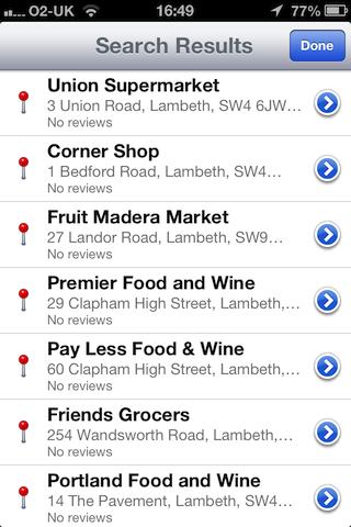
And it’s not a fluke. For example, the ‘food shop marked as a petrol station’: that’s true all over London and seemingly the rest of the UK as well. Almost everything marked with a little petrol pump icon is actually a food shop — although I have also found oil companies, a wholesale kerosene supplier, and a nuclear fuels company. And it’s not just the icons which are wrong; a search for ‘petrol station’ or ‘gas station’ dutifully returns a list of local food shops:

If you’re wondering what real petrol stations are marked as, I checked a few nearby ones; one was marked as a mechanic, two were missing completely.

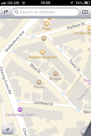
Irritating but not fatal is the fact that the outlines of buildings in Central London don’t align properly with the roads:

And my favourite find so far is something called the National History Museum in South Kensington.

However, I don’t use maps on the phone as a business directory, primarily. It would be helpful if things like petrol stations, post offices and ATMs were correctly marked, and it’s a step backward that they aren’t; but what really matters is whether I can use the maps for basic navigation. But there’s a bigger problem than a few missing businesses. I checked a few places I regularly visit. If you don’t know the area, it may not be obvious what’s wrong with this picture (apart from yet another corner shop marked as a petrol station):

The clue is ‘Station Road’. Yup, that map is centred on Wimbledon station. There should be a National Rail station, a London Underground station and a tram station marked there — not that Apple’s maps give you any way to distinguish between train stations and tube stations.

Richmond rail and underground stations are also missing. So is Bookham station in Surrey. So is Lambeth North underground. And Notting Hill Gate. And West Dulwich.

I should emphasise: I haven’t done an exhaustive search of London’s transport network, I just checked a few places I happen to use fairly regularly. And without trying very hard I’ve found six missing stations.

A map having a bit less detail, or missing a few restaurants: that’s mildly annoying. Not being able to find petrol stations and post offices: genuinely inconvenient.  But a map with a significant percentage of train stations missing is severely broken. Broken enough that you can no longer rely on it for anything important.

I suppose I should just be grateful that the roads themselves seem to be mainly in the right places — but I suspect we mainly have Ordnance Survey to thank for that, after they released so much data under Creative Commons-type licensing.

Categories
Other

Steve Jobs RIP

On the desk in front of me are a computer and an external hard drive for backup. The computer is a 24″ aluminium iMac from 2007, and the hard drive is a Western Digital My Book Pro from about the same time.

The iMac is 4 years old, so the novelty value has long worn off, but I still get a degree of satisfaction from looking at it: it’s an obviously high quality object, well-made and well-proportioned. The design, with the whole computer and screen suspended from an angled metal foot, might be precarious if it was done badly; but in fact it is solid as a rock, and the angle of the screen adjusts easily but stays where you put it. The Apple logo on the front is the same glossy black as the screen surround and contrasts with the soft, non-glossy brushed aluminium of the body.

The hard drive is designed in broadly the same style: it’s a plain metal box formed out of rounded rectangles, with a simple glowing blue ring on the front. But the metal doesn’t have the same quality of finish as the computer: it’s greyer and slightly shinier, and it’s held together by an ugly plastic rim that immediately makes the whole thing look cheap. And it’s flimsier, and it’s been manufactured via a cheaper process; I think the iMac was machined out of a block of aluminium, whereas the hard drive looks like it was made by bending sheets of metal into shape. And the logo etched onto the side is a bit ugly. And the grille on the top is cut with an odd pattern of square holes and slots which is presumably intended to be attractive but just looks like design for the sake of design. And having managed to find, download and install the right driver to make the button on the front work, it now communicates with me via an arbitrary and completely unintuitive system of flashing lights: if the light is going round in a circle, that means one thing; flashing means something else; a steady light means something different again. If I ever need to know what they mean, I look it up in the manual, then immediately forget again.

Don’t get me wrong, the Western Digital drive is entirely good enough for my purposes and I would cheerfully recommend it to a friend. And despite my nitpicking, it’s not a hideous object, it’s a normal-looking bit of consumer electronics. I’ve seen much worse. But when Apple made the iMac, they didn’t settle for ‘good enough’, ‘not hideous’ and ‘normal looking’. They made something excellent.

I know Steve Jobs didn’t personally design my iMac. The credit for that has to go to Jony Ive and his team. But Jony Ive was already at Apple before Jobs came back, and the company wasn’t winning any design awards. And I bet there are talented designers working at Samsung and Nokia and Sony and even Microsoft. But what Jobs did was create the environment where design is able to survive. He made sure that the good work of designers was not always being undermined by the pressure to ship products quicker, to make them cheaper, to include badly-executed features so you can list them on the box. I bet there are amazing, beautiful prototypes sitting in labs at HP and Sony and Samsung; but at Steve Jobs’s Apple they were still beautiful when they reached the customer.

William Morris said ‘Have nothing in your houses that you do not know to be useful or believe to be beautiful’. Under Jobs, Apple made products that were more beautiful — something that seemed to irritate a lot of technology people, who apparently regard the quest for beauty as suspicious and potentially subversive. But they also made products that were more useful, because Jobs understood that it doesn’t matter how many things a device can do; it only becomes more useful if you actually use it, and you only use it if it’s easy enough to use.

Categories
Me

Um, what?

Just got this text from O2, the company which provides both my mobile phone service and internet connection:

We’re happy to tell you that your tariff New Allowance will offer browsing as well as text at £15 starts on 09/04/2011.

I rely on this company for much of my ability to communicate with the world. The fact they can’t make their website run properly or compose intelligible automated messages to their customers: this does not inspire confidence.

Categories
Other

The iPhone, Top Trumps, and widescreen TV

The BBC’s tech blog has posted a piece about the new iPhone, and, inevitably, the comments are full of people whining about how the iPhone is rubbish because it lacks some feature that competing phones have, or has inferior specs, and that people only buy it because of they are stupid fashion victims. 

This comment provides a particularly classic example:

What about MMS support -sure no one really uses MMS, but it’s kind of a missing feature don’t you think?

I’m not sure that people outside the UK ever had the pleasure of playing ‘Top Trumps’. The way it worked was that you had a themed deck of cards, which might be cars or footballers or whatever. And each card was scored with various qualities:

from the Pointless Museum

You had to turn over your next card and try to win your opponent’s card by challenging him to beat a particular score. With this set, the Horror Top Trumps (which I remember playing at primary school, incidentally), the scores are out of 100, so it’s very obvious that if it’s your turn to play and you have Dracula, you should challenge on ‘Horror Rating’. The winner gets both cards and gets to play again. Naturally enough, different sets had different kinds of scores. I assume that for Prehistoric Monsters, older is better.

from the Pointless Museum

This was all good clean fun, but it wasn’t a very subtle or nuanced way of evaluating which prehistoric monster (or sports car, or footballer) was really ‘better’. And I can’t help feeling that all those BBC blog commenters are just playing technology Top Trumps.

The idea that a technology product is more than the sum of its features is not a new insight. I’m just one of the many people who have been banging on about it for years. But it’s always worth reiterating because  those who are most fascinated by technology, and are the most vociferous about it, are exactly the kind of people who don’t get it. They are, in fact, the kind of people who would probably rather enjoy playing Tech Specs Top Trumps.

I have a favourite new example of the distance between those technology enthusiasts and the bulk of the public. I watched the Champions’ League final in a pub in Wales. The football was on a nice big widescreen plasma TV, and the signal was coming from Sky, so I know it was being broadcast in widescreen — but the picture was distorted. Presumably, at some stage there had been something on TV which was in a 3:4 ratio and they had changed the TV settings so that the picture was stretched to fill the screen, and had never changed it back.

I tried to explain what was wrong and offered to fix it, but unsurprisingly the barman was reluctant to hand over the remote control to a random stranger just before the biggest match of the season started. So Wayne Rooney looked even shorter and squatter than usual, and the ball was oval.

In other words, they’ve spent many hundreds of pounds on a TV, and however much it costs to get a Sky subscription for a pub, and are using it to distort the picture and cut off the edges. Because they can’t tell the difference? Because they don’t care? Or the most worrying possibility: perhaps they think that’s what widescreen is — a normal picture, stretched a bit.

There are probably many many people, all around the country, doing the same thing: using their expensive new equipment to distort the TV they watch. And the biggest favour you could do those people is not to provide them with more features: it’s to make sure they can use the features they have. If that’s true for something as simple as a TV, it’s even more true for a sophisticated smartphone. Ease of use and good interface design are so much more important for most people than the sheer number of features.

Look, it’s a good thing that there are people who go over these kind of technical specifications with a fine tooth comb and compare products against each other. It’s a valid kind of critique and provides useful information. But brandishing these numbers as though they are irrefutably The Final Answer is like saying “obviously the woolly rhinoceros is better than the archaeopteryx, because it weighs more”.

» All the pictures are taken from The Pointless Museum.

Categories
Other

What I want to see at WWDC

WWDC, for those of you who don’t avidly follow Apple’s annual publicity cycle [for shame!], is the Worldwide Developer’s Conference. Which is being held next week in California.

Everyone’s expecting a new iPhone with slightly better specs, but I’m not quite geeky enough to get excited about wireless data standards. Obviously faster=better, but it’s not suddenly going to persuade me that I can afford to shell out £270 for a phone. What I think is potentially much more exciting is to see new iPhone app demonstrations. That has potential to have a real ooh factor.

What I would like to see is an Apple e-reader. I have become more and more convinced that sooner or later we will be doing much more of our reading on some kind of handheld device; much as I like books as physical objects, I have too many of them already. And it would be great to be able to take six or seven books on holiday with me — or just around town — without the bulk and weight of dead trees. And to be able to read newspapers and blogs on the tube.

This device doesn’t have to be made by Apple, of course, but I’d love to see what they could achieve if they tried. The only problem is that there isn’t even the hint of a smidgen of a whiff of it on any of the Apple gossip sites. And I suspect that the nice people at Apple have had their hands full recently with Leopard and the iPhone. 

» Transgenic Apple, posted to Flickr by dujarandille. I’s not actually transgenic, I don’t think, that’s just what the photographer has called it.