-
The moneyball approach applied to basketball, and the specific example of an unflashy but highly effective player. Interesting though I don't know enough about basketball to judge; the same analysis for soccer would be fascinating. via Daring Fireball, I think.
Tag: statistics
Links
-
The world’s first deep-sea webcam. I can see fish! Via Deep Sea News.
-
A statistical analysis of England’s batting wrt a lack of big centuries.
Lies, damn lies and religion
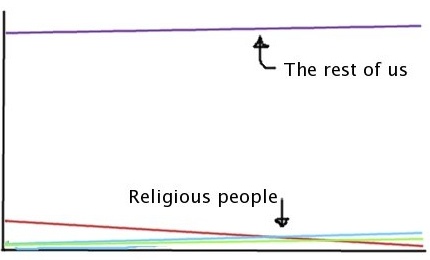
There’s an article in today’s Times about the rapid decline in church attendance in the UK. The particular angle they’ve chosen to take is that within a mere 30 years, the number of people going to mosque every weekend will outnumber those going to church. This is illustrated by a dramatic graph with the Christian line sweeping down at a vertiginous angle and crossing the lines for Muslims and Hindus, which are creeping up a bit slower at the bottom.*

Leaving aside the huge uncertainties involved in extrapolating the trends forward, I can’t help feeling that the graph is missing something important: a line for the vast majority of us who don’t go to any kind of religious service. If they had included us, and changed the scale of the y-axis to accommodate us, all the religious people would be squashed down into a very flat and unimpressive bit at the bottom of the chart.

Of course it’s an interesting and significant demographic shift if the number of churchgoers changes from about 8% to 1% in 45 years, as the graph suggests. But if you say instead that the number of people who don’t go to church/mosque/temple regularly is rising from 90% to 94%, it doesn’t seem quite so dramatic.
As regular readers will know, I’m not about to lose sleep over shrinking congregations; and I certainly don’t believe there’s some kind of essential connection between Britishness and Christianity. But I was mainly annoyed by the use of statistics.
*The graph isn’t available online or I’d link to it. The Times’s consistent habit of having less in the way of pictures and graphics online than in the dead tree edition always seems to be completely missing the point, to me, but hey-ho.
Rain, rain, go away
We’re currently having a ‘drought‘ in the south-east of England, despite the fact that it’s been raining for the past week. The argument is that a few days of rain don’t compensate for the past year which has been unusually dry, although it seems pretty clear that if the water companies were better at maintaining their infrastructure there wouldn’t be a problem.
Anyway, a meteorologist has taken a close look at the water companies’ statistical claims and shows that they are selective to the point of being misleading. That’s not terribly surprising in itself, but I found the specifics interesting.
It’s nice to see an attempt in the media to actually look at some statistics and explain what’s wrong with them.