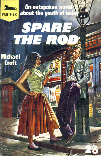
Flickr set of the week is sleazy reads by trevira. I particularly love the tagline on the second one.

Flickr set of the week is sleazy reads by trevira. I particularly love the tagline on the second one.

Core77’s design blog led me to this article about form vs. function in mobile phone design. The title of the article says it all: Is the ‘dumb blonde’ phone here to stay?
In this context, a ‘dumb blonde’ phone is one which looks pretty but lacks functionality. I can understand why someone thought that was a good gag, but it completely misses the point. It assumes that people actually want all the added functionality of web-browsing, email, multimegapixel cameras, Bluetooth, music playback and God knows what else; that they’ve sacrificed something by choosing a stylish phone instead. But perhaps they haven’t. Perhaps they just want to make phone calls and send texts. Here’s a paragraph whose stupidity makes it worth quoting in full:
Andrew Brown, IDC’s European mobile devices programme manager, said the operators and manufacturers have played their part in the dumbing down. “Everyone gets very excited about aesthetics. It’s easier to sell design than it is to sell feature functionality – it’s laziness.” Good looks are immediately apparent to the average buyer – the benefits of having 3G connectivity or a smart operating system are not.
Which inevitably reminds me of the equally stupid quote from Sim Wong Hoo I blogged about earlier. Sim, as the CEO of Creative, was completely failing to learn the obvious lesson about iPod thrashing his products in the marketplace. The same lessons apply to mobile phones.
Here’s the first point: to choose a simple, attractive phone over an ugly but hi-tech one is not an irrational choice. It seems like such an obvious point that I can’t quite believe I have to explicitly say it, but I suspect I do. There’s a bizarre prejudice against aesthetics in the tech community, as though the pleasure in using an object you actually like is somehow an illusion, a deceit, and something of no value. Now if that’s how you feel, then fair enough. Good luck to you. Go and buy the most function-filled gadget, or the one which gives you most oomph per dollar, and ignore design issues completely. But if you want to sell gadgets to the non-geek community, you have to learn that people like to own nice things.
We’re not talking about a once-in-a-lifetime purchase: a mobile phone costs about as much as a handbag. Why on earth shouldn’t it be a fashion item?
Here’s the second bizarre prejudice: that added functionality adds value. This is the mentality that produced the much-mocked ballpoint pen with clock that used to be a staple of Innovations catalogues. Functionality you don’t want doesn’t add value, it reduces it. Even if it doesn’t interfere with the main function of an object, it makes it more complicated, which is a Bad Thing. I only use my mobile for phone calls and texting; so for me, all the other menu options are just unnecessary rubbish I have to scroll past to find what I want. By all means make a Swiss Army Knife phone with a tool for getting the stones out of horses hooves; just don’t expect me to buy one.
But the real problem, the one that underlies the others, is a belief that design is something you put on at the end, a lick of paint to pull in the stupid, style-obsessed consumer who somehow doesn’t appreciate the wonderful functionality you’re giving them. But design, properly, is not superficial. It deals with every aspect of the user’s experience of the product, down to the number of button-presses to perform an action and the obviousness or otherwise of how to do it. If a product is badly designed (or just as likely, not really designed at all), if it doesn’t try to make it easy for the user, then it’s a bad product, however many features it has.
My father has a PVR/DVD recorder that makes the perfect case study. When he got it a couple of years ago, it was the bleeding edge of the technology. And to be fair, it has proved itself to be a brilliant step forward from the VCR – no more scrabbling around for blank tapes, no difficulty trying to find what you recorded earlier. The basic concept of recording TV on a hard drive is superb. But despite that, I’ve come to actively dislike it. Because it was obviously put together by people who put all their effort into providing a certain set of features none of it into the user experience.
First example: pretty much everything you would need to do with the machine can be done, as you’d expect, by pressing buttons on the remote and using onscreen menus. But if you want to stop a timer recording, you have to press the stop button on the front of the machine twice. That’s completely unguessable, and easily improved upon; when someone presses ‘stop’ on the remote, just give them an ‘are you sure?’ message. Second example: despite the fact that even slightly complicated functions are managed through onscreen interfaces, the remote has 76 buttons. I don’t know what the right number is, but I’m damn sure it’s less than that. It also came with three separate manuals — an outline of the basic functions, a hideously complicated full manual that explained every possible function badly, and something in-between because, presumably, they realised the other two were both crap.
I’m conflating two meanings of ‘design’ here, attractiveness and usability, and of course they aren’t the same thing. Indeed, products often sacrifice usability for aesthetic appeal. What they have in common, though, is that they both make the product more likeable. They give pleasure. But pleasure is intangible and unmeasurable, so it’s all too easy for people to undervalue it, or just to pay lip-service to it. Because the thing is – good design is hard. It takes a lot of time, effort and commitment, an endless appetite for details and a deeply stubborn perfectionism. A company is never going to get it right if, deep down, they think of design as superficial.
Which isn’t actually going to happen. I was working on a new look for the blog a while ago, but came to the conclusion it was going to be just too memory-intensive. It’s heavy on the graphics, and because it uses lots of sharp-edged high-contrast shapes, you can’t compress the images very much without getting lots of glitching.
Anyway, I thought I’d produce a mock up to show you. If I’d worked it up into a full WordPress theme, I daresay I would have tweaked various things, not least the text styling. But it’ll give you the idea. I’ve done it as a PDF, although I don’t know why really.
I was looking for an internet copy of Thomas Chippendale’s The Gentleman and Cabinet-Maker’s Director (which is a large collection of the most elegant and useful designs of household furniture in the Gothic, Chinese and modern taste) and found the University of Wisconsin’s Digital Library for the Decorative Arts and Material Culture. Not only does it have complete scans of the Chippendale, it also has Owen Jones’s The Grammar of Ornament, and lots of similar stuff like Temple of Flora, or, Garden of the botanist, poet, painter, and philosopher, The City and Country Builder’s and Workman’s Treasury of Designs, or, The art of drawing and working the ornamental parts of architecture, and A New Treatise on Flower Painting, or, Every lady her own drawing master: containing familiar and easy instructions for acquiring a perfect knowledge of drawing flowers with accuracy and taste: Also complete directions for producing the various tints.
And while I’m posting links to that kind of thing, I can’t resist adding one to Ernst Haeckel’s Kunstformen der Natur.
I went to see the Modernism: Designing a New World exhibition at the V&A, which was good. It was largely what you’d expect – white houses, angular furniture and posters with large sans serif headers printed at an angle – although there were some treats and surprises, like a Tatra T-87 saloon car.

Looking at the best of the modernist buildings, like the Villa Savoye and thinking of all those lumpen, red-brick, pitched-roofed houses that the British construction industry threw up over the course of the C20th, you can’t help feeling that our suburbs might be less ugly if we’d embraced modernism a bit more. Of course no style or philosophy is a substitute for a good architect. An industry that cares so little about aesthetics and design would only produce equally lumpen, graceless buildings in white-rendered concrete.
Incidentally, note that many of the most successful modernist dwellings seemed to be (like the Villa Savoye), stand-alone houses set in the country, where the trees provide a soft green background to the starkness of the design and the sweeping picture windows can look out over beautiful views. The large scale housing projects – and there were plenty of those in the exhibition as well – struggle to have the same impact. With rows of separate buildings, the effect can be rather a lot of visual clutter; perhaps because Modernism eschews decoration, so the aesthetic effects are achieved with structural elements – i.e. the shapes of the buildings. Or something. I haven’t really thought that through yet.
One of the odd things about the exhibition was that it was a constant stream of utopian, reformist ideals, but in the back of your mind was that the period it dealt with was bookended by the Great War and the Russian Revolution at one end and World War Two at the other, with the Depression and the growth of Fascism in the meantime. And yet somehow, all these idealists who were trying to change the world by giving the working man an efficient living space with Licht, Luft und Sonne seem to fit quite well into that kind of background. The wish to change the world by throwing out everything old and rebuilding it from scratch, to draw a line under ten centuries of European history and say “we can do better than that” has its echoes in the politics. Of course revolutionary Russia was one of the centres of early Modernist design.
And while I’m sure they wanted nothing but to make people’s lives better, the rhetoric – of the house as a ‘machine for living’, of progress, efficiency, mass-production – can be rather dehumanising. It reeks of top-down planning. And then there’s all the stuff about ‘hygienic’ living, with its celebration of cleanliness and the body. There’s a section about it in the exhibition, including some film of the ‘Sokol Slets’ – massed displays of gymnastics in Czechoslovakia which look like something Reni Liefenstahl would have dreamt up after eating too much cheese.

‘Performance of 16 800 women at the 1938 Sokol Slet. Strahov Stadium, Prague.’
Despite all the dubious parallels I’m drawing, it’s worth pointing out that both Hitler and Stalin disliked Modernism. Their idea of a good building was one smothered in heavy-handed political symbolism. And although some of the architects and designers were quite political (mostly leftists of various kinds, but some of the Italian Futurists were Fascist sympathisers, apparently), I’m not suggesting that any of that is terribly relevant to the actual buildings. I’m just drawing connections because I think it’s interesting.
both from wmmna: