Categories
Culture

Renaissance Faces at the National Gallery

Renaissance Faces: Van Eyck to Titian is an exhibition that does exactly what the title the suggests: it’s a selection of portraits by van Eyck, Titian, Raphael, Holbein, Botticelli, Dürer, Cranach and their contemporaries. Room after room of rather solemn looking people — no smiling for portraits back then — wearing their most expensive-looking velvets and furs and damasks. So if that’s the kind of thing you like, and on the whole I do, you’d probably like this show.
About half the pictures are from the National’s permanent collection, which sometimes seems a little bit like cheating; but there are some very good paintings they’ve borrowed from elsewhere, it’s interesting to see them all together, and it’s not actually a chore to have another look at van Eyck’s Arnolfini portrait, or the Bellini portrait of the Doge, or Holbein’s Lady with a Squirrel and a Starling.
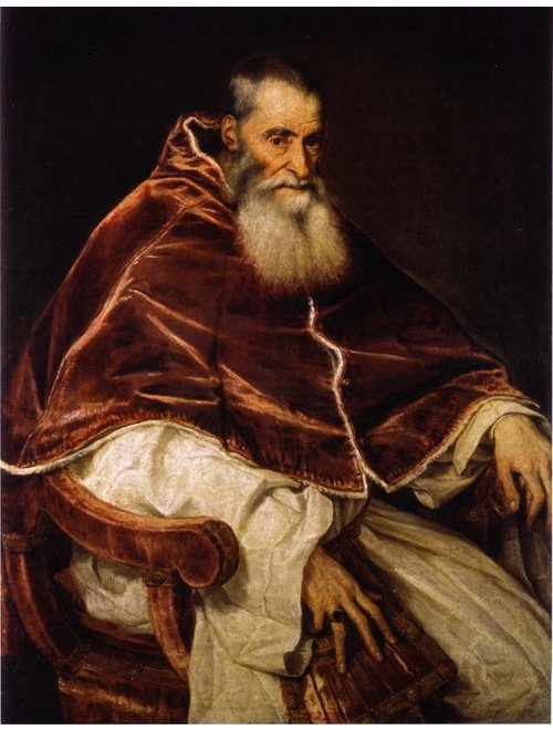
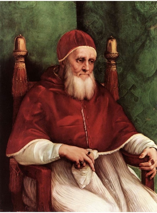
For me the finest picture in the exhibition is the Titian portrait of Pope Paul III which normally lives in Naples. It really is one of those works which seems transcendent even by the standards of a great artist. The Pope sits there, engulfed in these huge robes, looking physically old but sharp-eyed and full of power. And they have it hanging next to the portrait of Pope Julius II by Raphael from their permanent collection, painted fifty years earlier and an important influence for Titian’s portrait. They are both marvellous paintings and they make a fascinating contrast, stylistically and psychologically.

» The Raphael is the one at the top.
Categories
Culture

Flemish paintings at the Queen’s Gallery

I went yesterday to see Bruegel to Rubens — Masters of Flemish Painting at the Queen’s Gallery, Buckingham Palace. I wasn’t really sure what to expect; you have to love Bruegel, but I’ve always found Rubens easier to admire than to enjoy.

It turned out to be just the one Bruegel on show, with seven or eight paintings by Rubens and a variety of other artists: Teniers, van Dyck, Memling and so on. Or to be strictly accurate, only one painting by Pieter Bruegel the Elder; there are a couple by Jan Brueghel the Elder as well. You can see all the paintings on the exhibition website I linked to above.

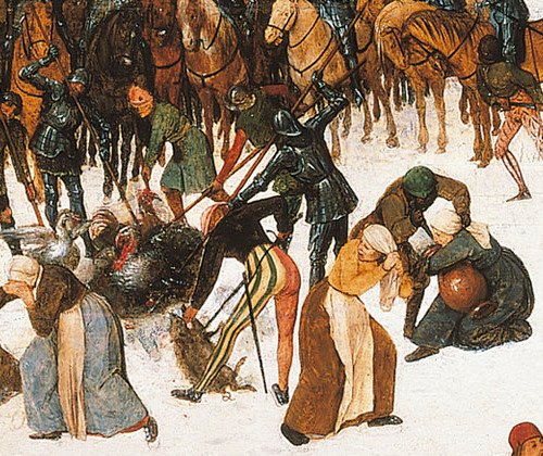
The Bruegel, Massacre of the Innocents, is a hell of a painting. The biblical story of the massacre ordered by Herod has been painted as set in a Flemish village, with the troops in Spanish costume, making it highly topical, apparently, because the Holy Roman Empire had been cracking down on the Netherlands in brutal fashion. The painting was then acquired by Emperor Rudolph II, who presumably for political reasons had the painting edited: all the massacred babies have been painted over to make the scene one of generic plunder.

So wherever you see a soldier slaughtering an animal, or a woman trying to hold on to a storage jar or a bundle of rags, you know that there was originally an infant. In some places, as in the detail above, you can almost make out what it originally looked like.

It really is one of those occasions when reality seems to be demanding to be used as a metaphor for something, but I shall resist.

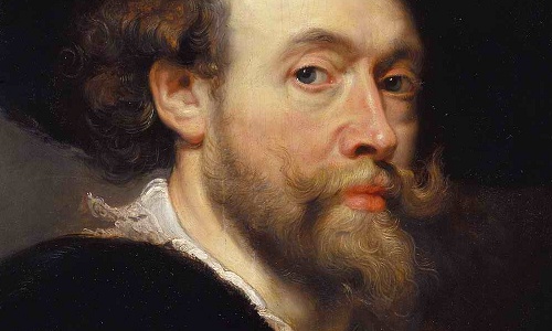
The exhibition didn’t persuade me to love Rubens, or at least, not his mythological works or landscapes (though the painting Winter: The interior of a barn pleased me more than most). There were, though, two Rubens portraits which were really fabulous, particularly his self-portrait. Apparently an English nobleman bought a painting from Rubens, and Rubens, not knowing that it was actually intended for the king, fobbed him off with a mediocre work that was mainly painted by his workshop. The self-portrait was the piece he sent to the king as an apology.

It really is a gorgeous piece of work. It doesn’t make me like all those big pink women any more, but this painting at least is very very covetable.

» I got the pictures from this article about the exhibition. The Royal Collection’s website for the show is very good: all the paintings, I think, with commentary, so do check it out.

Categories
Culture

Francis Bacon at Tate Britain

I went to see the Bacon exhibition at Tate Britain today. And I enjoyed it, if enjoyed is the right word for work which is quite so bleak. He was an atheist who made a habit of painting crucifixions; and without the theology, a crucifixion is just a man being tortured to death.

Study of a Baboon 1953

So there were lots of trapped, screaming, contorted and frequently eviscerated figures, brutally unflattering portraits, and distinctly unhealthy-looking flesh. Which makes the work sound like some kind of chaotic stream of consciousness, but actually it seems tightly controlled: figures isolated in large plains of colour.

» Study of a Baboon, 1953, © The Estate of Francis Bacon/DACS 2008. Digital image © 2008, The Museum of Modern Art, New York. James Thrall Soby Bequest, 1979. Taken from the exhibition website, which is excellent as usual at the Tate.

Categories
Culture

Rothko at Tate Modern

I went to the Rothko exhibition at Tate Modern today. The show is of his ‘late series’: the centrepiece is the Seagram Murals (i.e. the group of dark Rothkos which have been in the Tate for years, plus some related works that normally live in Japan), but there are also some other groups of works (the ‘Black-Form’, ‘Brown and Grey’ and ‘Black on Gray’ paintings) as well as related odds and ends.

'Red on Maroon Mural', Mark Rothko, Tate

It’s quite suggestive, I think, that the Seagram murals were commissioned for the Four Seasons restaurant in the new Seagram building in New York, and that they ‘never reached their original destination, after Rothko decided that a private dining room was an unsuitable environment to experience his paintings.’ Because with these big colour-field paintings there is always going to be a delicate path to tread between art and interior design. And indeed you can see why the restaurant might have wanted them: they would have added a touch of modernity and sophistication without actually challenging the air of hushed pomposity which is so important to an expensive restaurant.

But although they could serve as interior design, they are certainly more than that. They are seductive pieces, and they do reward patient contemplation. Partially that’s because they are much more carefully made than the simplest description of them might suggest: a painting may be, in the most reductive terms, a big maroon blob on a red background, but they have more presence than that. Apparently he painted them with many many layers of very thin paint, and they remind me slightly of fine Japanese lacquer; the way a plain red and black rice bowl can be a deeply desirable object because of the texture and way the light falls on it.

And despite what I said in my last post, and despite the funereal colour-schemes, they aren’t gloomy. They are whatever the antithesis of frivolous is — suolovirf — but half an hour spent in their company was restful rather than depressing. They are beautiful things: big, but subtle in their colours and textures.

Or at least the Seagram murals are; some of the others were less exciting, most notably the ‘Black on Gray’ works, all divided into an area of black at the top and pale grey below. Those ones managed to be exactly as boring as the description suggests.

» The painting is ‘Red on Maroon Mural’, from the Tate. I’ve taken it from the exhibition website, which as usual with the Tate, is very good, so do go and take a look.

Categories
Culture

Hadrian at the British Museum

Today I went to the BM’s exhibition about famous wall-builder Hadrian. Its not just the wall, though; he also built the Pantheon, as well as a staggering villa complex at Tivoli. He inherited the Roman Empire from Trajan when it was at its biggest and actually reduced its size slightly, abandoning some of the less manageable extremities and consolidating the borders. In fact, topically enough, on gaining power he quickly made the decision to withdraw the troops from Iraq.

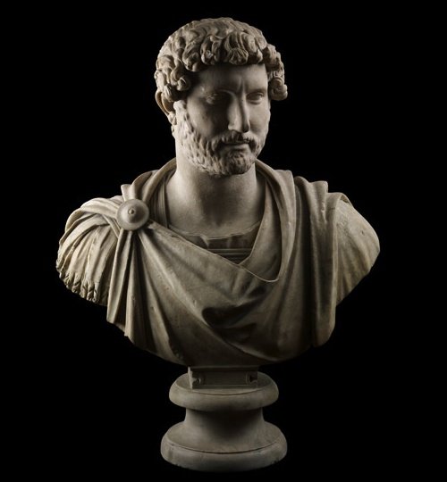
I enjoyed the exhibition (pricey, though: £12 seems a lot to me), although the Romans make for pretty familiar subject matter: portrait busts, marble columns and memorial inscriptions. And in the specific case of Hadrian, I’ve been to the Pantheon and the villa at Tivoli, and I’ve read Marguerite Yourcenar’s novel, Memoirs of Hadrian, so this wasn’t one of those exhibitions which completely opened my eyes to a new subject. Still, the quality of objects on display was high, and I learnt a few interesting snippets along the way, like the fact that Hadrian had a distinctive crease in his earlobe, visible on the portrait busts, which is an indicator of heart disease.

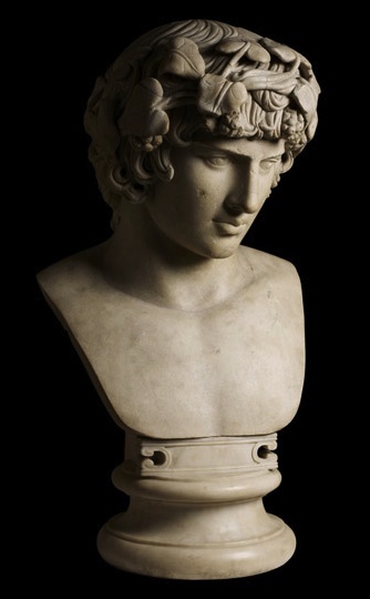
I suppose the other thing that’s most famous about Hadrian is the fact that when his (male) lover Antinous drowned in the Nile, he founded a city named after him, Antinopolis, and encouraged the cult of Antinous which treated Antinous as a deity associated in some way with Osiris, the Egyptian god who was in charge of flooding the Nile. The homosexual relationship itself was apparently not unusual, but the very public grief and memorialising of it was. Because of the cult, there are many surviving statues of Antinous, and they have some fabulous examples in the exhibition.

The section about Antinous mentioned in passing that in Egypt at the time, the cult of Antinous was ‘in competition with Christianity’, which made me wonder how different the world would be if he’d been more popular than Jesus.

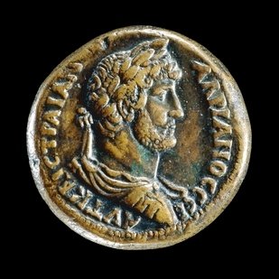
» The exhibition website doesn’t have much in the way of pictures (though there are some videos, which I haven’t looked at), but all these photos are part of the BM’s permanent collection, and are taken from their website. The coin showing Hadrian’s head is from Alexandria; the busts are Hadrian and Antinous.

Categories
Culture

Divisionist Painters at the National Gallery

Radical Light: Italy’s Divisionist Painters 1891-1910, to give the exhibition its full title. Divisionism is a style of painting where the image is built up of lots of individual brushstrokes of pure colour which, ideally, merge together for the viewer but create a more luminous effect than if the colours were blended on the palette.

Angelo Morbelli, 'In the Rice Fields', 1898-1901, © the owner

If that sounds familiar, it’s because it’s Pointillism under a different name. Apparently the Divisionists had heard about Pointillism and were inspired by it but hadn’t actually seen the paintings; they generally use long thin brushstrokes rather than the little dabs favoured by Seurat, but the principle is the same. Divisionism was also apprently an important stepping stone towards Futurism, the rather more famous Italian art movement.
 
I didn’t have very high expectations — I think obscure artistic movements are often obscure for a reason, I don’t like Seurat that much, and it got a bad review in Time Out — but, perhaps because of that, I enjoyed it. Some of the symbolist and political stuff had aged badly, but there were some really very likeable landscapes. Since the optical effect which is the whole point of Divisionism is destroyed by reproducing them as little jpegs, the pictures on the website don’t do them justice, but hey-ho.

» The picture above, taken from the exhibition website, is Angelo Morbelli’s ‘In the Rice Fields’, 1898-1901, © the owner