Categories
Culture

‘Alexander Rodchenko’ & ‘Laughing in a Foreign Language’ at the Hayward

I went to the Hayward today to see an exhibition of the photography of Alexander Rodchenko; the price of the ticket included entry to a show called ‘Laughing in a Foreign Language’, a exhibition which “investigates the whole spectrum of humour, from jokes, gags and slapstick to irony, wit and satire.”

It was a pleasure to go to an exhibition of contemporary art and find that the gallery was filled with the sound of joyful laughter.

No, not really. The humour on display was not generally of the kind that would win the artist a long engagement at the Glasgow Empire. Which is fine; work can be gently humorous or ironic or whatever without being laugh-out-loud funny. But for an exhibition themed around humour, it was a curiously deadening event.

Perhaps something like the Glasgow Empire would be a salutary experience for a lot of contemporary artists: having to cope with failing miserably and visibly in front of a sceptical audience. Perhaps then they would tighten up some of their work so it was a bit more punchy. Can there really be many 30 minute video works that couldn’t be cut down to 20 minutes?

Lili Brik

I preferred the Rodchenko exhibition. Rodchenko was a photographer/graphic designer in the USSR in the 20s and 30s; I didn’t know a great deal about him beyond what was featured in the recent BBC history of photography. As far as I can see his most remarkable work was in publications like [I may have the title slightly wrong] The USSR in Construction which combine his photography with typography, photomontage and graphic design to produce something really incredible.

But that aesthetic rapidly fell out of favour with the government, who liked to micromanage all aspects of culture; Rodchenko was accused of ‘Formalism’ and had to find less radical outlets for his creativity. So he switched to a more straightforward kind of reportage. Perhaps most intriguing now are the most Soviet subjects, like the May Day parades and athletic demonstrations.

One aspect of the Rodchenko exhibition which I found interesting was the prints, which had quite a limited tonal range; I know I’ve seen more vibrant versions of the same pictures before. I guess the difference is down to the technological limitations of the older printing process—generally silver gelatine prints—rather than anything else, but it’s an intriguing curatorial question: do you present someone’s work as they produced it, or how you think they would have produced it given the chance? I suppose in a gallery authenticity trumps other considerations so you just post the originals.

Categories
Culture Me Other

The Thames path, Isle of Dogs to London Bridge

I picked up the Thames path where I left off, in Greenwich, and crossed straight under the river to the Isle of Dogs. The Greenwich foot tunnel itself is kind of freaky; I’m not normally susceptible to claustrophobia, but I got a definite twinge here. I took the stairs down, which made me conscious of how deep underground it was; and then the tunnel is quite narrow, and feels surprisingly long. And if you start thinking too much about the mass of the Thames sitting above you…

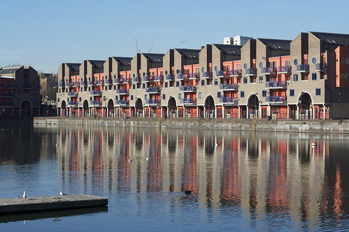
Anyway, the Idle of Dogs [sorry, that’s a typo, but it would make a good title for something, don’t you think?]. I mentioned that during the last section there were occasional outcrops of upmarket apartment blocks among the industrial landscape. As far as you can tell from the Thames path, on the Isle of Dogs that process is now complete. The riverfront is almost completely residential for this section of the walk. And the exceptions are offices rather than industry. It’s a dramatic change, since this was once one of the greatest trading centres in the world. The docks are still there, huge stretches of water now serving as watersport centres, or marinas, or just gigantic decorative water features; and many of the wharves and factories have been adapted into apartments and offices. But it’s remarkable how little these physical traces of the past give any sense of what it must have been like. In the absence of noise and smell and dirt, with no real traffic on the river, the old hoists that have been left on the sides of converted warehouses just seem like some peculiar local architectural vernacular: steampunk genteel.

river front

The buildings I found most attractive were those which seemed to have an intimacy with the river. That usually meant converted wharves. Not just because they’d had the chance to weather and age into the landscape, but because they’d been built right up on the river, overhanging the water. The new-built apartment blocks are quite different. In some ways, the river is the reason for their existence; they were built where they were because the developers know people will pay good money for a river view. But it’s a view. The river is something they look over and look across. It could be anything; as it happens, it’s a river. The apartment blocks don’t even have a relationship with each other; the Thames Path regularly has to leave the river to skirt around buildings not because they are physically blocking the way, but because they have big walls and fences covered in private property signs. I understand the desire for security, but there’s something faintly depressing about a whole row of apartment blocks all treating each other as the enemy.

Just occasionally you find a corner that gives you an idea of what this part of London could have been like: a city on the water, a kind of Venice with docks replacing the canals. Perhaps Venice is a bit optimistic, but the redevelopment of a whole area of London has to be an opportunity to do something remarkable; on the whole that opportunity has been wasted. Not that the area is a disaster; hell, I wouldn’t mind one of those apartments with a view of the river for myself. But it’s not a triumph, either.

apartments reflected in water

The most striking collision of architecture and the water is Canary Wharf, where from the right angles, the skyscrapers seem to rise out of sheets of water. Which is spectacular, in a 60s-vision-of-the-future sort of way. I remember when it was just the Canary Wharf Tower standing alone, then the tallest building in Europe, towering over the area. It had only just been completed when the property market collapsed, and it stood half-empty for a long time. You used to be able to see it from all over south London. In the post-binge guilt of the early 90s, it seemed like a visible symbol of the greed and hubris of the 80s. Now, with Canary Wharf a major centre for London’s financial industry, and a whole rash of big new tower blocks planned for London, that original building seems ahead of its time; visionary, almost. Timing is everything. Since it looks like we’re about to have a serious economic downturn, the builders of all those new super tall skyscrapers may that find out the hard way.

After lunch, I went down to rejoin the river and was startled to find myself looking at Tower Bridge. You wouldn’t think something like that could creep up on you, but the geography of the river is such that I hadn’t seen even a partial view of it until going round the bend in the river at Wapping. And next to Tower Bridge, the Tower of London. Just as it’s hard to get a sense of the industrial past of the Isle of Dogs, it’s hard to think of the Tower as a military installation and prison. I believe the tour guides do their best to play up the gorier elements of the Tower’s history, but on a day with the sun shining on the honey-coloured stone walls and tourists wandering aimlessly around, it’s hard to think of the building as the Lubianka of medieval and Tudor London. Tower Bridge doesn’t help. I think I’ve mentioned before how odd I find the juxtaposition; the genuinely medieval Tower right up against the Victorian medieval pastiche.

girl in sun

It says something about the self-confidence of the Victorians that they built the bridge there at all; the Tower is one of the most historically important buildings in the country, and the bridge is right up against it, looming over it. The Gothic styling on a cutting-edge piece of engineering just adds to the intrigue. I’d love to know what the planners thought they were doing. Did they think that it would make the bridge complement the Tower? Or were they just following the fashion of the moment? If they did intend it to be a sympathetic piece of design, I think they failed. The two are too close, too much in competition. It almost feels like the bridge is poking fun at the Tower. Don’t get me wrong, I think that Tower Bridge is a fabulous construction. It’s the complete opposite of a purist’s bridge. I think bridge aficionados typically enjoy a kind of engineering aesthetic, where the beauty arises from the structure; the builders of Tower Bridge clearly had no time for such asceticism. And the result is slightly bonkers. In fact I think it’s only familiarity that stops us from seeing how bonkers it is; but it didn’t become one of the most easily recognisable bridges in the world by being normal.

» Once again, these photos and others are posted to my Thames Path set on Flickr. I’ve tagged all the ones taken on this section with thamespath2.

Categories
Culture

Medieval ivory at the Courtauld

The Courtauld Gallery currently has a small but perfectly formed exhibition of medieval ivories.

I do love me some medieval art. And I can really see why someone would collect ivories: they are small but full of character, and I imagine they are beautifully tactile although obviously I didn’t get my hands on the ones in the exhibition.

medieval ivory head

It’s curious to think, as well, of the trade that must have been involved to get the ivory from Africa to Paris, which was the centre of ivory carving.

I wasn’t taking any notes in the exhibition so I can’t tell you anything about this little head. I remember it was only a few centimetres tall; I think it may be a memento mori bead: the other side carved in the form of worm-eaten skull.

Categories
Culture

The Leopard by Giuseppe Tomasi di Lampedusa

The Leopard has been on my to-read list for some time and I’m glad I finally got round to it. It’s a novel, written by a Sicilian prince in the 1950s, about the declining aristocracy in Sicily in the second half of the nineteenth century.

The leopard of the title is the Prince of Salina, whose heraldic emblem is a leopard. The novel is centred around him, but he is a curiously passive figure. The world he grew up in crumbles around him and he gloomily but pragmatically goes with the flow.

stuffed leopard

The book is nostalgic and melancholy in tone—in so far as a writer can be nostalgic for something that happened before he was born—and it exhibits a kind of regret for a lost world; but crucially, it doesn’t read, to me, as wishing to turn the clock back. The aristocratic world represents a special kind of elegance and sophistication in the book and the shift of power to a nouveau riche class of merchants as a coarsening of society, but the book doesn’t attempt to claim the aristocrats as especially virtuous or deserving of their position. It reminds me a bit of Proust: not immune to snobbery and the glamour of the aristocracy, but just a bit too clear-sighted to fully buy into it.

It’s low-key and atmospheric and rather wonderful.

» The photo is a stuffed leopard in the Crystal Palace and is from the British Library collection.

Categories
Culture

Sharevari

via Dilated Choonz

Categories
Culture

Terracotta warriors at the BM

I went to see the terracotta warriors at the British Museum. It’s unusual for them to be on show outside China, so it’s a big event; they have about a dozen terracotta figures and lots of associated material.

It’s certainly worth going to, but the warriors themselves didn’t have the wow factor you might hope for. I may not have seen them in the flesh before, but they are so familiar that it felt like I had. I don’t know why some artworks—paintings particularly?—are so much more effective in the flesh than in photos, while others aren’t. In the particular case of the terracotta warriors, I think part of what makes them incredible is the sheer number of them: the iconic image is of them standing in massed ranks. And although the figures are beautifully made—they are modelled in great detail and famously every one is slightly individual—I don’t know that they are great works of Art. Whatever that means. They were made on a production line basis by prisoners doing forced labour; I don’t know whether that’s relevant.

banliang coin

So for me the most interesting thing was all the context: the stuff about the ‘First Emperor’, his conquest and unification of about a third of modern China and the standardisation of the coinage, weights and measures, and writing system; the architectural details of his palaces; and all the other stuff that was buried with him. It’s not just warriors; the exhibition had terracotta acrobats, civil servants and musicians. And all those things were found at sites away from the main tomb mound itself, which has never been excavated out of respect for the emperor. And there’s probably lots of good stuff in the tomb. This is Wikipedia:

According to the Grand Historian Sima Qian (145 BC-90 BC) [i.e. about 100 years after the event], the First Emperor was buried alongside great amounts of treasure and objects of craftsmanship, as well as a scale replica of the universe complete with gemmed ceilings representing the cosmos, and flowing mercury representing the great earthly bodies of water. Pearls were also placed on the ceilings in the tomb to represent the stars, planets, etc.

I particularly liked the writing, a form called Small Seal Script. It’s the ancestor of modern Chinese script, and they had a sample next to the modern equivalent that allowed you to see the similarities. But the seal script looks like petroglyphs: much more varied than modern hanzi, and sort of more organic, though I’m not sure that’s the right word. Partially the difference is between a script written with a pointed implement and one written with a brush, but it’s also presumably the effect of two thousand years of standardisation. There’s an interesting chart of various writing styles on this Wikipedia page.

One thing I find interesting is the terms which they chose to use to talk about the emperor. Qin Shihuangdi’s achievement in conquering the neighbouring kingdoms and unifying them was undoubtedly remarkable. But he was a megalomaniac despot. He declared himself divine emperor of the universe. His tomb complex—built, remember, by prisoners, and designed to be buried—is just him extending his megalomania into the afterlife. So when the BM refers to him as ‘one of the greatest rulers in history’, I find myself a bit uncomfortable. In some sense it’s clearly true, but I’m certainly glad I didn’t have to live in his empire. And I find the fact that the Chinese aren’t willing to excavate his tomb slightly creepy. It’s hardly a uniquely Chinese thing, of course: it’s easy to get caught up by the romance of someone like Alexander the Great or Julius Caesar, but it’s hard to argue that they increased the sum of human happiness. I wonder, by the way, since the Chinese government is clearly currently running a campaign of cultural diplomacy, whether they exercise any editorial control over exhibitions like this. I imagine the BM would have been absolutely gagging for the opportunity to host the show, so they wouldn’t need to be heavy-handed about it: just a gentle hint here or there.

» There aren’t really any pictures of the warriors on the BM website, so I found a picture of a Qin dynasty banliang coin from their collection just to have something to illustrate the post.