I went to see Helvetica today. It is, as the name suggests, a documentary about the typeface, which is 50 years old this year.
I enjoyed it. My usual feeling with factual-type documentaries like this (as opposed to narrative-type documentaries like, say, Spellbound) is that they are very slow; that given the same amount of information in written form, you could take it in about ten times quicker. There was something of that in Helvetica, but it’s a visual subject, so it’s well-suited to film. It’s always good to see people talking enthusiastically about their particular area of expertise, and between them the interviewees and the film-makers did a good job of communicating what’s special about Helvetica and placing it in its historical context. It is undoubtedly a remarkably good typeface although the more I saw it over and over again on screen, the more it started looking a bit dated. Not so dated as to be unusable; it’s surely good enough to be a permanent part of the repertoire for hundreds of years. Just a bit tired.
I think you’d need some degree of interest in graphic design to enjoy the film, but you probably don’t need to be a die-hard type geek. My biggest complaint is actually with the cinema; they had the sound too loud and gave me a headache.
I’m itching to do yet another site redesign—I have a pretty good idea of what I want and a working test version of it, allowing for a bit of tweaking—but I think it makes sense to wait until the release of WordPress 2.3 so I don’t have to worry about any compatibility issues. I’m considering losing the theme switcher, as well; since I make no effort to make changes to the site backwards-compatible, it’s probably better that way. And it’ll make it easier to rework things for my ultra-minimalist new look.
Of course the whole thing is increasingly irrelevant, since a growing proportion of my (diminishing number of) readers are now accessing HF through feed readers and may never see the design at all. But I enjoy the process.
I’m also intending to start a photoblog. I’ve always liked the idea of photography but found the results slightly disappointing. As a birder I know well the importance of good optical equipment; the difference between a cheap pair of binoculars and an expensive pair can be profound. I never bought a film SLR camera because I didn’t think I would get the use out of it to justify it; now with digital, knowing I can go out and shoot 50 or 60 and discard them all, it seems like a good moment to make a serious attempt to take some good photographs. So the photoblog will be part of that attempt; recording my learning process. But I can’t decide on a name for it. I could keep up the G.M. Hopkins theme and go for something like ‘Plough Down Sillion’ or ‘Shook Foil’ or ‘Finches’ Wings’, but I think I fancy a change. Hmmm. We’ll see.
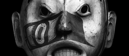
I’ve been reading The Elements of Typographic Style by Robert Bringhurst. When I ordered it, I noticed the mild coincidence that the author has the same name as the chap who translated the poetry of the Haida (the native inhabitants of the Queen Charlotte islands in the Pacific Northwest). As it turns out, though, it’s the same man. Which certainly explains why the books of Haida poetry are so attractively designed.
Alderwood mask of a woman of high rank, possibly Djiláquons. Haida, around 1830; in the British Museum.
It’s an impressive combination of talents, but there is a natural fit between poetry and typography. After spending all that time choosing and arranging words, what poet wouldn’t want them physically arranged on the page with equal care?
The parallel is marked: it’s all about the combined effect of a thousand tiny decisions. The poet and the typographer have to believe that every tiny tweak matters, that no detail is unimportant.
Now, with powerful computers at home, we all have the possibility of being our own typographers. But one thing that’s clear, reading the book, is that it’s not as simple as it sounds. There’s a lot more to it than choosing the least ugly font that came with your computer, picking a type size and a line height and letting the computer do the work. The point this was really brought home to me was where he argues convincingly that digital fonts often come from the foundries insufficiently precisely kerned, and that you will probably need to spend a couple of days with each new typeface manually adjusting the kerning so that even unusual letter pairs found in words like Ypres, Rwanda or Vázquez will be properly spaced.
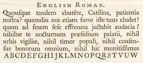
A section of a specimen sheet printed by William Caslon; from Wikipedia.
Even so, there is a lot of information and advice in the book which can be used even for the normal user of Microsoft Word; about choosing the right type size and measure, arranging the text block on the page, and creating headers which are harmonious with the body type, for example.
This is one field where the internet lets us down, of course. I can specify a typeface – from a very limited range I can rely on the reader’s computer to have – a type size, a line height and a line length, but I can’t control the way your system and browser deal with the kerning, anti-aliasing or any of the other nuances that completely transform the appearance it will have on your screen. Still, even here, some knowledge of typography can only help, and the technology is moving fast.
It’s an interesting, readable and, as one would hope, very attractive book. The Haida poetry is fascinating as well, but that would need a post to itself, methinks.
Last week I went to ‘Surreal Things: Surrealism and Design‘ at the V&A. It explores the influence of Surrealist art on design, and demonstrates how quickly surrealist imagery was recycled as a design style; initially in very chic and expensive contexts and then in mass-market commercial design. And demonstrated in the process that it’s a very rare image that still manages to be startling, unsettling and generally unheimlich when used as curtain fabric.
That’s true even before the adoption of this imagery into the mainstream. One part of the exhibition was about the house of an art collector who was an early enthusiast of Surrealism. His house was painted purple; it had plaster shapes on the walls to look like sheets hanging out of the windows and huge model palm trees on either side of the door; he had the iconic Dali lobster telephones and Mae West Lips sofa, wolf pawprint carpets, and specially designed china, lamps and so on.
But if Surrealism is a radical exploration of the subconscious, dreams, sexuality and so on, what does it mean to fill a whole house with surreal objects? I suppose the collector might have claimed that the whole house was one Surrealist artwork, but it seems to me that once you’ve decided to use Surrealism as a interior design choice, you’ve already neutered it; it just becomes a set of visual tics.
Surrealism is always very vulnerable to that loss of power; like a lot of modern art, the moment the audience stops taking it seriously, it’s very hard to recapture the mystique. The most iconic, striking surrealist works—the lobster telephone, the fur-lined cup, some of those Magritte paintings—are also the most easily absorbed as likeable mainstream objects. You can enjoy them as visual jokes or intellectual puzzles and they are memorable and interesting; but without the unsettling, dangerous quality that I think Surrealism aspires to. There’s a very easy slippage from powerfully strange to amusingly quirky.
As regular readers probably know, I’m an enthusiastic supporter of the London Olympics. But I’ve always had my own particular private worry about them. Not transport problems or cost overruns; no, what I’ve always had a nagging worry about is the opening ceremony.
There have been two big international sporting events held in the UK in the past 15 years: Euro ’96 and the 2002 Commonwealth Games. From an organisational point of view, both were a great success. But the opening ceremonies were cheesy, incoherent, unimaginative, clichéd. Half-baked. Second-rate. And my worry was that not just the opening ceremony, but the whole style, everything that the world will remember about the London Olympics other than the sport, might end up the same way: naff and a bit amateurish.
There are plenty of people in the UK who know how to put on a show, whether it’s an exhibition, a rock concert, a West End musical or a royal funeral. For that matter, the fabulous opening ceremony for the Athens Olympics was done by a British company. But none of that creativity seems to survive contact with the government. Whether politicians just have bad taste, or it’s the clammy hand of design by committee that ruins everything, I don’t know, but the record doesn’t inspire much optimism. The ultimate example is the Millennium Dome. It was always an event in search of a reason for existing, and the cost of the thing wasn’t exactly going to endear it to anyone, but much of that would have been forgiven if the experience of visiting it had been exciting and stimulating. Or glamorous, or awe-inspiring, or shocking, or moving. Instead, it was overwhelmingly mediocre. I had a pleasant enough day out there with my family, but it was completely unwowful and unmemorable.
I was cautiously optimistic about London 2012, though. The team seemed to be very focussed and professional, the bid logo was certainly the best of the competing cities, and the videos for the bid presentation in Singapore were very polished and even quite witty. And beach volleyball on Horseguards Parade, where the PM will be able to watch it from the windows of 10 Downing Street, is a stroke of genius. So I had a sense of shock and a feeling that all my worst fears had come true when I saw that the new logo is, basically, ugly:
Not only is it garish and lopsided, it looks so dated. And not generically old-fashioned, but quite specifically dated. My immediate associations were Max Headroom and the original Channel 4 logo; other people have mentioned Smash Hits, the video for Money For Nothing, MTV, and the titles for Saved By The Bell. In other words, there’s an immediate association with the cheesier end of 80s yoof culture.
Now I have a certain nostalgic fondness for the 80s, and I know the decade is quite trendy at the moment, but it seems a bizarre note to strike for the 2012 Olympics. And what worries me even more than the retina-scarring gaudiness of it is that note of cheesiness. The Olympics is never going to be cutting-edge and hipper-than-thou; it’s too big, too old, and too establishment for that. But it should be possible to do it with a bit of panache.
Well, I’ve been reading some of the commentary on design blogs—there’s a couple [1, 2] among the daily links in the previous post—and although everyone seems to have the same initial reaction of startled revulsion, some people have, after a little thought, offered some defences of the design. There seem to be three basic points:
1) Technically speaking, it’s a very flexible design. It scales well, it works well in black and white and a variety of colour schemes, and it will work not just in print and on screen but on baseball caps, polystyrene cups and just about any other medium. Which wouldn’t make up for any of its other failings, but is worth noting.
2) At least it doesn’t include a picture of Big Ben. More broadly: Olympic logos are generally forgettable, clichéd and bland. This one is surprising, striking, and, presumably, memorable. It has had an immediate impact, and although that initial impact has been negative, it is at least a strong reaction. And people will get used to the design in time. Possibly.
3) Most interestingly: it’s not just a logo. Because it is so visually striking, it sets up a visual signature which will be able to be carried through into all kinds of materials: TV ads, posters, banners, volunteer uniforms and so on. It really is, as the committee stressed, a brand rather than a logo.
These arguments have not quite won me over. ‘At least it’s not bland’ is a bit too much like saying ‘don’t you see? It’s ugly on purpose.’ Which just might be so clever it loops round to stupid again. And while I can see the virtues of a coherent visual style for the Games, the idea of the whole of London being plastered with lurid jaggedy shapes for the next seven years doesn’t fill me with an overwhelming sense of joy.
But at least it’s given me something to think about and a sense that, just possibly, there’s some method to the madness. Perhaps they know what they’re doing, perhaps it’ll all be OK; perhaps we won’t be looking back at the Games in 20 years time with a visceral cringe of embarrassment.
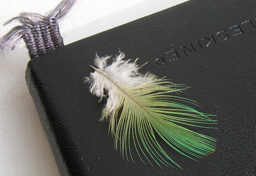
I bought a new notebook yesterday for my upcoming trip to Crete. This is the previous one, with a feather I found near the birdfeeders, presumably from a parakeet. I do like Moleskine notebooks. I’ve used masses of different notebooks of various kinds over the years both for birdwatching and poetry, but these are the only ones I really enjoy as objects in their own right.
They’re a fine example of why you can’t judge a product just on its functionality. Any old notebook which contains a supply of paper and is small enough to be portable would fulfil my requirements; I hardly ever use them for sketching or anything, just noted jotted in biro. The elastic to keep the notebook shut, the ribbon bookmark and the built-in pocket are nice touches but not really necessary.
It’s just a likeable object. It looks good: simple, old-fashioned, functional, ungimmicky. Even more important is that it’s very tactile; the oilcloth cover, good quality paper and twangy elastic all make it a nice thing to hold. I think it’s worth paying three times as much to get a notebook that gives me pleasure as well as doing its job. I just wish I got as much enjoyment out of using, say, my mobile phone.


