Categories
Culture Other

‘From Russia’ at the Royal Academy

This is a seriously impressive exhibition. The full title is ‘From Russia: French and Russian Master Paintings 1870-1925 from Moscow and St Petersburg‘. It starts with a little room of Russian paintings from the start of that period; then you get a whole load of French paintings that were collected by two Russian art collectors, Ivan Morozov and Sergei Shchukin, and are now divided between various Russian state museums; then the rest of the show is of Russian paintings again, which are more or less heavily influenced by the French work.

The French section includes major works by most of the biggest names in French art — Renoir, Monet, Cézanne, Van Gogh, Gauguin, Matisse, Picasso, Rousseau, Bonnard — whereas with a couple of major exceptions in Chagall and Kandinsky the Russian artists are less familiar. It makes for a good combination; the French artists are immediately enjoyable while the Russians, simply because they are less familiar, require a bit more evaluation.

My favourite painting was probably Matisse’s Harmony in Red:

Harmony in Red by Matisse

Apparently, when the collector bought it at a Paris show, it was all blue instead of red, but Matisse asked to hang on to it for a few weeks because he wanted to tweak it. It must have been a bit of a shock to open it up and find it had completely changed colour.

Of the Russians: there were lots I quite liked including, unusually for me, the two Chagalls. Among the people I was with the most popular choice for a painting to take home would be Altman’s portrait of Anna Akhmatova. I think I’d probably take one of the three Malevich paintings called Black Square, Black Circle and Black Cross which are just black shapes on white backgrounds. That kind of geometrical minimalism is a bit mysterious: sometimes it works and sometimes it doesn’t. Those ones worked, for me, though I’d be hard pressed to explain why.

This exhibition has an obvious relevance to the whole modernism and politics discussion, since Russia went through an immensely creative period in art and architecture for the first two decades of the C20th, and for a while after the revolution this radical art was embraced by the party; but then the regime ruthlessly crushed it. Artists may have supported radical politics, but politicians didn’t necessarily support radical art. A dislike of ‘decadent’ art was one of the things Hitler and Stalin had in common.

» The Matisse image is from the Artchive.

Categories
Culture Other

Herba Parietis or the Wall Flower

Newgate

The text reads:

Herba Parietis or the Wall Flower
As it Grew out of the Stone Chamber
Belonging to the
Metropolitan
Priſon
of London Called
NEW GATE.

Being A History
Wch is Partly True
Partly Romantick
Morrally Devine
Wherby A Marriag
Betweene Reallity &
fancie is Solemnised
By Devinity

Written By: I: B: whilst he was A Prisoner therr.

Every time I start browsing the British Library collections online, I find lots of stuff I want to post. This is from George III’s collection of geographical material, so I guess it must be C18th. I’ve slightly reduced the size; you can see it full-sized here.

Categories
Culture Other

Deletionists, Inclusionists, and the joy of the trivial.

There is, I gather, an ongoing philosophical debate running behind the scenes of Wikipedia; one which will probably run forever. On the one side are the deletionists; on the other are the inclusionists. The question is how to deal with articles about less important subjects: one side generally favours deleting them, the other would prefer to include. The deletionists see Wikipedia as an attempt to create an online version of a traditional encyclopedia; only important subjects are worthy of an article. In the jargon, they have to be ‘notable’. The inclusionists would tend to allow articles on any subject, however obscure. They make a virtue of the fact that ‘wiki is not paper’: that there is no material constraint that prevents it growing indefinitely.

I’m on the inclusionist side. I just can’t see what harm it does if, for example, every primary school in Norfolk has its own article on Wikipedia. Or indeed every bakery or hairdresser’s in Norfolk. And I think that trivial information has its own value.

the West Sussex Dairy Company

I’m not trying to make a radically relativist case, that your local florist is just as important as Paradise Lost; of course Wikipedia should strive to have good coverage of the core encyclopedic subject matter. And I can completely see why some of the people who edit Wikipedia find it faintly embarrassing that the coverage of Doctor Who is so much more comprehensive than the coverage of Elizabethan drama (I haven’t actually checked whether that’s true; bet it is, though).

But I’d like to make the comparison with the Evanion Collection of Ephemera. Evanion was the professional name of the Victorian conjurer and ventriloquist Harry Evans. He collected trade cards, catalogues, advertisements, posters: all kinds of rubbish. It is, almost by definition, a collection of the sort of thing that deletionists at a Victorian Wikipedia would have rejected as non-notable. Now, proudly displayed on the British Library website, it is endlessly fascinating.

Steiner's Insect Powder

Or take a more recent example. If all has gone according to plan, just below this post should be a post with links to YouTube clips recorded from a Detroit TV station in the late 80s and early 90s. Some are from a dance show, with locals dressed up for a night out and dancing to Detroit techno; the others are recorded from ad breaks for the same show. They are only twenty years old, but already they have the same fascination as the Evanion material: a record of a very particular time and place through fashion, music, the adverts made by small local businesses; the ephemeral and trivial.

Wikipedia has only been running for seven years and is already an extraordinary success. There’s no reason why it shouldn’t still be going in a hundred years. There are two points I’d take from that. Firstly, taking the longer view, there is still loads of time to build up the serious encyclopedia stuff: Elizabethan drama, C16th Chinese porcelain, whatever. But also: who knows what people will find interesting, now or in twenty or a hundred years time. Just record it, let people sort it out for themselves.

» For more discussions about deletionism vs. inclusionism, check out this rather lovely article from the NYRB that I linked to before; or this blog post which I found via a post at Language Log. The ad for the West Suffolk Dairy Co. and E. Steiner’s Prime Dalmation Insect Powder are both from the Evanion collection at the British Library.

Categories
Culture

‘Duchamp Man Ray Picabia’ at Tate Modern

The exhibition is subtitled ‘The Moment Art Changed Forever’ and the poster is illustrated with Duchamp’s Fountain, the famous work that just consists of a urinal signed with the name ‘R. Mutt’. In 2004 Fountain was voted the most influential artwork of the C20th, presumably for having sharply and clearly established the principle that art is whatever the artist says it is. So I can see why the Tate is emphasising it; but in fact those kind of ready-mades make up a fairly small proportion of the show; which is probably just as well because they are pretty one-dimensional. Sure, it was a gesture worth making, and Duchamp did it well, with a good choice of object and title and so on; but I wouldn’t want to see a whole exhibition of them.

Other stuff in the show includes paintings and sculptures themed around the body, sex, machines and movement, including familiar pieces like Duchamp’s Nude Descending A Staircase and The Bride Stripped Bare by her Bachelors, Even (The Large Glass) which is in the Tate anyway; there are paintings as well as photographs by Man Ray. Picabia was the artist whose work I knew least about beforehand; lots of the Duchamp and Man Ray has been in previous exhibitions about Dada and Surrealism. Picabia was also probably the least interesting, but some of his paintings were quite fun.

Daughter Born without Mother by Picabia

I can’t say I was wildly excited by the show, but if it’s the kind of thing you like it’s certainly worth checking out. The most covetable objects are mainly Man Ray photographs and Rayographs (made by placing objects on photographic paper and briefly exposing it to light), though there were some small, very abstract late paintings by Picabia, just a few dots of colour in thick paint on a plain coloured background which I would also quite like on my wall.

On thing I would say is: don’t waste your money on the audioguide. The commentary has a kind of coy, knowing, vaguely patronising tone, as though the narrator was trying to seduce a slightly dim 12-year-old; so that was deeply irritating. It was also short of insights that reached beyond the blindingly obvious. If I’m standing in front of a painting, I don’t need the guide to carefully tell me what the painting looks like; I want some kind of extra information that I can’t see for myself. You can actually hear some of the audio tour on the exhibition website (this page, for example) if you’re curious.

On top of the tour itself, the controllers were also a problem; instead of the standard audioguides with a big keypad, the Tate has got some little touchscreen devices. Which would be fine in principle, except that the touchscreen is erratically responsive, you have to carry around a stylus, and the user interface is badly designed. This is a machine which people are expected to just pick up, use for about an hour and hand back; there’s no time for a learning curve. So make the controls large, use standard icons for play/pause etc, and if necessary label the buttons with text. I spent a couple of minutes trying to figure it out and nearly crumbled and went and asked for help. Even when it was working, some design decisions were just bad; for example, when you pressed the ‘Go’ button to start a recording, the screen changed and the play/pause appeared on exactly the same part of the screen, with the result that many times, I accidentally pressed the screen twice and found I had paused the audio by mistake. And just when I was coming to the end of the exhibition, it crashed and I lost the tour altogether.

» The painting is Daughter Born without Mother by Picabia, from the exhibition website.

Categories
Culture Other

Boy jumping

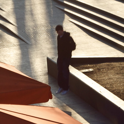
A crop out of the centre of a photo I shot on the South Bank the other day when I went to see the Rodchenko at the Hayward.

boy jumping

See also Phillippe Halsman and Jacques-Henri Lartigue. And of course Flickr.

Categories
Culture

‘Alexander Rodchenko’ & ‘Laughing in a Foreign Language’ at the Hayward

I went to the Hayward today to see an exhibition of the photography of Alexander Rodchenko; the price of the ticket included entry to a show called ‘Laughing in a Foreign Language’, a exhibition which “investigates the whole spectrum of humour, from jokes, gags and slapstick to irony, wit and satire.”

It was a pleasure to go to an exhibition of contemporary art and find that the gallery was filled with the sound of joyful laughter.

No, not really. The humour on display was not generally of the kind that would win the artist a long engagement at the Glasgow Empire. Which is fine; work can be gently humorous or ironic or whatever without being laugh-out-loud funny. But for an exhibition themed around humour, it was a curiously deadening event.

Perhaps something like the Glasgow Empire would be a salutary experience for a lot of contemporary artists: having to cope with failing miserably and visibly in front of a sceptical audience. Perhaps then they would tighten up some of their work so it was a bit more punchy. Can there really be many 30 minute video works that couldn’t be cut down to 20 minutes?

Lili Brik

I preferred the Rodchenko exhibition. Rodchenko was a photographer/graphic designer in the USSR in the 20s and 30s; I didn’t know a great deal about him beyond what was featured in the recent BBC history of photography. As far as I can see his most remarkable work was in publications like [I may have the title slightly wrong] The USSR in Construction which combine his photography with typography, photomontage and graphic design to produce something really incredible.

But that aesthetic rapidly fell out of favour with the government, who liked to micromanage all aspects of culture; Rodchenko was accused of ‘Formalism’ and had to find less radical outlets for his creativity. So he switched to a more straightforward kind of reportage. Perhaps most intriguing now are the most Soviet subjects, like the May Day parades and athletic demonstrations.

One aspect of the Rodchenko exhibition which I found interesting was the prints, which had quite a limited tonal range; I know I’ve seen more vibrant versions of the same pictures before. I guess the difference is down to the technological limitations of the older printing process—generally silver gelatine prints—rather than anything else, but it’s an intriguing curatorial question: do you present someone’s work as they produced it, or how you think they would have produced it given the chance? I suppose in a gallery authenticity trumps other considerations so you just post the originals.