Categories
Tumblr

Tumblr round-up, August 30th

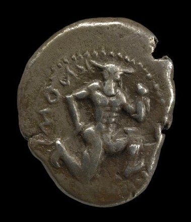
I think my favourite thing I posted to Tumblr this week was this Minoan coin from Knossos. It has a minotaur on it!

I thought this article about the dropping of the case against Dominique Strauss Kahn and the differences between the French and US legal systems and legal cultures was interesting.

A flapjack octopus — a spiny flower mantis — some cephalopodsanatomy — crystals of gypsum and kapellasite — Shoebill skull

The Grindelwald Glacier — a Californian canyon — the Grand CanyonChartreuse Arch

Shoe warehouse trade card — Mexican film posterstained glass in India — natural historyinfrared Congo

Categories
Other

Thesaurian spam

The spam filter caught this reply to my post with the title ‘The stupidity of big books (and the joy of cheap paperbacks)‘:

wooow, take a fancy to your things concerning Heraclitean The stake » The vapidness of swollen books (and the felicity of of small account paperbacks

Yup, the spambot has just run the post title through a thesaurus.

The idea of course is to generate fake comments which are genuine-sounding enough to avoid being deleted. It’s an ingenious idea, even if the results are a bit peculiar. I guess it might have worked better if the original post title was something shorter and less elaborate.

If nothing else, ‘the vapidness of swollen books’ is quite a nice line of iambic tetrameter.

Categories
Culture

The stupidity of big books (and the joy of cheap paperbacks)

I’m currently reading Only Yesterday, S.Y. Agnon’s novel about Jewish settlers in Israel before the first world war. And so far I’m enjoying it, apart from one thing. It’s in a handsomely made edition published by Princeton University Press, on high-quality paper, with large type, set with a generous amount of leading and plenty of white space. In other words: it’s fucking enormous.
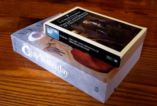
There it is with my old Penguin Classics edition of Tristram Shandy for comparison.

Ah, but, I can hear you saying, you’ve used the wide-angle effect of the camera to exaggerate the difference in size! And there’s a degree of truth to that, so here’s a different angle:

The Agnon is 5.2cm longer, 4.2cm wider and 1.6cm thicker. The result is that it is nearly three times the volume, and over three times the weight (930g; i.e. over two pounds).

Ah but, I hear you say, you are still being unfair! Clearly the Agnon is a much longer novel!

You might think so, but no, it isn’t (thank heavens; Tristram Shandy isn’t exactly a pamphlet). It’s hard to compare exact word counts, but Tristram Shandy has 659 pages; Only Yesterday has 652. And they have the same number of lines per page and at least roughly the same number of words per line. I counted.

Seriously, though, whose idea was it to inflict these ludicrously big books on us? I spent a large chunk of my youth with one Penguin Classic or another tucked in my jacket pocket; the Agnon isn’t just too big to fit in a pocket, it’s close to being too big to read comfortably at home on a sofa.

The pointlessly large paperback seems to be a particular weakness of American publishers — insert your own joke about obesity or steroid abuse here — but I think it’s part of a general trend. I have a load of old Penguin Classics from the 80s and 90s, and at some point they changed the format. Inevitably they got bigger, by about 2cm in each direction. That’s not as gargantuan as the Agnon, and thankfully they’re still printed on nice thin paper so they’re not any fatter, but it’s probably too big to fit in a pocket.

And if you’re wondering, yes I do dislike hardbacks for exactly the same reason. They’re less comfortable to read, and they take up too much room in your bag or on your shelves.

I think I understand the logic for the publishers, mind you; they need to charge a lot of money for these books, particularly if they’re not expecting to shift a lot of copies. And physically making the book is a fairly small part of the overall costs, so why not spend a little extra producing an object which feels substantial and high quality; that way people feel more like they are getting their money’s worth. The list price for Only Yesterday is $32.50; at that price perhaps people want a lot of paperback for their money.

But it’s madness. Why can’t publishing learn from the tech industry? A book is nothing if not a mobile device; and just as each generation of the iPhone is advertised as thinner and lighter than the one before, why aren’t publishers advertising ultraportable novels?

It’s a silly time to be making this argument, of course, because the decision is being taken out of publishers’ hands. There is an ultraportable format of books: it’s called digital. I don’t often carry books around with me any more; instead I have books on my phone. It isn’t the ideal way to read, but it’s zero extra bulk to carry.

But if ink and wood pulp are going the way of the horse-drawn carriage, I just want to say: what I will miss is not big glossy hardbacks, however beautifully designed and printed, but small format mass-market paperbacks printed on flimsy paper. If the invention of the printing press changed the world by democratising knowledge, then the paperback was the apotheosis of that project; the cheapest, most convenient, most accessible way of communicating ideas and literature ever devised.
Categories
Tumblr

Tumblr round-up, August 23rd

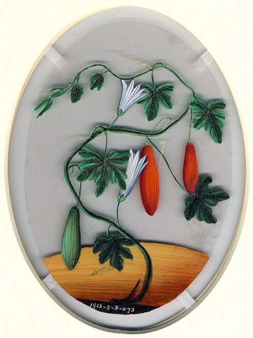
I spent a while this week roaming through the British Museum’s various C19th Indian paintings; many of them, like this one, painted for European patrons or the European market. And many of them, like this one, painted on thin sheets of mica. This is a gourd of some kind:


Also painted on mica were an eagle, an LBJ, and an orchid.

Some more romantic scenes: a lady playing a musical instrument to a gazelle watched by an attendant; two lovers playing with fireworks; a girl waiting for her lover under a tree on a stormy night.

Some religion: a foot decorated with auspicious symbols; Krishna standing on the hood of the serpent Kaliya; Shiva pursues his Enemy –and although he assumed the shape of an Elephant yet Shiva crushed him to death.

Miscellanea: a pretty cakea multicoloured tree — a spectacular snowstormSoviet architecture — a Tahitian mourner’s costume — a tiger with an elephant’s head — a salt landscapeparsnipchameleon anatomy — Swedish book covers (1, 2)

Categories
Culture

Daily Life in Victorian London by Lee Jackson

This is an anthology for the Kindle compiled by Lee Jackson, proprietor of the website The Victorian Dictionary, which anyone who has some interest in either Victoriana or London will surely have stumbled on at some time or another.

If you have visited the website, you’ll know what a great resource it is, and you won’t be surprised to hear that Jackson has compiled an anthology full of curious and interesting snippets about such subjects as a ‘B’ meeting, a baby show, a balloon ride, bar-maids, bathing, bazaars, bed bugs, beggars, bicycle races, Billingsgate Market, black eyes, blackmail, the Blind-School, Bloomerism and burglars. And that’s just the Bs.

It’s a bargain at £1.84 or $2.99.

Categories
Culture

Mama Lily and the Dead by Nicolette Bethel

Mama Lily and the Dead is my book from the Bahamas for the Read The World challenge. It’s a collection of poems which tell Lily’s life story, running from ‘The Scotsman Gives Lily Her Name (1904)’ to ‘The Granddaughter Sings Lily Home (1994)’. I know Nico a bit via the world of internet poetry, and I’d read some of the poems before, or earlier drafts of them, so I had a pretty good idea of what to expect, but it’s still rather different to have them in actual printed paper form and read the whole lot in order.

Incidentally, if you’ll excuse a slight detour, it still seems weird to me to say I ‘know’ someone when I’ve never met or talked to them. Even if I have interacted with them online over a period of years. I feel like we need a new verb for it. Like: “Do you know Bob?” “Well, I knowontheinternet him.” Or: “I’ve had a couple of Twitter exchanges with George Michael, but I wouldn’t say I knowontheinternet him.

Anyway. As I was saying, I’d never read the whole sequence of Lily poems together before, and I thoroughly enjoyed it. At their best they have a sharp in-the-moment-ness, a vivid sense of being a particular point in time. And that brings with it a sense of place, emphasised by the use of Caribbean-inflected grammar.

One thing which struck me as interesting, reading them, is as much a point about me as about the poems. Nico* has a particular stylistic quirk of using neologistic compounds — like, for example, using ‘bonechill’ as a verb — which just slightly makes my critical self uneasy; not because I object to neologising, but precisely the opposite: I have exactly the same tendency myself when I write poetry [perhaps I should say when I wrote poetry]. All the times I have come up with compounds and then cast a jaundiced eye on them trying to decide if I was being self-indulgent have apparently programmed a warning flag into my brain which pings up whenever I see them.

I was going to type out an extract but actually there’s no need, because various of the poems have been published in internet poetry journals; so if you want to read some, just put Nicolette Bethel Lily into Google and it will offer you a variety to choose from. You could start with ‘The Preacher Man Saves Lily’s Soul (1914)’, for example.

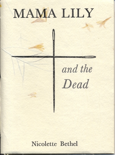
And a quick note on the actual physical book, which is rather lovely. It’s a numbered edition; my copy is 35 of 200. As you can see above, the cover is letterpress printed† on handmade Indian paper with bits of flowers in it. What you can’t see above is that it has endpapers, also handmade paper, in a sort of translucent acid yellow with thready bits running through it; or that the pages themselves are printed on high quality cotton paper.

It struck me, when I opened the parcel and saw the book for the first time, that this is one future for printed books in a world of e-readers: to celebrate the physicality of them, to make them into covetable objects in their own right. Although, nice as it is to imagine a flowering of artisanal, boutique publishers producing books which are exquisitely designed and made, I guess it’s a red herring really. The point of books is the words, not the packaging. Any defence of printed books purely on the basis of their appearance is straying into the territory of interior designers who buy leather-bound books by the metre because they make a room look cosy.

And actually I don’t think small publishers would be the winners in a world where books were bought for their beauty. I’ve read a lot of books from all kinds of small presses as part of the Read The World challenge, and Poinciana Paper Press is an admirable exception; much more often the books are rather badly designed. Which is understandable; a small press on a shoestring budget has to focus on what they’re good at, which is hopefully choosing, translating and editing texts.

* And this is where the fact I knowontheinternet her comes in again, combined with the generally informal tone of blogging: ‘Nico’ sounds a bit offhand and casual, in the circumstances, but ‘Bethel’ would sound weirdly formal. Especially since I have actually mostly known her over the years by an internet pseudonym. Ah, netiquette.

† Letterpress printed in, of all places, Camberwell. Not that I have anything against Camberwell; my sister lives there. And I think I had some art classes there as a child, though I don’t remember much about them except making some kind of collage out of bits of magazines, and eating pear drops. It’s just a long way from the Bahamas.