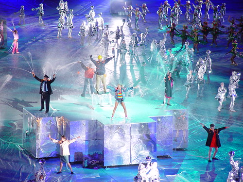
It just keeps getting better: “Olympic organisers have been forced to pull the promotional video of the brand from their website after reports that the flashing section had triggered seizures in at least eight people with photosensitive epilepsy.”
As regular readers probably know, I’m an enthusiastic supporter of the London Olympics. But I’ve always had my own particular private worry about them. Not transport problems or cost overruns; no, what I’ve always had a nagging worry about is the opening ceremony.
There have been two big international sporting events held in the UK in the past 15 years: Euro ’96 and the 2002 Commonwealth Games. From an organisational point of view, both were a great success. But the opening ceremonies were cheesy, incoherent, unimaginative, clichéd. Half-baked. Second-rate. And my worry was that not just the opening ceremony, but the whole style, everything that the world will remember about the London Olympics other than the sport, might end up the same way: naff and a bit amateurish.
There are plenty of people in the UK who know how to put on a show, whether it’s an exhibition, a rock concert, a West End musical or a royal funeral. For that matter, the fabulous opening ceremony for the Athens Olympics was done by a British company. But none of that creativity seems to survive contact with the government. Whether politicians just have bad taste, or it’s the clammy hand of design by committee that ruins everything, I don’t know, but the record doesn’t inspire much optimism. The ultimate example is the Millennium Dome. It was always an event in search of a reason for existing, and the cost of the thing wasn’t exactly going to endear it to anyone, but much of that would have been forgiven if the experience of visiting it had been exciting and stimulating. Or glamorous, or awe-inspiring, or shocking, or moving. Instead, it was overwhelmingly mediocre. I had a pleasant enough day out there with my family, but it was completely unwowful and unmemorable.
I was cautiously optimistic about London 2012, though. The team seemed to be very focussed and professional, the bid logo was certainly the best of the competing cities, and the videos for the bid presentation in Singapore were very polished and even quite witty. And beach volleyball on Horseguards Parade, where the PM will be able to watch it from the windows of 10 Downing Street, is a stroke of genius. So I had a sense of shock and a feeling that all my worst fears had come true when I saw that the new logo is, basically, ugly:
Not only is it garish and lopsided, it looks so dated. And not generically old-fashioned, but quite specifically dated. My immediate associations were Max Headroom and the original Channel 4 logo; other people have mentioned Smash Hits, the video for Money For Nothing, MTV, and the titles for Saved By The Bell. In other words, there’s an immediate association with the cheesier end of 80s yoof culture.
Now I have a certain nostalgic fondness for the 80s, and I know the decade is quite trendy at the moment, but it seems a bizarre note to strike for the 2012 Olympics. And what worries me even more than the retina-scarring gaudiness of it is that note of cheesiness. The Olympics is never going to be cutting-edge and hipper-than-thou; it’s too big, too old, and too establishment for that. But it should be possible to do it with a bit of panache.
Well, I’ve been reading some of the commentary on design blogs—there’s a couple [1, 2] among the daily links in the previous post—and although everyone seems to have the same initial reaction of startled revulsion, some people have, after a little thought, offered some defences of the design. There seem to be three basic points:
1) Technically speaking, it’s a very flexible design. It scales well, it works well in black and white and a variety of colour schemes, and it will work not just in print and on screen but on baseball caps, polystyrene cups and just about any other medium. Which wouldn’t make up for any of its other failings, but is worth noting.
2) At least it doesn’t include a picture of Big Ben. More broadly: Olympic logos are generally forgettable, clichéd and bland. This one is surprising, striking, and, presumably, memorable. It has had an immediate impact, and although that initial impact has been negative, it is at least a strong reaction. And people will get used to the design in time. Possibly.
3) Most interestingly: it’s not just a logo. Because it is so visually striking, it sets up a visual signature which will be able to be carried through into all kinds of materials: TV ads, posters, banners, volunteer uniforms and so on. It really is, as the committee stressed, a brand rather than a logo.
These arguments have not quite won me over. ‘At least it’s not bland’ is a bit too much like saying ‘don’t you see? It’s ugly on purpose.’ Which just might be so clever it loops round to stupid again. And while I can see the virtues of a coherent visual style for the Games, the idea of the whole of London being plastered with lurid jaggedy shapes for the next seven years doesn’t fill me with an overwhelming sense of joy.
But at least it’s given me something to think about and a sense that, just possibly, there’s some method to the madness. Perhaps they know what they’re doing, perhaps it’ll all be OK; perhaps we won’t be looking back at the Games in 20 years time with a visceral cringe of embarrassment.
‘One of my frustrations with contemporary photographic technique, mine included, is the feeling of sterility. Digital processes have become so sophisticated that nearly every picture you see is dusted and anti-scratched to a state of frozen perfection.’
via Circus of the Spineless: ‘Two months ago, March 9th, Bev posted this question at Burning Silo: How many of you are nervous of spiders?… In the comments, I promised a story. I’m finally getting around to it.’
“The London 2012 logo was revealed yesterday, and it seems to be almost universally loathed… Just like you, our first reaction was shock. But we talked about it all morning. By 3pm, we decided we love it, and here are ten reasons why you should, too.”
via The Tofu Hut: ‘Its my love of the carniceria store paintings. I’ve always had a fascination with them ever since I was a little kid… Taco stands, bars and restaurants will make there way on this site as well.’
“it is a momentous occasion when you wake up to a buzzing design community eager to talk about a logo… I even woke up to fifteen e-mails with the same subject line: Olympic logo of London 2012.” For the comments as well as the post.
via Coudal: “As if you need another reason to love Iggy Pop, the veteran rocker (and his band The Stooges) have the single most entertaining concert rider TSG has ever obtained.”
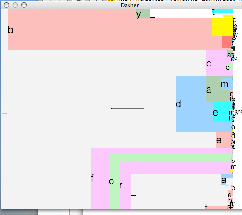
Following on from Dvorak, this entry was composed using a piece of software called Dasher which I learned about via Metafilter. Or at least, It wasn’t, because the Mac version is very beta and crashed, taking all my words with it. But I did write a couple of paragraphs and get some sense of what it was like.
Basically, there’s a stream of letters moving across the screen, and you ‘steer’ through them, just using mouse movements, to pick out the ones you want. The software guesses which are most likely and makes those bigger, which certainly makes it quicker when you want to type predictable things but for unusual words like ‘Dvorak’ you have to slow right down.
It takes a bit of getting used to, but surprisingly soon you can ‘type’ at a respectable speed.
It has very clear advantages for people with limited mobility. It doesn’t have to be used with a mouse, of course; it could be a joystick or it could track eye movements. Personally I’ll be sticking to a keyboard because, apart from anything else, all those zooming letters made me a bit nauseous and headachy.
It’s interesting, though, especially because new user interfaces seem to be in the air at the moment. The Wii, Microsoft’s new Surface, the iPhone: all are examples of machines that break away from the keyboard/mouse/joystick model and look for new ways of interacting with your computer. I’m slightly sceptical that it’s going to be easy to improve on something like a keyboard as a way of inputting type, but these days a computer is a lot more than a pimped-out typewriter. The more we use our computers to communicate, and deal with photographs, pictures, music and so on, the less central to the experience the keyboard needs to be.
Who knows. The next few years could be very interesting.
I started putting these intergalactic self-defense mechanisms (ray guns) together after being totally inspired by Clayton Bailey, artist/gunsmith. I also draw inspiration from old 50’s and 60’s space movies/TV/toys…anything retro cool! I hope you enjoy looking at these as much as I did creating them. Stay tuned, I have about 15 or so that I’ve already completed but have yet to load up and depending on what kind of stuff I find, I can usually crank out a couple of these a month.
Cool though those are, I’m getting bored of FSotW. It’s not as entertaining as Mask of the Week used to be. Hmm. Might need to think of something else.