Smilies used to really irritate me. But I’ve been persuaded. So much online communication now is chit-chat, banter and small talk. And informal conversation is driven as much by tone of voice as by actual words. A real example. Someone leaves a nice comment on this blog, and I don’t really have anything to say in reply but want to acknowledge the comment. This seems too curt:
Thanks.
This seems too effusive:
Thanks!
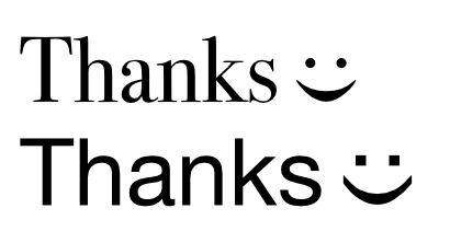
So what I often use is this:
Thanks :)
Which seems a genuinely useful thing to be able to do. It’s just a bit friendlier. But you’ll notice WordPress hasn’t converted that into a smiley, because I have in fact turned smilies off. They’re just too ugly. These are the ones that ship with WordPress:

They’re not the most horrible smilies ever, but I didn’t spend hours tweaking and fine-tuning the design of the site just to clutter it up with yellow cartoon faces. What I like about the classic emoticon is that it’s visually unobtrusive but clear. It is in fact like punctuation, which I think is the state all smilies should aspire to. But emoticons are limited. I know that people have expended endless ingenuity in coming up with ways to convey everything from ‘laughing hard while covering mouth with hands’ to ‘silent resignation’, but they tend to be large, ambiguous and, of course, obviously cobbled together out of other symbols. What I want is for fonts come with a range of emoticons designed to match the font. The most important one is a smile; the other ones I’ve found most useful in internet forums are ‘confused’ ‘roll eyes’ and ‘grin’, but they might as well include the other obvious ones: ‘angry’, ‘sad’ and ‘winking’ at least.
They don’t even have to be designed to look like faces; conceptually these similar to the exclamation mark and the question mark, and a similarly arbitrary symbol would be fine. But since emoticons and smilies are currently in widespread use, they seem like a good starting point. Perhaps something like this:
I am, obviously, not a type designer, but you can see what I’m trying to do. The more complex symbols, like confused or roll-eyes, would need a bit more ingenuity, but humans are nothing if not ingenious.
Can you tell I’m short of inspiration for napowrimo? And, btw, if WordPress is going to insert curly quotes, I wish it would bloody well get them right. The automatic formatting seem to be screwed up in several ways since the release of WP2.1, and it’s really irritating. [angry smiley could go here]