Categories
Culture

Exhibition roundup: History is Now, Marlene Dumas, & Cotton to Gold

The South Bank Centre is marking 70 years since the end of WW2 with a collection of events entitled Changing Britain. The Hayward Gallery’s contribution is an exhibition History Is Now: 7 Artists Take On Britain.

Filtering collective history through their individual perspectives, seven British artists of different generations and backgrounds – John Akomfrah, Simon Fujiwara, Roger Hiorns, Hannah Starkey, Richard Wentworth and Jane and Louise Wilson – each curate distinct sections of the exhibition and provide their unique ‘take’ on recent British history.

As you might imagine, it’s a bit of a mixed bag. John Akomfrah has selected a whole range of films from the Arts Council Film Collection, which I pretty much skipped, because who has the patience to watch seventeen different pieces of video art in a row? I hope some people do, but not me. Roger Hiorns has put together a whole exhibition of material related to the BSE crisis, arranged chronologically, and I found it really interesting to go back and revisit that period but I’m not sure I was responding to it as art — whatever that means. The only reason it couldn’t have been an exhibition at the Science Museum is that contemporary art has a willingness to be more boring — or at least dense and text-heavy — than a traditional museum would dare.
evil-banalbig

The two I enjoyed most were Hannah Starkey and Richard Wentworth. Hannah Starkey selected 70s, 80s and 90s photography from the Arts Council Collection, which she juxtaposed with commercial photography in a somewhat heavy-handed but still effective way. So glossy ads for fashion and booze were contrasted with grimy, peeling 1980s unemployment offices and so on. I don’t know if that contrast was absolutely necessary — the photographs would have been effective on their own — but it was still good. Richard Wentworth’s was the most crowd-pleasing section. To quote the blurb: ‘Through his eclectic selection of objects, artworks and artefacts Wentworth takes us from post-war austerity to the optimism of the 1950s and into the gloom and paranoia of the Cold War.’ So there was some art by people like Ben Nicholson, Barbara Hepworth, and Henry Moore, lots of press clippings, lots of old books which were thematically appropriate but also appealing for their mid-century graphic design, various objects like a 1950s TV, and most dramatically a decommissioned anti-aircraft rocket launcher out on the balcony.

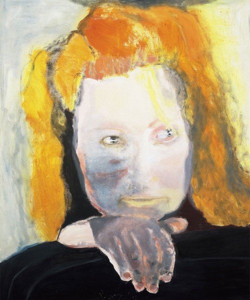
Meanwhile at Tate Modern they have Marlene Dumas: The Image as Burden. Marlene Dumas is a South African artist who paints rough, blobby paintings, nearly all of people. I enjoyed it much more than I expected because the Tate have done a terrible job of marketing it. Or at least a terrible job of marketing it to me. All the pictures I’d seen made her work look dismal and unattractive, and quite a lot of it is a bit like that: lacking immediate visual appeal (which is not the same as being bad, but doesn’t make me rush to go and see it). Particularly, there are paintings in black ink which are dark and grey and miserable looking. But actually her larger oils are much more likeable, and some of them are even quite colourful. I didn’t come out of the exhibition as her biggest fan, but I certainly liked it more than I thought I would.

And at Two Temple Place is Cotton to Gold: Extraordinary Collections of the Industrial North West. In the 19th and early 20th centuries, there were some people in Lancashire making a hell of a lot of money from cotton mills and other industry. And some of them put that money into collecting historical manuscripts, or old coins, or beetles, or Turner watercolours, or Japanese woodcuts… With the result that there are apparently some particularly notable regional museums up there. But for the moment a lot of those coins and beetles and whatnot have been lent to Two Temple Place.

It’s an enjoyable kind of exhibition to visit: the building is attractive, entry is free, and if one cabinet leaves you cold, well, the next one will have something completely different. Last year they had a similar exhibition of items from the various University of Cambridge collections; I think that one was better, with more varied and more remarkable exhibits, but Cotton to Gold is enjoyably eclectic in the same way.

» The painting is Evil is Banal, Marlene Dumas, 1984. Collection Van Abbemuseum, Eindhoven, The Netherlands. © Marlene Dumas. Photo credit: Peter Cox, Eindhoven, The Netherlands.
Categories
Culture

Twombly, Poussin, Emin and Hungarian Photographers

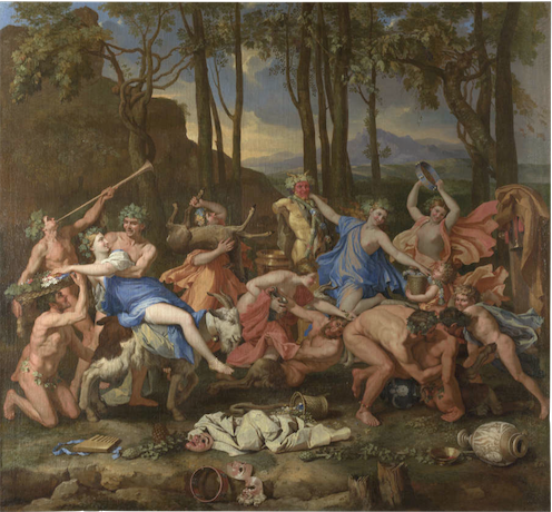
A bit of an exhibition round up. This is not, as you might think, four exhibitions, because at Dulwich Picture Gallery at the moment they have a combined Cy Twombly/Nicolas Poussin exhibition. Which might seem like a rather odd choice at first glance, since they lived 330 years apart and one of them painted highly controlled classical paintings and the other did scrawly abstracts.

But there is a kind of logic to it. Both of them moved to Rome at the age of about 30, both use lots of classical references in their work, and Twombly specifically referenced Poussin in several paintings, most notably by painting a large group of four paintings called the Four Seasons, a subject Poussin painted 300 years earlier.

And while I don’t think it was exactly revelatory to see them together, it’s always interesting to explore these kind of comparisons, as an intellectual parlour game if nothing else. I guess you could argue that the Poussins brought out a controlled, restrained quality in the Twombly, for example, but it’s rather an elaborate way to make such a straightforward point. I did find myself warming to Poussin more than usual, though. Clearly he’s a great painter, but generally I find his work a bit sterile. But being displayed among modern paintings did at least make the paintings seem a bit fresher.

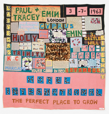
Meanwhile the Hayward is holding a retrospective of Tracey Emin. I went into it with mixed feelings. She has attracted so much bone-headed mockery from the media over the years that I’ve always felt the need to stick up for her… despite not actually liking her work that much. But seeing it all together it does hold up pretty well. The caricature is that she just splurges her personal life uncontrollably into her work for shock value; and that’s not completely unfair. But of course the execution is what matters, just as a confessional memoir could be good or bad could be good or bad depending on who wrote it. And at her best — some of the appliqué blankets, the video work — Emin’s work is sensitive and intelligent. On the other hand, by the time I had gone all the way round the exhibition, it was also starting to feel a bit repetitive. So she’s still not exactly my favourite artist, but I enjoyed the show well enough.

And at the Royal Academy is an exhibition of C20th Hungarian photography. Why Hungarian photography? Well, because five of the most notable photographers of the C20th — Brassaï, Robert Capa, André Kertész, László Moholy-Nagy and Martin Munkácsi — were all Hungarian. So they provide the core of the exhibition, but other, less famous people are included as well. In some ways the exhibition is about Hungary, with striking photographs recording the various wars political upheavals that engulfed the country, but it also includes many taken in other countries: Brassaï photographs of Paris nightlife, or Kertész shots of New York.

If there is anything distinctively Hungarian about the work, I couldn’t particularly see it. It did feel very European, somehow, and it reminded me again how much my idea of Europe was shaped by the Iron Curtain growing up. Austria ended up on one side of it and was therefore a ‘real’ European country; Hungary was on the wrong side and was part of some shadowy other Europe. And 20 years after the fall of communism, that sense of them not being part of the European mainstream still lingers. I don’t know how much that’s just me showing my age; people just out of university now, who were two three when the Berlin Wall came down, hopefully see the continent rather differently.

Anyway, geopolitics aside, the exhibition is definitely worth going to because it has some very fine photographs in it.

» The Triumph of Pan is by Nicolas Poussin; Hotel International, 1993, © Tracey Emin; Greenwich Village, New York, 30 May 1962 is by André Kertész.

Categories
Culture Other

Boy jumping

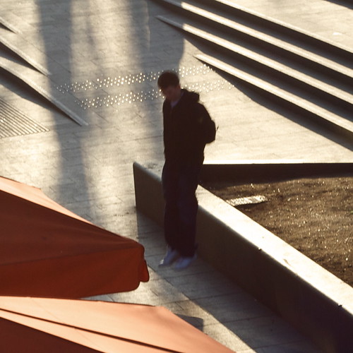
A crop out of the centre of a photo I shot on the South Bank the other day when I went to see the Rodchenko at the Hayward.

boy jumping

See also Phillippe Halsman and Jacques-Henri Lartigue. And of course Flickr.

Categories
Culture

‘Alexander Rodchenko’ & ‘Laughing in a Foreign Language’ at the Hayward

I went to the Hayward today to see an exhibition of the photography of Alexander Rodchenko; the price of the ticket included entry to a show called ‘Laughing in a Foreign Language’, a exhibition which “investigates the whole spectrum of humour, from jokes, gags and slapstick to irony, wit and satire.”

It was a pleasure to go to an exhibition of contemporary art and find that the gallery was filled with the sound of joyful laughter.

No, not really. The humour on display was not generally of the kind that would win the artist a long engagement at the Glasgow Empire. Which is fine; work can be gently humorous or ironic or whatever without being laugh-out-loud funny. But for an exhibition themed around humour, it was a curiously deadening event.

Perhaps something like the Glasgow Empire would be a salutary experience for a lot of contemporary artists: having to cope with failing miserably and visibly in front of a sceptical audience. Perhaps then they would tighten up some of their work so it was a bit more punchy. Can there really be many 30 minute video works that couldn’t be cut down to 20 minutes?

Lili Brik

I preferred the Rodchenko exhibition. Rodchenko was a photographer/graphic designer in the USSR in the 20s and 30s; I didn’t know a great deal about him beyond what was featured in the recent BBC history of photography. As far as I can see his most remarkable work was in publications like [I may have the title slightly wrong] The USSR in Construction which combine his photography with typography, photomontage and graphic design to produce something really incredible.

But that aesthetic rapidly fell out of favour with the government, who liked to micromanage all aspects of culture; Rodchenko was accused of ‘Formalism’ and had to find less radical outlets for his creativity. So he switched to a more straightforward kind of reportage. Perhaps most intriguing now are the most Soviet subjects, like the May Day parades and athletic demonstrations.

One aspect of the Rodchenko exhibition which I found interesting was the prints, which had quite a limited tonal range; I know I’ve seen more vibrant versions of the same pictures before. I guess the difference is down to the technological limitations of the older printing process—generally silver gelatine prints—rather than anything else, but it’s an intriguing curatorial question: do you present someone’s work as they produced it, or how you think they would have produced it given the chance? I suppose in a gallery authenticity trumps other considerations so you just post the originals.

Categories
Culture Other

Anthony Gormley at the Hayward

Last week I went to Blind Light, the Gormley show at the Hayward. Gormley must be the third most famous artist in Britain, I should think*, particularly on the back of two spectacular public works: Angel of the North and Another Place.

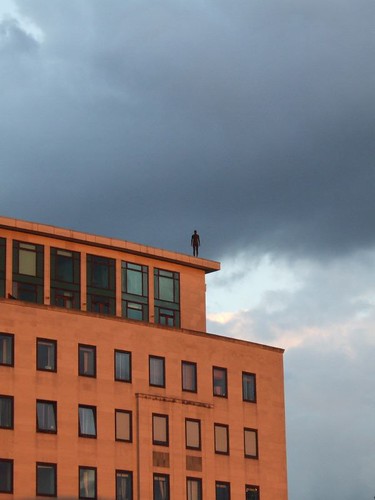
For those of you who don’t know his work—foreigners and the like—he has produced an endless series of variations of the human form; his visual signature is a blank-faced statue, standing rigid with its hands by the sides. I believe most of them are cast from his own body, but any distinctive characteristics are removed to leave a generic male form. The two works I’ve linked to above give you an idea of how he varies the basic template. To accompany the current exhibition, he has created another such installation: a number of life-size male figures, cast in bronze, positioned on rooftops and other prominent places over a 1.5 km radius, all facing towards the gallery.

0706290002, originally uploaded by domeheid.

This installation, titled Event Horizon, is a joy in itself; you start seeing the figures as you walk to the gallery, and then from the various exterior spaces of the gallery you can scan the rooftops of London to look for more of them. All these mute figures watching from the rooftops are almost rather creepy—it’s very Doctor Who—but mainly it adds a touch of magic to some very mundane buildings and creates a striking relationship between the exhibition and its surroundings.

Part of what makes it so good is the sheer scale. It must have been a major undertaking just identifying places to put them, negotiating with the owners of the buildings, and getting them into position. You could imagine an artist doing the same thing but being content to just place half a dozen figures on nearby buildings. Gormley has placed 31 figures (according to Wikipedia); some are so far from the gallery that you can’t even be certain that you’ve identified them correctly.

That commitment, I think, is typical of the artist. With someone whose work has quite such a consistent theme running through it, there’s a risk of them being a one-trick pony, but Gormley doesn’t just have lots of ideas for how to develop his basic theme; he develops and executes those ideas thoroughly. My most frequent irritation with contemporary art is when I feel that it’s under-developed. Half baked. I don’t get that with Gormley.

It helps of course that, being human ourselves, we tend to find the human form endlessly fascinating.

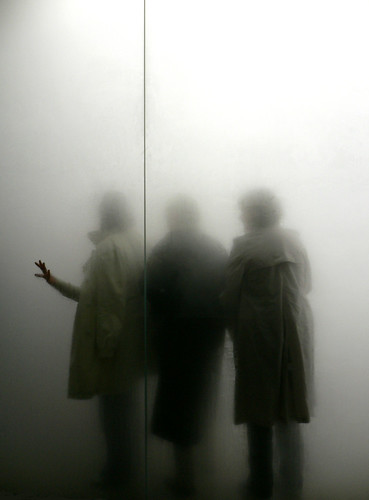
The most striking work inside the gallery is called Blind Light; it’s a glass-walled box, about 10m square, which, with the help of ultrasonic humidifiers and flourescent lights, is filled with bright white fog. Once you enter, visibility is down to a couple of feet, sound is muffled, the floor is wet underfoot; I only walked across the box and then turned round to walk back to the entrance, but still got lost enough that I had to feel my way along the wall to find the door again. Meanwhile, from the outside, you see people’s figures appear as ghostly shadows in the mist.

people in the mist

blind light by _imax, used under a by-nc-nd Creative Commons licence.

What I found most striking was the disjuncture between the immersive, disorientating strangeness of being inside the box and the relative mundanity of what it looks like from the outside. Intellectually you know what it will be like, and you can see other people stumbling around in the mist, but it doesn’t quite prepare you for actually being in there. In a sense this feels like a trick; yes, it’s an intense experience being unable to see where you’re going. Does that mean it has artistic worth or is it just a fairground ride with an arty blurb attached to it?

One point to make is the way it relates to the other work in the exhibition; the box obscures people’s individuality and turns them into shadowy versions of Gormley’s blank-faced statues. And when you’re in there, you become very aware of your own body and your relationship with your surroundings. In the same room there’s a work from 1991 called Sense, a block of concrete with a couple of holes that turn out to be just the ends of a body-shaped void in the block. A model of Gormley’s body was cast in wax, the concrete was poured around it, and then the wax melted to leave the empty space. Blind Light is like a live-action version of the same thing; everyone who walks into it carves out a body-shaped hole in the mist.

There were lots of other works as well which I haven’t touched on; this slideshow from the Telegraph gives you some idea.

*Hirst and Emin.

Categories
Culture

‘Undercover Surrealism’ at the Hayward

Going to them one after the other, it’s hard not to see the Undercover Surrealism exhibition at the Hayward as some kind of riposte to the Modernism exhibition at the V&A.

The Hayward exhibition (full title: Undercover Surrealism – Picasso, Miró, Masson and the vision of George Bataille) is about a magazine called Documents which Bataille ran from 1929-30. Bataille was most closely associated with the Surrealists – he had a falling out with the ‘official’ surrealists and was never really a surrealist himself, but that was the circle he moved in. Documents was notable for juxtaposing articles about high culture, popular culture and ethnography. So you get coverage of Stravinsky, Duke Ellington, Picasso, Dali, Buñuel, Hollywood, trashy novels, African masks, Ethiopian iconography, and the development of the horse imagery from Roman coins into the coins of the Dark Ages. To be honest I was unexcited by the prospect of an exhibition devoted to a magazine, but the curators have done a good job of tracking down plenty of the objects that were covered; so there are Miros, Picassos, Giacomettis, as well as African masks, Dark Age coins; all sorts of stuff. Including some music and film, which was a good move. Apart from the intrinsic interest of most of the exhibits, it did a good job of evoking a particular artistic moment. You can see some of the work here.

Documents existed bang in the middle of the period covered by the V&A Modernism exhibition, but while Corbusier and the Bauhaus were building their airy white machines for rational hygienic living, the Surrealists were more interested in violence, sex, fetish, blood, transgression and distortion. Here’s a typical bit of Bataille:

The slaughterhouse is linked to religion in so far as the temples of bygone eras (not to mention those of the Hindus in our own day) served two purposes: they were used both for prayer and for killing. The result (and this judgement is confirmed by the chaotic aspect of present-day slaughterhouses) was certainly a disturbing convergence of the mysteries of myth and the ominous grandeur typical of those places in which blood flows. In America, curiously enough, W. B. Seabrook has expressed an intense regret; observing that the orgiastic life has survived, but that the sacrificial blood is not part of the cocktail mix, he finds present custom insipid. In our time, nevertheless, the slaughterhouse is cursed and quarantined like a plague-ridden ship. Now, the victims of this curse are neither butchers nor beasts, but those same good folk who countenance, by now, only their own unseemliness, an unseemliness commensurate with an unhealthy need of cleanliness, with irascible meanness, and boredom. The curse (terrifying only to those who utter it) leads them to vegetate as far as possible from the slaughterhouse, to exile themselves, out of propriety, to a flabby world in which nothing fearful remains and in which, subject to the ineradicable obsession of shame, they are reduced to eating cheese.

That’s one of the entries from the Critical Dictionary that was a feature of Documents. Somehow I don’t think Bataille would have agreed that less is more. Even the ethnographic stuff feels rather fetishised – even though it is a serious and intelligent effort of early ethnography, there are enough hints through the exhibition to suggest that Bataille’s interest in black people was basically sexual. Mind you, he seems to have found most things sexual. The surrealists, of course, were also a key part of de Sade’s reinvention as an important literary figure; it was that moment when Freud was seen as validating everyone’s sexual quirks, and the quirkier the better.

It’s tempting to see the two things – Corbusier on the one hand and Dali on the other – as somehow two sides of the same coin, or each as necessitating the other. Or at the least as products of the same forces; of the Great War, and a moment of cultural and historical instabiity when everything was up in the air and no-one quite knew where the world was going. As Yeats put it in 1920: The best lack all conviction, while the worst are full of passionate intensity. Perhaps it’s unwise to insist too much on the historicity of it, though. There are probably always some people who are minimalists by temperament and others who are surrealists.