Categories
Culture

London Film Festival: Target and Tahrir 2011

The last two films I went to see at the LFF were Target, a Russian film directed by Alexander Zeldovich, and a documentary abou the recent Egyptian revolution called Tahrir 2011: The Good, the Bad, and the Politician.

They don’t have distribution for Target in the UK at least, so I don’t know how likely you are to get to see it, but if you’re the kind of person who cares about such things I should warn now: SPOILERS.
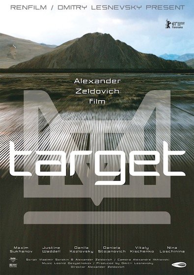
Target is science fiction, from the philosophical end of that genre rather than the lasers and bug eyed monsters end. It’s set in a near future which is described in the LFF catalogue as ‘dystopian’, although I’m not sure that’s quite right: it’s quite hard to tell exactly what kind of society they live in, because the focus is quite narrowly on a group of wealthy Muscovites. There’s some sign of serious wealth inequalities, government corruption and a trashy media culture; but by those standards, Russia is probably a dystopia already. There are also hints of some kind of odd, bureaucratic, government enforced social hierarchy, but it’s never really explained in detail.

The film centres around a group of people who go out to a site way out in the Russian steppes to have a treatment which is supposed to be rejuvenating; it becomes apparent that the treatment actually stops ageing altogether, but it also makes them slightly mad: full of energy but manic and impulsive. Most of them self-destruct, including two who die and two who have to flee the consequences of their actions.

There were things to like about the film: it often looks great, for a start. One of the characters works as customs on a massive 12-lane motorway packed with heavy goods vehicles travelling between Europe and China, which looks spectacular on screen. And the landscape out on the wilds were they get the treatment looks amazing too, especially in the final shot of the film which is stitched together out of three separate shots, the first of which is, they think, the longest single tracking shot in cinema history. And there are some nice set pieces, including scenes of a trashy celebrity cooking show, manically presented by one of the main characters.

And I rather liked the fact that the film had unlikeable characters and a shortage of happy endings. Although that fact is only noteworthy because the bulk of commercial cinema is quite so incredibly conventional and limited.

But in the end 2½ hours was too long. It almost always is, really; at least at the theatre you get an interval so you can stretch your legs and relieve your bladder. Not that it was a slow film — it’s not 150 minutes of meaningful silences, thank God — there was just a lot of material. Too many subplots. And so by the end I was losing concentration and finding my stiff buttocks increasingly distracting.
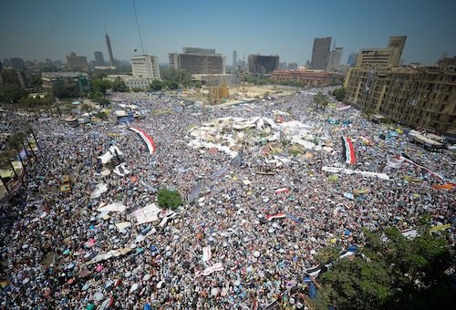
Tahrir 2011 is actually three documentaries made by different people and stitched together — hence The Good, The Bad, and the Politician. The first of them, ‘The Good’, is a fairly nuts and bolts telling of what happened in Tahrir Square this spring, which combined interviews with people who took part and lots of footage filmed at the protests. It’s a fairly conventional documentary, but the events were so amazing that it is riveting to watch. Fascinating and moving.

‘The Bad’ is made up of interviews with members of the police and security services, asking for their account of what happened. Potentially that’s a fascinating subject, but it’s less successful than it could be because they obviously found it very difficult to find anyone willing to talk to them — some of the interviews are conducted in silhouette — and the interviewees are obviously very conscious of finding themselves on the wrong side of history, so they are understandably cagey and defensive.

‘The Politician’ is a portrayal of Hosni Mubarak, framed as an attempt to find out how someone who came to power as a liberal, reforming figure ended up as a dictator. It attempts to present it in a fairly tongue-in-cheek, jokey way, broken into a list of ten items with little animated inserts between them, like a Channel 4 list program. But it doesn’t really come off, and by the end I was falling asleep.

» The photo ميدان التحرير يوم الجمعه ٢٩-٧-٢٠١١ is some rights reserved by أحمد عبد الفتاح Ahmed Abd El-fatah.

Categories
Culture

‘Rodchenko & Popova’ at Tate Modern

I went to ‘Rodchenko & Popova: Defining Constructivism’ at Tate Modern today. I’ve seen quite a few exhibitions in the past few years that feature Aleksandr Rodchenko*, so I wasn’t really sure how much I would get out of it, but in the event I enjoyed it. Firstly I didn’t know anything about Liubov Popova, and also they had a couple of rooms of paintings, which I certainly hadn’t seen many of before.

I think they were much better designers than painters, mind you — the paintings look like rather generic examples of early geometrical abstracts, to me — but it was still interesting to see them. And the graphic design work they had on display seemed to be a different selection from what I’d seen previously. So that was all good.

The Tate’s exhibition website doesn’t have much stuff on it — I’ve used most of the pictures in this post — but curiously enough, when I was looking for pictures, Google threw up the Tate’s Immunity from Seizure page which, currently as least, is full of (rather tiny) pictures of work from the exhibition. If you’re curious:

Part 6 of the Tribunals, Courts and Enforcement Act 2007 provides immunity from seizure for cultural objects which are loaned from overseas to temporary public exhibitions in approved museums or galleries in the UK where conditions are met when the object enters the UK.

Or you could check out this page of Rodchenko stuff from Howard Schickler Fine Art in New York, or this from MoMA.

Incidentally, I was interested to note that they’ve started using touchscreen iPods for their multimedia guides. Last time I got an multimedia guide at the Tate, it was on a Windows Mobile-fuelled piece of crap of some kind and it annoyed me so much that I complained about it at some length afterwards. I didn’t try the guide today, so I can’t offer a comparison, but it seems like a move in the right direction.

* There was an exhibition of his photography at the Hayward; at one stage the Tate had a room displaying his photomontages for USSR in Construction; he also featured in the V&A’s Modernism exhibition and the British Library’s exhibition of printed material from the European Avant-Garde.

» both pictures from the Tate website; the top one is Liubov Popova’s Painterly Architectonic, 1918, and the bottom is Aleksandr Rodchenko’s design for an advertisement for the Mossel’ prom (Moscow agricultural industry) cafeteria, 1923.

Categories
Culture

Prokudin-Gorskii photographs

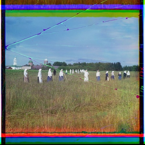
I’ve actually linked to these before, but a post over at i heart photograph reminded me about them and I was browsing through them again. Sergei Mikhailovich Prokudin-Gorskii was a Russian photographer taking colour pictures in the years before the Great War. He took three black and white negatives of each subject using different coloured filters, then reassembled them using a projector and coloured light.

The Library of Congress have used a digital version of this process to recreate the images and have put them online. The one above is a harvest scene from 1909, but also check out i.e. Woman in Samarkand, dog, Siberian scenery, Georgian woman in national costume. [as Jean points out, those links don’t work: you’ll just have to browse the collection]

I find the particular aesthetic of the lurid coloured borders as appealing as the subjects, though those clearly have historical and ethnographic interest. 

Categories
Culture Other

‘From Russia’ at the Royal Academy

This is a seriously impressive exhibition. The full title is ‘From Russia: French and Russian Master Paintings 1870-1925 from Moscow and St Petersburg‘. It starts with a little room of Russian paintings from the start of that period; then you get a whole load of French paintings that were collected by two Russian art collectors, Ivan Morozov and Sergei Shchukin, and are now divided between various Russian state museums; then the rest of the show is of Russian paintings again, which are more or less heavily influenced by the French work.

The French section includes major works by most of the biggest names in French art — Renoir, Monet, Cézanne, Van Gogh, Gauguin, Matisse, Picasso, Rousseau, Bonnard — whereas with a couple of major exceptions in Chagall and Kandinsky the Russian artists are less familiar. It makes for a good combination; the French artists are immediately enjoyable while the Russians, simply because they are less familiar, require a bit more evaluation.

My favourite painting was probably Matisse’s Harmony in Red:

Harmony in Red by Matisse

Apparently, when the collector bought it at a Paris show, it was all blue instead of red, but Matisse asked to hang on to it for a few weeks because he wanted to tweak it. It must have been a bit of a shock to open it up and find it had completely changed colour.

Of the Russians: there were lots I quite liked including, unusually for me, the two Chagalls. Among the people I was with the most popular choice for a painting to take home would be Altman’s portrait of Anna Akhmatova. I think I’d probably take one of the three Malevich paintings called Black Square, Black Circle and Black Cross which are just black shapes on white backgrounds. That kind of geometrical minimalism is a bit mysterious: sometimes it works and sometimes it doesn’t. Those ones worked, for me, though I’d be hard pressed to explain why.

This exhibition has an obvious relevance to the whole modernism and politics discussion, since Russia went through an immensely creative period in art and architecture for the first two decades of the C20th, and for a while after the revolution this radical art was embraced by the party; but then the regime ruthlessly crushed it. Artists may have supported radical politics, but politicians didn’t necessarily support radical art. A dislike of ‘decadent’ art was one of the things Hitler and Stalin had in common.

» The Matisse image is from the Artchive.

Categories
Culture Other

Stalin: The Court of the Red Tsar by Simon Sebag Montefiore

Stalin: The Court of the Red Tsar is a biography of Stalin, focussed on his domestic life and the tightly-knit group of people around him: his own family, and politicians, bodyguards, and their families.

As a piece of history, it’s very impressive. It’s clearly the result of a huge amount of research by Montefiore: he seems to have personally interviewed just about every living relative of the major figures, quite apart from the endless reading of archives and memoirs that must have been involved. As a casual reader I found it slightly hard going at times. I didn’t do it any favours by largely reading it in bed at night, but even allowing for that, I found it hard to keep track of all the people involved. I found I was having difficulty remembering which was which even of the most important figures, like Molotov, Mikoyan and Malenkov.

I don’t know if that’s an inevitable result of a book with quite so many people in it — it’s not a subject I’ve read about before, and all the unfamiliar Russian names didn’t help — or if it’s my fault for reading it while drowsy, or if there’s more Montefiore could have done to fix the various people in my mind. I didn’t find I got much sense of their various personalities that would have helped me keep them separate. Still, what I did get was a strong sense of Stalin himself, and his trajectory from a charming (though ruthless) young man living an almost campus lifestyle at the Kremlin, surrounded by the young families of his colleagues, to a sickly, garrulous old despot wandering nomadically from dacha to dacha and living in a vortex of terror and awe.

But even a sense of what Stalin was like to live and work with doesn’t get you much closer to understanding his motivations and the motivations of people around him. Was it just about power or did he believe to the end that he was acting in the interests of Russia and the party? The inner clique around Stalin clearly knew at some level that all the denunciations and show trials were arbitrary and could attach to anyone: they saw the process happen over and over again. And when colleagues they had known for years confessed to ludicrously unlikely accusations, they surely can’t have believed it. But the things they said and wrote suggest that at the same time they sort of did believe it, and remained theoretically committed to the ideology to the end. It made me inclined to reread 1984, because the concept of ‘doublethink’ is so startlingly apt.

In some ways the Stalinist purges are even more incomprehensible than the Holocaust. The Holocaust at least has a kind of simple central narrative: an attempt to exterminate the Jews. It fits into a thousand year history of European anti-Semitism as well as a broader human history of racism and genocide. The purges don’t offer any kind of similarly clear story: at different times they focussed on different things. It might be a whole social class, a profession, an ethnicity, or it might start with one or two individuals that Stalin was suspicious of and spread out through their colleagues and families to take in hundreds of people. Targets included kulaks, engineers, doctors, army officers, Poles, Jews, ethnic Germans, Chechens, Estonians, Latvians, Ukrainians, Koreans: in fact any ethnic minority that could provide a possible focus for dissent. The total number of deaths, including not just those executed but those who died in slave labour camps or famine, is disputed; but 20 million is apparently a plausible ballpark figure.

At one stage Stalin was setting two quotas for the different regions: the number to be shot and the number to be arrested. These numbers were in the tens or hundreds of thousands, but the regions were soon writing back and requesting that their quotas be extended — out of ideological zeal? In an attempt to demonstrate their loyalty? Or just because these things have a momentum of their own?

It’s a staggering story and despite the slight reservations I expressed earlier, this is a very impressive book.

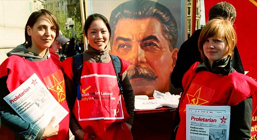
» The photo, Posing for communisim, was posted to Flickr by famous boxer and is used under a by-nc-nd licence. It was taken at the 2006 May Day protest in London and shows members of the Communist Party of Great Britain (Marxist-Leninist). The CPGB-ML website has a link to the Stalin Society, “formed in 1991 to defend Stalin and his work on the basis of fact and to refute capitalist, revisionist, opportunist and Trotskyist propaganda directed against him.” Which just goes to show… well, I don’t know what, really.

Categories
Culture

‘Alexander Rodchenko’ & ‘Laughing in a Foreign Language’ at the Hayward

I went to the Hayward today to see an exhibition of the photography of Alexander Rodchenko; the price of the ticket included entry to a show called ‘Laughing in a Foreign Language’, a exhibition which “investigates the whole spectrum of humour, from jokes, gags and slapstick to irony, wit and satire.”

It was a pleasure to go to an exhibition of contemporary art and find that the gallery was filled with the sound of joyful laughter.

No, not really. The humour on display was not generally of the kind that would win the artist a long engagement at the Glasgow Empire. Which is fine; work can be gently humorous or ironic or whatever without being laugh-out-loud funny. But for an exhibition themed around humour, it was a curiously deadening event.

Perhaps something like the Glasgow Empire would be a salutary experience for a lot of contemporary artists: having to cope with failing miserably and visibly in front of a sceptical audience. Perhaps then they would tighten up some of their work so it was a bit more punchy. Can there really be many 30 minute video works that couldn’t be cut down to 20 minutes?

Lili Brik

I preferred the Rodchenko exhibition. Rodchenko was a photographer/graphic designer in the USSR in the 20s and 30s; I didn’t know a great deal about him beyond what was featured in the recent BBC history of photography. As far as I can see his most remarkable work was in publications like [I may have the title slightly wrong] The USSR in Construction which combine his photography with typography, photomontage and graphic design to produce something really incredible.

But that aesthetic rapidly fell out of favour with the government, who liked to micromanage all aspects of culture; Rodchenko was accused of ‘Formalism’ and had to find less radical outlets for his creativity. So he switched to a more straightforward kind of reportage. Perhaps most intriguing now are the most Soviet subjects, like the May Day parades and athletic demonstrations.

One aspect of the Rodchenko exhibition which I found interesting was the prints, which had quite a limited tonal range; I know I’ve seen more vibrant versions of the same pictures before. I guess the difference is down to the technological limitations of the older printing process—generally silver gelatine prints—rather than anything else, but it’s an intriguing curatorial question: do you present someone’s work as they produced it, or how you think they would have produced it given the chance? I suppose in a gallery authenticity trumps other considerations so you just post the originals.