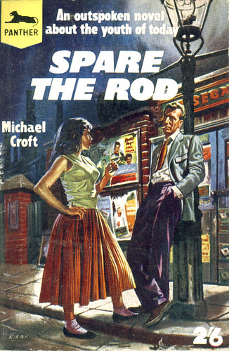
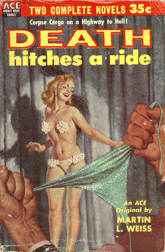
Flickr set of the week is sleazy reads by trevira. I particularly love the tagline on the second one.
Flickr set of the week is sleazy reads by trevira. I particularly love the tagline on the second one.
Core77’s design blog led me to this article about form vs. function in mobile phone design. The title of the article says it all: Is the ‘dumb blonde’ phone here to stay?
In this context, a ‘dumb blonde’ phone is one which looks pretty but lacks functionality. I can understand why someone thought that was a good gag, but it completely misses the point. It assumes that people actually want all the added functionality of web-browsing, email, multimegapixel cameras, Bluetooth, music playback and God knows what else; that they’ve sacrificed something by choosing a stylish phone instead. But perhaps they haven’t. Perhaps they just want to make phone calls and send texts. Here’s a paragraph whose stupidity makes it worth quoting in full:
Andrew Brown, IDC’s European mobile devices programme manager, said the operators and manufacturers have played their part in the dumbing down. “Everyone gets very excited about aesthetics. It’s easier to sell design than it is to sell feature functionality – it’s laziness.” Good looks are immediately apparent to the average buyer – the benefits of having 3G connectivity or a smart operating system are not.
Which inevitably reminds me of the equally stupid quote from Sim Wong Hoo I blogged about earlier. Sim, as the CEO of Creative, was completely failing to learn the obvious lesson about iPod thrashing his products in the marketplace. The same lessons apply to mobile phones.
Here’s the first point: to choose a simple, attractive phone over an ugly but hi-tech one is not an irrational choice. It seems like such an obvious point that I can’t quite believe I have to explicitly say it, but I suspect I do. There’s a bizarre prejudice against aesthetics in the tech community, as though the pleasure in using an object you actually like is somehow an illusion, a deceit, and something of no value. Now if that’s how you feel, then fair enough. Good luck to you. Go and buy the most function-filled gadget, or the one which gives you most oomph per dollar, and ignore design issues completely. But if you want to sell gadgets to the non-geek community, you have to learn that people like to own nice things.
We’re not talking about a once-in-a-lifetime purchase: a mobile phone costs about as much as a handbag. Why on earth shouldn’t it be a fashion item?
Here’s the second bizarre prejudice: that added functionality adds value. This is the mentality that produced the much-mocked ballpoint pen with clock that used to be a staple of Innovations catalogues. Functionality you don’t want doesn’t add value, it reduces it. Even if it doesn’t interfere with the main function of an object, it makes it more complicated, which is a Bad Thing. I only use my mobile for phone calls and texting; so for me, all the other menu options are just unnecessary rubbish I have to scroll past to find what I want. By all means make a Swiss Army Knife phone with a tool for getting the stones out of horses hooves; just don’t expect me to buy one.
But the real problem, the one that underlies the others, is a belief that design is something you put on at the end, a lick of paint to pull in the stupid, style-obsessed consumer who somehow doesn’t appreciate the wonderful functionality you’re giving them. But design, properly, is not superficial. It deals with every aspect of the user’s experience of the product, down to the number of button-presses to perform an action and the obviousness or otherwise of how to do it. If a product is badly designed (or just as likely, not really designed at all), if it doesn’t try to make it easy for the user, then it’s a bad product, however many features it has.
My father has a PVR/DVD recorder that makes the perfect case study. When he got it a couple of years ago, it was the bleeding edge of the technology. And to be fair, it has proved itself to be a brilliant step forward from the VCR – no more scrabbling around for blank tapes, no difficulty trying to find what you recorded earlier. The basic concept of recording TV on a hard drive is superb. But despite that, I’ve come to actively dislike it. Because it was obviously put together by people who put all their effort into providing a certain set of features none of it into the user experience.
First example: pretty much everything you would need to do with the machine can be done, as you’d expect, by pressing buttons on the remote and using onscreen menus. But if you want to stop a timer recording, you have to press the stop button on the front of the machine twice. That’s completely unguessable, and easily improved upon; when someone presses ‘stop’ on the remote, just give them an ‘are you sure?’ message. Second example: despite the fact that even slightly complicated functions are managed through onscreen interfaces, the remote has 76 buttons. I don’t know what the right number is, but I’m damn sure it’s less than that. It also came with three separate manuals — an outline of the basic functions, a hideously complicated full manual that explained every possible function badly, and something in-between because, presumably, they realised the other two were both crap.
I’m conflating two meanings of ‘design’ here, attractiveness and usability, and of course they aren’t the same thing. Indeed, products often sacrifice usability for aesthetic appeal. What they have in common, though, is that they both make the product more likeable. They give pleasure. But pleasure is intangible and unmeasurable, so it’s all too easy for people to undervalue it, or just to pay lip-service to it. Because the thing is – good design is hard. It takes a lot of time, effort and commitment, an endless appetite for details and a deeply stubborn perfectionism. A company is never going to get it right if, deep down, they think of design as superficial.
The V&A seems to have put lots more of their stuff online since I last looked, and it’s all searchable. I wondered if there was a photo of the terracotta Virgin Mary and Child I wrote a poem about a few years ago, but it seems not. Lots of other good stuff though, like this C15th English alabaster carving of Saint Michael Attacking the Dragon and Weighing a Soul that was lucky enough to survive the vandalism of the Reformation.
I don’t know why I’m posting these really. Certainly not because I claim any merit for them. Still, as with NaPoWriMo, the exercise of writing to a time limit is quite interesting, I think. The need to get something written makes you work with material that, rightly or not, you would normally have rejected out of hand. And the poems have a habit of wriggling away from you in the process of being written.
Writing poetry is always a kind of negotiation – between what you intended to write about, what you can get to work as poetry, and what emerges in the process of writing. Speed-writing just exaggerates that process and leaves it undigested on the page.
It doesn’t help that I’m out of practice. I’m sure if wrote a quick sonnet every day for a fortnight they’d start getting a bit slicker. This one took me 25 minutes. I made a point of doing it in (almost entirely) proper IP this time.
Somewhere a man is lying on a bank
of grass, watching the swallows overhead.
All he can see is blue; the green and dank
entangled grass and thistles round his head
cannot impinge upon his dreams of flight.
He thinks of nothing, but simply follows
the swoop and flicker, finds himself as light
and dancing as the flightpaths of the swallows.It tempts, that casual riding of the air,
it seems to hint at better ways of being;
we want to know that simple empty grace.
But still, remember if you stop and stare;
to see just one thing is to be unseeing.
We need to feel the thistles at our face.
Down to 12 minutes, this time.
They sing of eels;
the fishmongers trill their local songs
and try to drown the spiels
of sellers of deceptive pongs.
The three-card trickers
hope to draw the punters from
the stall that sells the polyester knickers;
and little acned Tom
with his knock-off Louis Vuitton
hopes to get the cash
of those who know it is a con
but are willing to be fakely flash.
All of human life is here, and loud.
You should be proud.
This was my go at Rob’s quick sonnet challenge. In the event it took me about 26 minutes, which isn’t very good considering that the the classic challenge is 15 minutes.
The hiss of pebbles on a shingled beach,
the stranded bladderwrack, the grey
sea-holly, hard against the spray,
the oystercatchers calling each to each.Where men are afterthoughts,
where cows have never grazed or hedges grown,
where gardens are driftwood and stone,
where ploughs would blunt against the quartz.It is not cosy here.
It does not feel secure;
we feel some inkling of the ancient fear
in the waves on the shore.
In the grating of stones underfoot we can hear
an opening door.
I quite like the ploughs line and the final image, but the rest is pretty generic.
You’ll notice that it’s metrically a bit peculiar. I did at one point have the first eight lines in IP, but the sestet really wanted to be shorter lines and I just thought wotthehell. And once I’d stopped being metrically regular I went back to the octet and pruned out some bits.
On the occasions when I do sit down to try and write metrical poetry, I increasingly find myself drawn to shorter lines – trimeter, tetrameter – and to changing line lengths. Ballad meter and suchlike (of course even that doesn’t explain the outbreak of anapests at the end). The discursiveness and unmusicality of sustained IP just doesn’t appeal to me at the moment.
Not that IP is inevitably discursive or unmusical but, fairly or not, that’s how I feel about it at the moment.