Here are some direct quotes from leaflets delivered in this constituency:
Labour leaflets: ‘Only Labour can keep the Tories out here’ ‘It’s a straight choice between Labour and the Tories round here’
Lib Dem leaflet: ‘Only the Lib Dems can beat Labour here’
Conservative leaflet: ‘Only the Conservatives can beat Labour here’
All of them accompanied by bar charts that purport to show why their party is the only one that can fend off the dreaded enemy.
It’s not exactly inspiring to have politicians try to win your vote in this way. It doesn’t do much to counteract people’s disenchantment with politics. But more sinister is the fact that at least two of those statements are in direct contradiction with each other. In other words, someone is telling porky pies.
In fact, when you read their explanations carefully, it is hard to pin down any statements of fact which are outright falsehoods; but all of them are, I would say, intentionally misleading.
The actual situation is that this constituency has been a Labour seat since 1992, and at the last election the vote split like this:
45% Labour
24% Lib Dem
22% Conservative
7 % Green
The boundaries have changed slightly, but the best guess is that it won’t make much difference; it is almost certainly a safe Labour seat, but with the Lib Dems and Conservatives pretty much equal in second place.
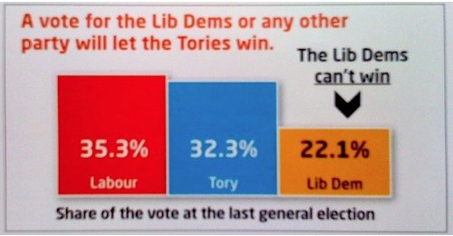
The statement which comes closest to being true is ‘Only Labour can keep the Tories out here’. If your main priority is keeping out the Tories, then a Labour vote is the safest option. On the other hand, the statement ‘It’s a straight choice between Labour and the Tories round here’ is pretty close to an outright lie. And it is illustrated with a shocker of a graph:

Yup, that’s right, a local election leaflet showing the ‘share of the vote at the last general election’, and it’s not using the votes cast in this constituency, but the national vote share. Classy.
And the Lib Dems and the Conservatives directly contradict each other. So who’s lying? Well, both of them. Since they both got about the same number of votes last time, it is completely unclear who has more chance to overtake Labour this time. The Lib Dems have gained more in the polls since 2005 than the Tories have, but how it is likely to play out in particular constituencies is totally unknown.
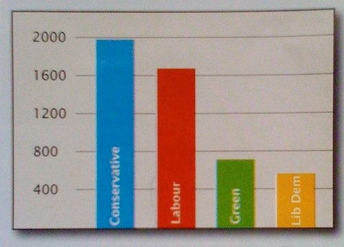
And yet both leaflets have clear bar charts showing why they are the ones to vote for! The Conservative leaflet even has the Lib Dems in 4th place behind the Greens:

And when you look closely, that’s because the chart illustrates the vote for each party’s leading candidate in the council elections to one electoral ward in 2006. Only the leading candidate, out of three, in only one ward out of the eight that make up the constituency. The chart is accurately labelled, but incredibly misleading on a leaflet which is mainly about the parliamentary candidate.
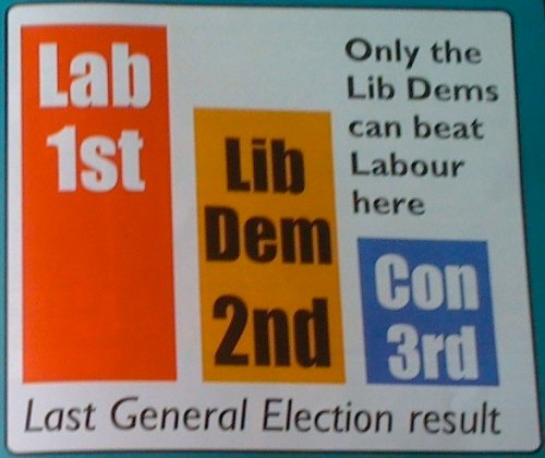
The Lib Dem leaflet uses a less ridiculous but still dubious trick: it shows what purports to be a ‘bar chart’ which illustrates the last general election result in this constituency:

But it’s not really a graph in the mathematical sense at all: the length of the bars is not proportional to the number of votes cast. An accurate chart would have the yellow and blue bars almost exactly the same height, both about half the height of the red bar.
What’s most depressing about this is that it is completely normal. This is how British elections are fought, all around the country, every time. Tactical voting is so deeply engrained in our political culture that we expect to have to vote negatively, and candidates consistently bend the truth to present themselves as the tactical vote of choice.
I am sick of it. I just want to make a choice based on policy and vote accordingly.
