Categories
Culture Other

‘Sacred’ at the British Library

I went yesterday to see Sacred at the British Library. I nearly missed it; the exhibition closes at the weekend. I’m glad I didn’t, as it was extraordinary.

Maghribi script

It’s an exhibition of sacred texts from Islam, Christianity and Judaism, and the selection is seriously impressive. For example, the show includes the Lindisfarne Gospels and a bit of a Dead Sea Scroll as just two exhibits among many. They also have one of the two oldest Christian bibles, from the C4th, an C8th Qur’an, the first printed Mishnah, Henry VIII’s psalter, copies of the Qur’an made for various sultans, a Tyndale New Testament and so on. They haven’t even bothered to include a copy of the Gutenberg Bible, presumably because they have one of those on display in their permanent exhibition anyway.

The Holkham Picture Book

Staggeringly, with a very few exceptions like the Dead Sea Scroll, all these books were part of their own collection. It’s odd to think of all these books, culturally interconnected but originally separated by many centuries and thousands of miles, having made their way, by who knows what means, from monasteries and mosques in Syria, Armenia, Ethiopia, India; and all ending up in a basement in North London.

Micrographia

Whatever my disagreements with religion, I do feel a reverential instinct towards ancient artefacts and books, so I had no difficulty feeling a sense of the sacred. And many of them are extraordinary objects in their own right. I have a new-found passion for Syriac script.

Syriac writing

There are zoomable high-resolution images of 67 of the texts available on the website, so those of you who can’t make it London this week can take a look. That’s where all the images illustrating this post came from. I have to say, generally, kudos to the British Library; all the exhibitions I’ve seen there have been excellent (and free).

» Pictures, from the top: 1) An example of Maghribi script from a C13th Spanish Qur’an. 2) One of the people drowned in the Flood in the C14th Holkham Bible Picture Book. 3) Micrographic decoration (i.e. made up of tiny writing) from The Duke of Sussex’s German Pentateuch, c. 1300. 4) The bible in Syriac, dated by the scribe to 463/4 AD.

Categories
Culture

‘Crafting Beauty in Modern Japan’ at the BM

I went to see Crafting Beauty in Modern Japan at the British Museum last week.

The exhibition presents works by members of the Japan Art Crafts Association (Nihon Kōgeikai), many of them designated ‘Living National Treasures’ in Japan, a title conferred by the Japanese government on exemplary individuals who carry on Japanese traditions.

In other words, it was lots of contemporary – or at least C20th – Japanese ceramics, kimonos, lacquer, metalwork and so on. There’s a wide range of techniques on display; the ceramics include stuff which is artfully rough-hewn as well as things which are finished to within an inch of their life; the kimono fabrics are a mix of tie-dyed, woodblock-printed, embroidered and woven. I didn’t find the items on display universally covetable; many were just not to my taste. Many of them wouldn’t have particularly stood out in a jumble sale, to my ignorant eye. I don’t think the lighting helped, mind you; it was perfectly competently lit, but I think most of them would have benefited from natural light. Others were absolutely gorgeous.

The things that appealed most to me were the lacquer and the woven kimonos. I find lacquer an incredibly tempting material; I can’t see it without wanting to pick it up and stroke it. Even just the plainest matte red and black lacquer rice bowl is a delight; I wish now I’d picked one or two up when I was in Japan, but the good ones seemed so expensive that I didn’t. The woven kimono fabrics were made with a technique called kasuri, which is the Japanese name for what I would usually call ikat. That is, the threads are tie-dyed in advance so that they form a design when woven together. Because the colour on the threads never quite lines up precisely, it forms soft-edged patterns which I find very attractive. They were mainly dyed with indigo for that classic blue and white Japanese look.

The BM website doesn’t offer any photographs, so I can’t easily illustrate any of my prejudices, but this website devoted to Japanese pottery and this virtual museum of traditional Japanese craft have plenty of pictures of the sort of thing in the exhibition. Those sites also demonstrate that even a passionate interest in visual arts doesn’t necessarily get carried over into web design. This tea bowl is from the second of those sites:

Tea bowl, Shino ware

Generally I’m slightly ambivalent about the Japanese attitude to art and craft. One is always told that the Japanese make no distinction between the two; and in some ways I find that a deeply admirable attitude. What’s great about it is the value placed on the making of beautiful things. Not just that there is a cultural and monetary value placed on beautiful objects, but that the job of making them is treated as a serious and important business. Curiously enough, I think the closest analogue in Western culture is the respect given, not to craftsmen, but to designers – Christian Dior, Charles Eames, Charles Rennie Mackintosh, Hermann Zapf – who, if not exactly household names, are still remembered in a way no hands-on practitioner is. Not that the craftsmanship of the Japanese is at the expense of being designers; they are more like designer-craftsmen in the William Morris tradition. To some extent they are even descendants of that tradition, since Morris was surprisingly influential in Japan.

I think we should all hope to live our everyday lives surrounded by well-designed and well-made things, and one part of achieving that is giving due respect to the people who design and make them. So I think that is a Good Thing. My ambivalence about it arises from the fact that actually I do think there is an important distinction between design and art. I don’t think that an earthenware sake jug, however exquisitely glazed, has the potential to be a great artwork in the same way as a Rembrandt or an El Greco. When I was living in Japan I went to few galleries of Japanese art, and a few exhibitions of ceramics, and I saw some lovely things; but I tended to think that flip-side of granting importance to craftsmen was a tendency to reduce the likelihood of producing an El Greco. All art seemed to be pitched at the level of the decorative arts. I’m wary of expressing that sentiment, because I know I’m an outsider with an extremely superficial knowledge of Japanese culture, and I think of the beautiful work of Hokusai and Hiroshige which would seem to cast doubt on my theory, but that’s how I felt.

The other slight concern is the essential conservatism that the attitude can produce. Not that Japanese culture has any shortage of modernity; but it can seem a little schizophrenic. There’s a risk that the admiration for design and craftsmanship in something like a kimono gets put into a tidy mental compartment and held separate from the manufacture of MP3 players, kettles and apartment blocks. I guess though that that tension between tradition and innovation is a separate issue, really; the important thing is to value well-made, beautiful things and not to treat them as disposable.

Anyway, I’d recommend the exhibition. And if you’re visiting the British Museum for any reason, I’d suggest having lunch at Bi-Won, a Korean restaurant on the intersection between Coptic Street and New Oxford Street. It’s very reasonably priced, the food is tasty and it’s very close to the museum.

Categories
Culture

Dutch Portraits at the National Gallery

I went to see Dutch Portraits: The Age of Rembrandt and Frans Hals yesterday. It was pleasantly quiet; I guess the prospect of lots and lots of paintings of men in black suits with white ruffs and little pointy beards doesn’t produce a frisson of excitement in your average Londoner.

And from that point of view, the exhibition is very much what you would expect; there are no startling surprises. There are some very good paintings though.

bit of Rembrandt

Whenever I go to an exhibition with a couple of named artists in the title, I tend to find myself treating it as a competition; Rembrandt vs. Frans Hals. I think it’s a very high compliment to Hals that for much of the exhibition, they’re neck and neck. It’s only when you get to the late Rembrandts that it becomes completely one-sided, but then those late Rembrandt portraits are, I think, among the finest works in the history of art. Of those I haven’t seen in the flesh before, the most remarkable is the incredible group portrait of the syndics (officials of the Draper’s Guild) which I’ve included a little section of above.

Still, I know Rembrandt’s work quite well, and several of his paintings on show here are part of the National’s permanent collection—notably the portraits of Jacob Trip and Margaretha de Geer. So for me the exhibition was more about discovering Hals, who I really only knew from the ‘Laughing Cavalier’. His most typical portraits are strikingly informal; one of the portraits has his subject leaning right back with his chair balancing on the just the back legs. That ability, to portray people looking relaxed and natural, is a good trick in itself, but he was also very good at using loosely handled paint to suggest textures: skin, of course, and almost as vital for the C17th portraitist, silk, satin, brocade, embroidery and lace. All those black clothes may have been superficially intended as a sober, modest reflection of a conservative Protestant culture, but with the lushness of the fabrics, the effect is no more humble than a little black Versace dress.

bit of Hals

Oddly enough, for a long time, I vaguely thought that The Laughing Cavalier (which isn’t the picture above; that’s part of the wedding portrait of Isaac Massa and his wife) was a Victorian painting. Obviously it’s not of a man in Victorian dress, but I vaguely thought it was a bit of C19th pastiche. I can still sort of see that in Hals’s paintings; often the informality has a kind of theatrical quality to it—cheesiness would be unfair, but I’m hinting in that direction—which is reminiscent of C19th narrative paintings. Certainly it doesn’t surprise me to learn that his reputation was re-established in the C19th after a period of neglect; I can see he would have been to their taste. I wouldn’t want to over-stress that comparison, though, because I can’t stand Victorian painting and Hals is much better than that.

I’ve mainly talked about Rembrandt and Frans Hals, but there were also some lovely paintings by other artists, most of whose names I’ve already forgotten. These exhibitions organised around a period always serve as reminders that for every famous artist there are dozens of very very good artists whose names are familiar only to specialists. Still, painters probably get treated better than poets by posterity, because the scarcity of original paintings lends value to work even by minor artists.

Categories
Culture Other

Anthony Gormley at the Hayward

Last week I went to Blind Light, the Gormley show at the Hayward. Gormley must be the third most famous artist in Britain, I should think*, particularly on the back of two spectacular public works: Angel of the North and Another Place.

For those of you who don’t know his work—foreigners and the like—he has produced an endless series of variations of the human form; his visual signature is a blank-faced statue, standing rigid with its hands by the sides. I believe most of them are cast from his own body, but any distinctive characteristics are removed to leave a generic male form. The two works I’ve linked to above give you an idea of how he varies the basic template. To accompany the current exhibition, he has created another such installation: a number of life-size male figures, cast in bronze, positioned on rooftops and other prominent places over a 1.5 km radius, all facing towards the gallery.

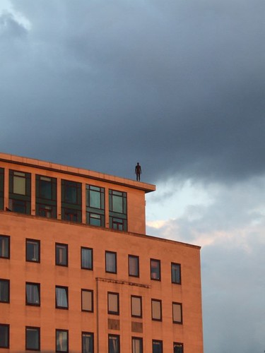
0706290002, originally uploaded by domeheid.

This installation, titled Event Horizon, is a joy in itself; you start seeing the figures as you walk to the gallery, and then from the various exterior spaces of the gallery you can scan the rooftops of London to look for more of them. All these mute figures watching from the rooftops are almost rather creepy—it’s very Doctor Who—but mainly it adds a touch of magic to some very mundane buildings and creates a striking relationship between the exhibition and its surroundings.

Part of what makes it so good is the sheer scale. It must have been a major undertaking just identifying places to put them, negotiating with the owners of the buildings, and getting them into position. You could imagine an artist doing the same thing but being content to just place half a dozen figures on nearby buildings. Gormley has placed 31 figures (according to Wikipedia); some are so far from the gallery that you can’t even be certain that you’ve identified them correctly.

That commitment, I think, is typical of the artist. With someone whose work has quite such a consistent theme running through it, there’s a risk of them being a one-trick pony, but Gormley doesn’t just have lots of ideas for how to develop his basic theme; he develops and executes those ideas thoroughly. My most frequent irritation with contemporary art is when I feel that it’s under-developed. Half baked. I don’t get that with Gormley.

It helps of course that, being human ourselves, we tend to find the human form endlessly fascinating.

The most striking work inside the gallery is called Blind Light; it’s a glass-walled box, about 10m square, which, with the help of ultrasonic humidifiers and flourescent lights, is filled with bright white fog. Once you enter, visibility is down to a couple of feet, sound is muffled, the floor is wet underfoot; I only walked across the box and then turned round to walk back to the entrance, but still got lost enough that I had to feel my way along the wall to find the door again. Meanwhile, from the outside, you see people’s figures appear as ghostly shadows in the mist.

people in the mist

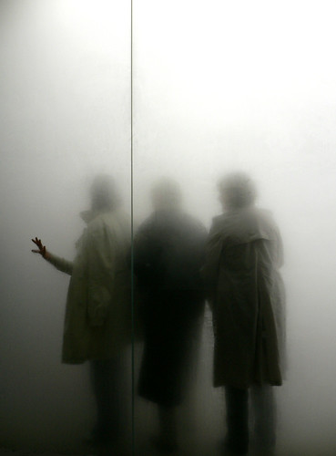
blind light by _imax, used under a by-nc-nd Creative Commons licence.

What I found most striking was the disjuncture between the immersive, disorientating strangeness of being inside the box and the relative mundanity of what it looks like from the outside. Intellectually you know what it will be like, and you can see other people stumbling around in the mist, but it doesn’t quite prepare you for actually being in there. In a sense this feels like a trick; yes, it’s an intense experience being unable to see where you’re going. Does that mean it has artistic worth or is it just a fairground ride with an arty blurb attached to it?

One point to make is the way it relates to the other work in the exhibition; the box obscures people’s individuality and turns them into shadowy versions of Gormley’s blank-faced statues. And when you’re in there, you become very aware of your own body and your relationship with your surroundings. In the same room there’s a work from 1991 called Sense, a block of concrete with a couple of holes that turn out to be just the ends of a body-shaped void in the block. A model of Gormley’s body was cast in wax, the concrete was poured around it, and then the wax melted to leave the empty space. Blind Light is like a live-action version of the same thing; everyone who walks into it carves out a body-shaped hole in the mist.

There were lots of other works as well which I haven’t touched on; this slideshow from the Telegraph gives you some idea.

*Hirst and Emin.

Categories
Culture

‘Surreal Things’ at the V&A

Last week I went to ‘Surreal Things: Surrealism and Design‘ at the V&A. It explores the influence of Surrealist art on design, and demonstrates how quickly surrealist imagery was recycled as a design style; initially in very chic and expensive contexts and then in mass-market commercial design. And demonstrated in the process that it’s a very rare image that still manages to be startling, unsettling and generally unheimlich when used as curtain fabric.

Ruby Lips Brooch by Salvador Dali

That’s true even before the adoption of this imagery into the mainstream. One part of the exhibition was about the house of an art collector who was an early enthusiast of Surrealism. His house was painted purple; it had plaster shapes on the walls to look like sheets hanging out of the windows and huge model palm trees on either side of the door; he had the iconic Dali lobster telephones and Mae West Lips sofa, wolf pawprint carpets, and specially designed china, lamps and so on.

But if Surrealism is a radical exploration of the subconscious, dreams, sexuality and so on, what does it mean to fill a whole house with surreal objects? I suppose the collector might have claimed that the whole house was one Surrealist artwork, but it seems to me that once you’ve decided to use Surrealism as a interior design choice, you’ve already neutered it; it just becomes a set of visual tics.

'Eine Kleine Nachtmusik' by Dorothea Tanning

Surrealism is always very vulnerable to that loss of power; like a lot of modern art, the moment the audience stops taking it seriously, it’s very hard to recapture the mystique. The most iconic, striking surrealist works—the lobster telephone, the fur-lined cup, some of those Magritte paintings—are also the most easily absorbed as likeable mainstream objects. You can enjoy them as visual jokes or intellectual puzzles and they are memorable and interesting; but without the unsettling, dangerous quality that I think Surrealism aspires to. There’s a very easy slippage from powerfully strange to amusingly quirky.

Categories
Culture

Self-Portraits from the Uffizi

The full title of this exhibition at Dulwich Picture Gallery is Artists’ Self-Portraits from the Uffizi. But I don’t think it’s overly pedantic to point out that self-portraits are pretty much always by and of artists. The Uffizi has a collection of 1600 self-portraits, apparently; 50 of them are currently in Dulwich, arranged in roughly chronological order from Filippino Lippi in 1485 to Mimmo Paladino in 2003.

The Uffizi isn’t apparently in any hurry to embrace the internet age, so I can’t illustrate this post with any pictures from the exhibition. Instead, here’s one by Gwen John which is in the Tate:

Self Portrait by Gwen John

I wandered into the exhibition whimsically wondering if I was going to be able to see some kind of common trait in the portraits; some kind of physiognomical identifier of artiness. Well, if this exhibition is to be believed, artists are much more likely to be men, but apart from that they didn’t have much in common physically.

There was a certain kind of expression, though: whether the artists were presenting themselves as glamorous men of substance or bohemians or just unadorned faces, they all tended to share an expression of quizzical detachment.

It would be tempting to see this as indicating a painterly scepticism about portraits; the expression of someone who has seen behind the curtain and knows that a painting is deceptive: contingent, unreliable, manufactured.

In fact, though, it’s probably just the expression of someone examining his own face in the mirror.