Categories
Culture Other

One Day In History and At Home In Renaissance Italy

I think this is quite a fun idea — One Day In History.

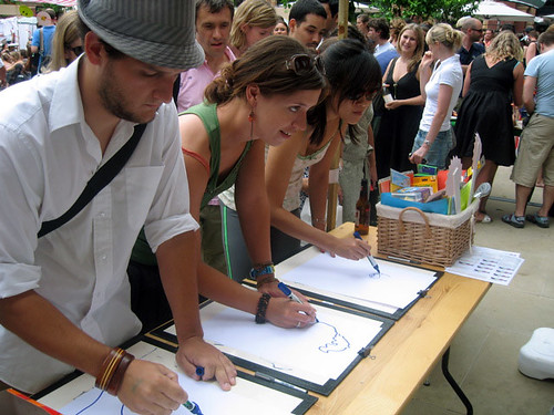
Make history with us on 17 October by taking part in the biggest blog in history.

‘One Day in History’ is a one off opportunity for you to join in a mass blog for the national record. We want as many people as possible to record a ‘blog’ diary which will be stored by the British Library as a historical record of our national life.

Write your diary here reflecting on how history itself impacted on your day – whether it just commuting through an historic environment, discussing family history or watching repeats on TV.

Anyone who reads Pepys online will know that the interest lies as much in the minutiae – what he ate, the plays he went to, and just recently (or at least at this time of year 343 years ago), his doctor’s attempts to cure his constipation. So the material collected today genuinely might be of interest to future historians. There was a somewhat similar thing done over a longer period in the UK during the 40s and 50s called the Mass Observation Project, where people were encouraged to keep diaries, and the results have been made into a couple of books that I know my father enjoyed.

I’m afraid that any historians of the future wanting to know what people had for breakfast in the carefree days before the Great Squid Wars will have to manage without my input, though. But if any HotF is reading this: I had marmite on toast. ‘Marmite’ is a brand name for yeast extract sold as food. ‘Toast’ is what we call a slice of bread which has been grilled or ‘toasted’ in a special-purpose machine called a ‘toaster’. ‘Bread’ is a foodstuff made by powdering the seeds of a species of grass, mixing the powder with yeast and water, and…

In all seriousness, there would have to have been a truly mammoth cataclysm for some future historian not to know what bread is. Perhaps if the squid win the war and we all end up living underwater. Who knows what other things might seem interesting, though. It’s tempting to pick on stuff which seems shiny and new and typical of our age, like the internet, but actually it would take almost as profound a cataclysm to destroy the internet as to eradicate bread. Of course even if there’s still a network of connected computers, I daresay the user experience will be radically different. One of these days someone is going to get a working 3D display, for a start. Internet Explorer 36 will no doubt still be lagging behind the competing browsers in terms of implementing the latest technology. Sorry, that’s a very lame joke. In fact, it would be amazing if Microsoft was still a dominant company in 30 years, let alone a few centuries. By that time, Microsoft and Bill Gates will only survive as a faint memory as synonymous with money, like Standard Oil and Rockefeller and Carnegie.

The idea that the stuff of everyday life is sometimes more interesting than the Big Historical Events makes a neat connection with the exhibition I went to see at the V&A today, called At Home In Renaissance Italy. I vaguely had it in my mind before I went that it was going to be about everyday life for ordinary people. It wasn’t, of course; it was about everyday life for the mega-rich. ‘Home’ sounds so cosy, but in this case it refers to huge palazzos (palazzi?) full of all the most fabulous and luxurious stuff that money could buy. For example: the exhibition was divided up according to the different rooms of the Renaissance house, and the scrittoio (study) was illustrated using stuff from the study of Lorenzo de’ Medici. Apparently Lorenzo distanced himself from the family business, but his grandfather really was the Gates or Rockefeller of his day. Although Gates, bless him, doesn’t strike me as much of an aesthete, so I doubt if his own mansion is full of the kind of beautiful objects on display here.

The reason they focussed on Lorenzo for that part of the exhibition is that the V&A owns the ceramic panels from the ceiling of his study, although they’d borrowed stuff from other collections to complement it, including a lavish copy of Pliny’s Natural History which must be the most elaborately decorated secular text I’ve ever seen. Not surprisingly, a large proportion of the stuff in the show comes from the V&A collection, but the act of curating it into a well-organised exhibition easily justifies an entrance fee to see stuff that would be on show in the permanant display anyway. And there are lots of things which they’ve borrowed from elsewhere as well.

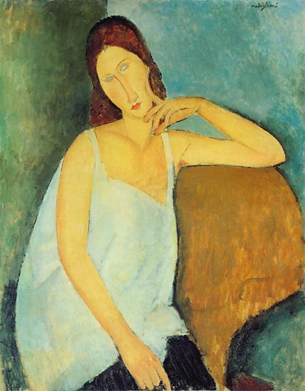
I felt that the exhibition made a bit of a statement when you walked in and were confronted by a pair of grand Veronese portraits, displayed together for the first time since they were moved from the room where they originally hung, and in front of them is a case with a sword like the one carried by the husband and a gold marten head like that carried by the wife (above). Which seemed a bit like saying ‘we’re so grand we can use a Veronese just to illustrate a sword’. And on the other side of the room was a Botticelli which served to illustrate the layout of a Renaissance house. This is presumably the curatorial equivalent of name-dropping. As well as some other fine paintings, including a couple of Lippis and a Crivelli, there was loads of interesting stuff — fireplaces, furniture, ceramics, glassware, board games, instruments, clothes, inkwells, spectacle frames, wafering irons — and I thoroughly enjoyed it.

Categories
Culture Other

FSotW: Fibre “Quick on the Draw” Drawings

Flickr set of the week is actually two sets; Fibre “Quick on the Draw” Drawings and Fibre “Quick on the Draw”. ‘Quick on the Draw’ was “Fibre’s stall at the 2006 V&A Village Fete. Each artist had one minute to draw a picture of Queen Victoria without taking their pen of the paper.” As usual, you can click on any picture to get to the relevant Flickr page.

Categories
Culture Nature

Modigliani at the RA

I went to see Modigliani and his models at the Royal Academy today. In a sense, there was nothing very surprising about the exhibition since Amedeo Modigliani only really seems to have painted rather stylised portaits and very pink nudes, including this one of Joan Collins from 1917:

It (she?) looked pinker in real life.

The stylised portraiture is intriguing, because although the basic characteristics were fairly consistent — long neck, rounded shoulders, elongated face — and the paintings all have the Modigliani look about them, the overall effect varied considerably. Some came across as caricature, including this one:

Others have a rather impersonal quality that suggests that the particular model is almost irrelevant, that the subject is just a generic woman. This portrait of his lover/common law wife, Jeanne Hébuterne, seems to me to tend to fall into that category, although not as much as some of his other pictures of her:

To get a sense of how stylised the portraits are, this is a photo of Jeanne Hébuterne:

Many of the portraits did manage to look like portraits — like they showed a real personality rather than a caricature or a blank —but I didn’t note down any titles in the exhibition and haven’t managed to track down good pictures on the web to use in this post. Which is a bit unfair on Amedeo, but them’s the breaks. I did enjoy the exhibition; the best of the paintings have a real presence to them, and they’re never less than likeable.

The most intriguing of his stylisations is perhaps the blank eyes. Some of his portraits have irises, but most have blank eyes. I can only guess that he chose to leave the eyes blank because otherwise they were too distracting. In that sense they unbalance a portrait.

In Green Park (the nearest tube station) I was amused to see that someone had scratched out the eyes on a movie poster in what I would like to believe was a reference to Modigliani, but was probably just because they were bored. I didn’t have a camera, but here’s a reconstruction:

And finally, a bonus picutre. When googling Modigliani, I discovered Cyclommatus modigliani:

I assume the beetle is named after some other Modigliani — an entomological relative — but you never know, perhaps it was named by an art-loving beetlist.

Categories
Culture

‘Rebels and Martyrs’ at the National Gallery

I went to Rebels and Martyrs at the National today. Note to curators: white writing on mid-grey walls is just fucking annoying. I started wishing I’d picked up one of the folders with large-print writing for the poorly sighted because I was having to squint to read the info next to the paintings.

Having vented that particular annoyance: I’m afraid I can’t get very excited about the exhibition itself, either. To quote the NG:

The artist as a rebel battling against society, a tortured and misunderstood genius, has a powerful hold on our collective imagination.

This exhibition traces the development of this idea, from the birth of Romanticism through to the early 20th century and the avant-garde.

Bringing together works by many of the great artists of the period, including Delacroix, Courbet, Manet, Van Gogh, Gauguin, Rodin, Picasso and Schiele, it explores how they responded to Romantic ideas about creativity and deliberately cast themselves as outsiders and visionaries.

So it was basically a parade of artists portraying themselves and their friends as visionaries, tortured souls, bohemians, dandies, flâneurs, martyrs and prophets. The trouble with grouping together paintings whose common theme is the vanity and posturing of the artists is that all the pictures seem lessened by the context. There were some very fine pieces in the show, but somehow the theming discouraged you from seeing them as individual paintings; instead they all seemed like symptoms.

The portrayal of artists in C19th art should be an interesting and worthy subject for an exhibition, but it just felt like a focussing-in on an unattractive aspect of the artistic culture. Even though it was theoretically putting the individual works in a broader cultural context, somehow it just felt reductive.

On a more positive note, their next exhibition is Velasquez, which I’m really looking forward to. And since I’ve been on a Rembrandt kick lately, after looking at all those C19th poseurs, I popped round to see the NG’s Rembrandts again. Fuck me, they’re good.

EDIT:

It’s not that I think the artists were less admirable because they occasionally produced rather self-serving work. These [self]portraits are only a small part of their output, and not generally the most important part. That’s the problem with the exhibition; not that the observations it makes are untrue, but that the selectiveness is unfair on the artists as individuals. It demonstrates the ways in which the caricature is true without touching on all the ways that it is partial.

EDIT:

The caricature is at the expense of everything that makes the artists interesting. Perhaps it’s the antithesis of what makes them interesting.

Categories
Culture

‘Rembrandt & Co: Dealing in Masterpieces’ at DPG

‘Rembrandt & Co’ is on at the moment at Dulwich Picture Gallery, as part of the 400th birthday celebrations. Rembrandt’s 400th birthday was July 15th. To quote them:

Dulwich Picture Gallery explores, for the first time, the story of one of the most important art dealerships in 17th-century Amsterdam. The exhibition will show 19 Rembrandts from this period along with work by his contemporaries.

The idea presumably is to provide context for the Rembrandts, although a cynic might point out that it’s easier to persuade other galleries to loan you their Flincks, Ovenses and de Lairesses. They have got hold of some major works, though, most notably the portrait of Agatha Bas from the Royal collection and Man in Oriental Costume (“The Noble Slav”) from the Met:


I found this painting interesting because it’s so grand for what is basically just a character study – not a portrait of anyone in particular, or a historical or religious subject. It’s 5′ x 3′ 8″ and both very imposing and highly finished. I suppose there’s no reason why an important painting needs to be on an important subject, but it’s still slightly odd; almost as though it’s a quiet joke on Rembrandt’s part.

There were some nice prints as well, like this view of Amsterdam:

I always think it’s striking how much difference the medium makes. You can see similarities between Rembrandt’s prints and his paintings, particularly with the portraits and biblical scenes where the composition and the use of chiaroscuro is similar, but the feel is so different. You can see quite a few Rembrandt etchings and copperpoints on the Rembrandthuis website.

I didn’t find the context of the other artists’ work particularly enlightening, although it did emphasise the quality and distinctiveness of the Rembrandts. It also brings out the ruthlessness of time’s effect on art. These were all respected and successful artists in their day, but not many of the paintings offer much to the modern viewer. Some are quite attractive, but hardly any of them spark any kind of connection. For me, at least.

Categories
Culture Other

The V&A online

The V&A seems to have put lots more of their stuff online since I last looked, and it’s all searchable. I wondered if there was a photo of the terracotta Virgin Mary and Child I wrote a poem about a few years ago, but it seems not. Lots of other good stuff though, like this C15th English alabaster carving of Saint Michael Attacking the Dragon and Weighing a Soul that was lucky enough to survive the vandalism of the Reformation.