Categories
Culture

The funniest thing on the internet

I was googling around for pictures of Satan the other day for the Satanic Verses post, and found myself at the Art Renewal Center, which, to be fair, is an extremely good source for pictures of fine art. In fact, I think I’ve been there before and assumed that was their entire raison d’être. But no: they have a Higher Mission.

This is how their ‘philosophy‘ section starts:

For over 90 years, there has been a concerted and relentless effort to disparage, denigrate and obliterate the reputations, names, and brilliance of the academic artistic masters of the late 19th Century. Fueled by a cooperative press, the ruling powers have held the global art establishment in an iron grip.

Punchy stuff, isn’t it? Those dastardly ruling powers with their iron grip! But there’s more:

Equally, there was a successful effort to remove from our institutions of higher learning all the methods, techniques and knowledge of how to train skilled artists. Five centuries of critical data was nearly thrown into the trash. It is incredible how close Modernist theory, backed by an enormous network of powerful and influential art dealers, came to acquiring complete control over thousands of museums, university art departments and journalistic art criticism. We at the Art Renewal Center have fully and fairly analyzed their theories and have found them wanting in every respect, devoid of substance and built on a labyrinth of easily disproved fallacies, suppositions and hypotheses. If, dear reader, you are not already one of their propaganda successes, I encourage you to read on.

You see, dear reader, you too can fight the good fight. Are you sufficiently committed to Art to live in fear of that knock on the door in the middle of the night? The one that means the Ruling Powers of Modernist Theory have sent out their goons? You are not alone:

Against all odds, and in the face of the worst kind of ridicule and personal and editorial assault, only a small handful of well-trained artists managed to stay true to their beliefs. Then, like the heroes who protected a few rare manuscripts during inquisitional book-burnings of the past, these 20th Century art world heroes managed to protect and preserve the core technical knowledge of western art. Somehow, they succeeded to train a few dozen determined disciples. Today, many of those former students, have established their own schools or ateliers, and are currently training many hundreds more. This movement is now expanding exponentially. They are regaining the traditions of the past, so that art may once again move forward on a solid footing. We are committed in every way possible to record, preserve and perpetuate this priceless knowledge.

We have painstakingly unraveled an understanding of how and why great traditional art nearly perished. For the sake of our children, our culture, and posterity, the Art Renewal Center is dedicated to traditional humanist art, which is essential to the health and welfare of mankind, and to a critical and truthful analysis of the modernist onslaught by which it was nearly consumed.

For the sake of the children! Will no-one think of the children?

I’m impatient with many aspects of contemporary art myself. But the rhetoric here is priceless. There’s only one possible explanation for the shift in direction of art in the twentieth century: a cabal of tyrannical theorists and their cowardly lackeys maliciously distorting the world art market for their own dubious reasons, and remorselessly stamping out anyone who is found committing thought crimes.

messed-up painting by Bougereau

The general drift of this – that modern art is all Emperor’s New Clothes, that it is imposed from above by an elite consisting of Charles Saatchi, Nicholas Serota and that guy who faked the moon landings, and that it has lost touch with what real people like – is a commonplace of tabloid journalism. But seeing it spelled out so vehemently and explicitly crystallises just how silly it is. After all, at no point in the past century has it been illegal to paint, print, sell, exhibit, write about, or otherwise promote whatever kind of art you want. If non-representational art has become mainstream, it can hardly be put down to a conspiracy. And it genuinely is mainstream; the majority of people may still be sceptical about stuff at the bleeding edge of contemporary art, but artists like Picasso and Matisse are as big a commercial draw as any of the Old Masters.

But to appreciate the full glory of the Art Renewal Center, you have to get to the part where they name names.

As you read, you will be seeing images of masterpieces by some of those artists whose names and art were so ruthlessly maligned: William Bouguereau, John William Waterhouse, Sir Lawrence Alma-Tadema, Leon L’hermitte, John William Godward, Edward Coley Burne-Jones, Jules Joseph Tissot, and Frederick Lord Leighton, amongst others. All giants in their lives, they were amongst history’s greatest, yet prior to the last fifth of the twentieth century, virtually no mention or knowledge of their work was being taught, analyzed or exhibited anywhere.

The ARC isn’t a refuge for people who dislike Jake and Dinos Chapman, or Marcel Duchamp, or Jackson Pollock; or even Kandinsky and Picasso. Nothing so obvious. No, it’s for people who think that the great tradition of Western Art was fatally undermined by Corot, Renoir, and Monet. It’s for people who think that the Pre-Raphaelites were better than the Impressionists.

I actually rather admire them for that. The obvious division might be between representational art and abstract art; to draw your line in the sand between the classical/academic tradition and the Impressionists is much more radical and much less crowd-pleasing. They are, however, obviously wrong.

It’s an interesting issue, though. Even if you aren’t willing to reject all art from the Impressionists onwards, there remains the point that, at the same time as the Impressionists were painting their splodgy pictures of haystacks and canals, there were plenty of artists painting in the academic style. They were continuing the tradition that had served pretty well for several centuries; they may not have been at the cutting edge, but there were many talented painters among them. Are we (by which I suppose I really mean: Am I) too quick to write them off as vapid and uninteresting?

Well, it’s always good to examine your prejudices and usually a mistake to write off whole artistic movements wholesale. But the more I browse around the ARC site, looking at the images of ruthlessly maligned masterpieces, the more inclined I am to think I was right to start with.

yet another messed-up Bougereau

Starting with the Pre-Raphaelites; it’s striking how little of the nineteenth century there is in their work. It’s all Greek myth, knights in armour, or harems. Even the paintings that aren’t set in an exotic locale seem to take place in some kind of never-never land where the women drift around gracefully around in culturally non-specific flowing robes. In a century of urbanisation, industrialisation, increasing democracy, non-conformist religion and empire, the paintings seem wilfully disconnected from the broader culture.

So how is that different from Botticelli painting the Birth of Venus? Well, in the Quattrocento, the revival of classical culture was hot. It was one of the core ideas driving the culture forward. I am a great believer that cultures have a sort of pulse; at any given time, there are certain art forms or media or genres which are a focus of creative energy. Then, after a while, for reasons that may or may not be obvious, the pulse moves on to something else. That doesn’t mean people suddenly stop producing work in the old form, but the dynamism and cultural relevance, the snap, crackle and pop, has gone.

You can see this happening in an accelerated form in the last hundred years of popular music. Jazz had a good run of thirty or forty years when it was at the cutting edge of Western culture, but eventually it died. That doesn’t mean people stopped making it, or performing it, or going to concerts, but it became a heritage activity like renovating classic cars. The same thing happened to rock, and to soul; for some time, hip-hop has been the world’s most vibrant popular music form, but it’s been around for thirty years now, and has, perhaps, run out of ideas.

Fashions in popular music are just ripples on the cultural surface, of course. Other shifts are bigger and slower. One of those was the classical revival we call the Renaissance, which reshaped the literary, artistic and architectural vocabulary of Europe for centuries. And, you know, it had a good run. From the late fifteenth to the seventeenth centuries it was the only game in town; by the eighteenth it had reached its most polished, refined, and bloodless form, and it’s starting to feel like a mannerism or a habit. So you get the debate about Ancients v. Moderns, the invention of the Gothick, and people writing poems ‘as far as was possible in a selection of language really used by men’.

And like the poets and novelists and architects, the painters had to find new ways of doing things which were more in tune with the times. It’s questionable, of course, how much the tradition had really been based on classical models – there are, after all, very few surviving paintings from ancient Greece or Rome – but still, there were a whole bunch of habits associated with Renaissance art, like history painting, figures in ‘classical’ drapery, personifications of abstract qualities and so on, which had once been fertile sources of ideas but now needed to be thrown aside like a squeezed-out tube of toothpaste.

Indeed, the Pre-Raphaelite Brotherhood obviously understood that on some level, since despite the ARC championing them as the finest products of the academic tradition, they were actually rejecting most of it; they were medieval revivalists. Hence the name. But their solution was no improvement. They adopted some of the qualities of late medieval/early Renaissance painting, but never made any more of it than a decorative style. It’s all petals and no backbone. There was no organic connection to the broader culture. The nineteenth century was dynamic, fast-moving and chaotic; and if there’s one thing Pre-Raphaelite work is not, it’s dynamic.

another messed-up painting by Bougereau

I’m going about this at some length because I find these questions of artistic taste – of changing fashions – fascinating. This is the classic argument:

‘This style was good enough for [famous artist x], so it’s good enough for me; just because it’s not fashionable, that doesn’t mean it has suddenly become worthless.’

And it sounds very plausible. But I just don’t think it’s true. Changes in artistic fashion may seem arbitrary and superficial, but they are indicative of something deeper. You don’t have to slavishly follow fashionable taste, but you need to take it seriously. If your poetry reads like it was written a hundred years ago, that probably means there is something wrong with it.

Of course you might be ahead of the curve. It might be that we’re due a change, that the tide is turning, that the pendulum is going to swing back, that everyone else will catch up with you later. But be warned: it’s probably not going to happen. People, like the Pre-Raphaelites, try to stage revivals all the time. Usually the tide is not turning, and you’ll just end up looking like a bit of a Cnut.

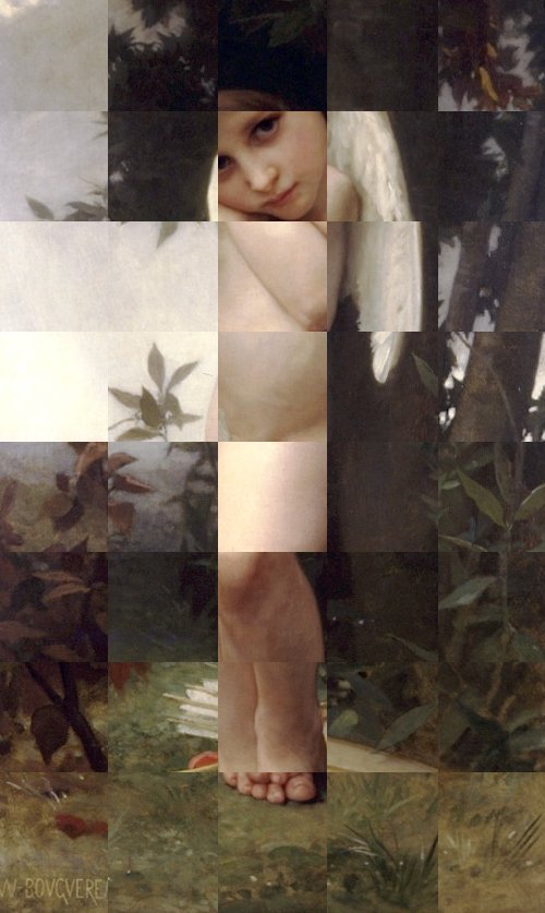
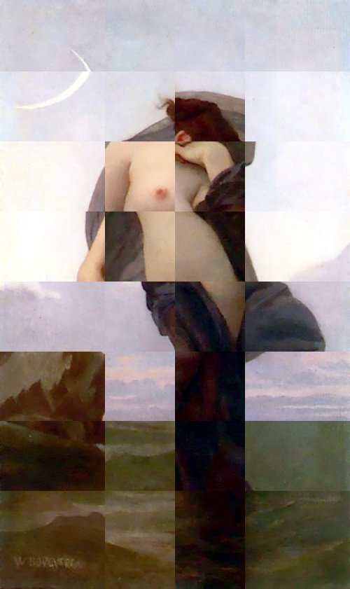
» The sliced and diced pictures above are all by William Bougereau, the favourite artist of the ARC. I particularly like the bit where they say “Considering his consummate level of skill and craft, and the fact that the great preponderance of his works are life-size, it is one of the largest bodies of work ever produced by any artist. Add to that the fact that fully half of these paintings are great masterpieces, and we have the picture of an artist who belongs like Michelangelo, Rembrandt and Carravaggio [sic], in the top ranks of only a handful of masters in the entire history of western art.” Because, of course, greatness is best measured by the square inch.

Categories
Culture

‘Crafting Beauty in Modern Japan’ at the BM

I went to see Crafting Beauty in Modern Japan at the British Museum last week.

The exhibition presents works by members of the Japan Art Crafts Association (Nihon Kōgeikai), many of them designated ‘Living National Treasures’ in Japan, a title conferred by the Japanese government on exemplary individuals who carry on Japanese traditions.

In other words, it was lots of contemporary – or at least C20th – Japanese ceramics, kimonos, lacquer, metalwork and so on. There’s a wide range of techniques on display; the ceramics include stuff which is artfully rough-hewn as well as things which are finished to within an inch of their life; the kimono fabrics are a mix of tie-dyed, woodblock-printed, embroidered and woven. I didn’t find the items on display universally covetable; many were just not to my taste. Many of them wouldn’t have particularly stood out in a jumble sale, to my ignorant eye. I don’t think the lighting helped, mind you; it was perfectly competently lit, but I think most of them would have benefited from natural light. Others were absolutely gorgeous.

The things that appealed most to me were the lacquer and the woven kimonos. I find lacquer an incredibly tempting material; I can’t see it without wanting to pick it up and stroke it. Even just the plainest matte red and black lacquer rice bowl is a delight; I wish now I’d picked one or two up when I was in Japan, but the good ones seemed so expensive that I didn’t. The woven kimono fabrics were made with a technique called kasuri, which is the Japanese name for what I would usually call ikat. That is, the threads are tie-dyed in advance so that they form a design when woven together. Because the colour on the threads never quite lines up precisely, it forms soft-edged patterns which I find very attractive. They were mainly dyed with indigo for that classic blue and white Japanese look.

The BM website doesn’t offer any photographs, so I can’t easily illustrate any of my prejudices, but this website devoted to Japanese pottery and this virtual museum of traditional Japanese craft have plenty of pictures of the sort of thing in the exhibition. Those sites also demonstrate that even a passionate interest in visual arts doesn’t necessarily get carried over into web design. This tea bowl is from the second of those sites:

Tea bowl, Shino ware

Generally I’m slightly ambivalent about the Japanese attitude to art and craft. One is always told that the Japanese make no distinction between the two; and in some ways I find that a deeply admirable attitude. What’s great about it is the value placed on the making of beautiful things. Not just that there is a cultural and monetary value placed on beautiful objects, but that the job of making them is treated as a serious and important business. Curiously enough, I think the closest analogue in Western culture is the respect given, not to craftsmen, but to designers – Christian Dior, Charles Eames, Charles Rennie Mackintosh, Hermann Zapf – who, if not exactly household names, are still remembered in a way no hands-on practitioner is. Not that the craftsmanship of the Japanese is at the expense of being designers; they are more like designer-craftsmen in the William Morris tradition. To some extent they are even descendants of that tradition, since Morris was surprisingly influential in Japan.

I think we should all hope to live our everyday lives surrounded by well-designed and well-made things, and one part of achieving that is giving due respect to the people who design and make them. So I think that is a Good Thing. My ambivalence about it arises from the fact that actually I do think there is an important distinction between design and art. I don’t think that an earthenware sake jug, however exquisitely glazed, has the potential to be a great artwork in the same way as a Rembrandt or an El Greco. When I was living in Japan I went to few galleries of Japanese art, and a few exhibitions of ceramics, and I saw some lovely things; but I tended to think that flip-side of granting importance to craftsmen was a tendency to reduce the likelihood of producing an El Greco. All art seemed to be pitched at the level of the decorative arts. I’m wary of expressing that sentiment, because I know I’m an outsider with an extremely superficial knowledge of Japanese culture, and I think of the beautiful work of Hokusai and Hiroshige which would seem to cast doubt on my theory, but that’s how I felt.

The other slight concern is the essential conservatism that the attitude can produce. Not that Japanese culture has any shortage of modernity; but it can seem a little schizophrenic. There’s a risk that the admiration for design and craftsmanship in something like a kimono gets put into a tidy mental compartment and held separate from the manufacture of MP3 players, kettles and apartment blocks. I guess though that that tension between tradition and innovation is a separate issue, really; the important thing is to value well-made, beautiful things and not to treat them as disposable.

Anyway, I’d recommend the exhibition. And if you’re visiting the British Museum for any reason, I’d suggest having lunch at Bi-Won, a Korean restaurant on the intersection between Coptic Street and New Oxford Street. It’s very reasonably priced, the food is tasty and it’s very close to the museum.

Categories
Culture

Dutch Portraits at the National Gallery

I went to see Dutch Portraits: The Age of Rembrandt and Frans Hals yesterday. It was pleasantly quiet; I guess the prospect of lots and lots of paintings of men in black suits with white ruffs and little pointy beards doesn’t produce a frisson of excitement in your average Londoner.

And from that point of view, the exhibition is very much what you would expect; there are no startling surprises. There are some very good paintings though.

bit of Rembrandt

Whenever I go to an exhibition with a couple of named artists in the title, I tend to find myself treating it as a competition; Rembrandt vs. Frans Hals. I think it’s a very high compliment to Hals that for much of the exhibition, they’re neck and neck. It’s only when you get to the late Rembrandts that it becomes completely one-sided, but then those late Rembrandt portraits are, I think, among the finest works in the history of art. Of those I haven’t seen in the flesh before, the most remarkable is the incredible group portrait of the syndics (officials of the Draper’s Guild) which I’ve included a little section of above.

Still, I know Rembrandt’s work quite well, and several of his paintings on show here are part of the National’s permanent collection—notably the portraits of Jacob Trip and Margaretha de Geer. So for me the exhibition was more about discovering Hals, who I really only knew from the ‘Laughing Cavalier’. His most typical portraits are strikingly informal; one of the portraits has his subject leaning right back with his chair balancing on the just the back legs. That ability, to portray people looking relaxed and natural, is a good trick in itself, but he was also very good at using loosely handled paint to suggest textures: skin, of course, and almost as vital for the C17th portraitist, silk, satin, brocade, embroidery and lace. All those black clothes may have been superficially intended as a sober, modest reflection of a conservative Protestant culture, but with the lushness of the fabrics, the effect is no more humble than a little black Versace dress.

bit of Hals

Oddly enough, for a long time, I vaguely thought that The Laughing Cavalier (which isn’t the picture above; that’s part of the wedding portrait of Isaac Massa and his wife) was a Victorian painting. Obviously it’s not of a man in Victorian dress, but I vaguely thought it was a bit of C19th pastiche. I can still sort of see that in Hals’s paintings; often the informality has a kind of theatrical quality to it—cheesiness would be unfair, but I’m hinting in that direction—which is reminiscent of C19th narrative paintings. Certainly it doesn’t surprise me to learn that his reputation was re-established in the C19th after a period of neglect; I can see he would have been to their taste. I wouldn’t want to over-stress that comparison, though, because I can’t stand Victorian painting and Hals is much better than that.

I’ve mainly talked about Rembrandt and Frans Hals, but there were also some lovely paintings by other artists, most of whose names I’ve already forgotten. These exhibitions organised around a period always serve as reminders that for every famous artist there are dozens of very very good artists whose names are familiar only to specialists. Still, painters probably get treated better than poets by posterity, because the scarcity of original paintings lends value to work even by minor artists.

Categories
Culture Other

Anthony Gormley at the Hayward

Last week I went to Blind Light, the Gormley show at the Hayward. Gormley must be the third most famous artist in Britain, I should think*, particularly on the back of two spectacular public works: Angel of the North and Another Place.

For those of you who don’t know his work—foreigners and the like—he has produced an endless series of variations of the human form; his visual signature is a blank-faced statue, standing rigid with its hands by the sides. I believe most of them are cast from his own body, but any distinctive characteristics are removed to leave a generic male form. The two works I’ve linked to above give you an idea of how he varies the basic template. To accompany the current exhibition, he has created another such installation: a number of life-size male figures, cast in bronze, positioned on rooftops and other prominent places over a 1.5 km radius, all facing towards the gallery.

0706290002, originally uploaded by domeheid.

This installation, titled Event Horizon, is a joy in itself; you start seeing the figures as you walk to the gallery, and then from the various exterior spaces of the gallery you can scan the rooftops of London to look for more of them. All these mute figures watching from the rooftops are almost rather creepy—it’s very Doctor Who—but mainly it adds a touch of magic to some very mundane buildings and creates a striking relationship between the exhibition and its surroundings.

Part of what makes it so good is the sheer scale. It must have been a major undertaking just identifying places to put them, negotiating with the owners of the buildings, and getting them into position. You could imagine an artist doing the same thing but being content to just place half a dozen figures on nearby buildings. Gormley has placed 31 figures (according to Wikipedia); some are so far from the gallery that you can’t even be certain that you’ve identified them correctly.

That commitment, I think, is typical of the artist. With someone whose work has quite such a consistent theme running through it, there’s a risk of them being a one-trick pony, but Gormley doesn’t just have lots of ideas for how to develop his basic theme; he develops and executes those ideas thoroughly. My most frequent irritation with contemporary art is when I feel that it’s under-developed. Half baked. I don’t get that with Gormley.

It helps of course that, being human ourselves, we tend to find the human form endlessly fascinating.

The most striking work inside the gallery is called Blind Light; it’s a glass-walled box, about 10m square, which, with the help of ultrasonic humidifiers and flourescent lights, is filled with bright white fog. Once you enter, visibility is down to a couple of feet, sound is muffled, the floor is wet underfoot; I only walked across the box and then turned round to walk back to the entrance, but still got lost enough that I had to feel my way along the wall to find the door again. Meanwhile, from the outside, you see people’s figures appear as ghostly shadows in the mist.

people in the mist

blind light by _imax, used under a by-nc-nd Creative Commons licence.

What I found most striking was the disjuncture between the immersive, disorientating strangeness of being inside the box and the relative mundanity of what it looks like from the outside. Intellectually you know what it will be like, and you can see other people stumbling around in the mist, but it doesn’t quite prepare you for actually being in there. In a sense this feels like a trick; yes, it’s an intense experience being unable to see where you’re going. Does that mean it has artistic worth or is it just a fairground ride with an arty blurb attached to it?

One point to make is the way it relates to the other work in the exhibition; the box obscures people’s individuality and turns them into shadowy versions of Gormley’s blank-faced statues. And when you’re in there, you become very aware of your own body and your relationship with your surroundings. In the same room there’s a work from 1991 called Sense, a block of concrete with a couple of holes that turn out to be just the ends of a body-shaped void in the block. A model of Gormley’s body was cast in wax, the concrete was poured around it, and then the wax melted to leave the empty space. Blind Light is like a live-action version of the same thing; everyone who walks into it carves out a body-shaped hole in the mist.

There were lots of other works as well which I haven’t touched on; this slideshow from the Telegraph gives you some idea.

*Hirst and Emin.

Categories
Culture

‘Surreal Things’ at the V&A

Last week I went to ‘Surreal Things: Surrealism and Design‘ at the V&A. It explores the influence of Surrealist art on design, and demonstrates how quickly surrealist imagery was recycled as a design style; initially in very chic and expensive contexts and then in mass-market commercial design. And demonstrated in the process that it’s a very rare image that still manages to be startling, unsettling and generally unheimlich when used as curtain fabric.

Ruby Lips Brooch by Salvador Dali

That’s true even before the adoption of this imagery into the mainstream. One part of the exhibition was about the house of an art collector who was an early enthusiast of Surrealism. His house was painted purple; it had plaster shapes on the walls to look like sheets hanging out of the windows and huge model palm trees on either side of the door; he had the iconic Dali lobster telephones and Mae West Lips sofa, wolf pawprint carpets, and specially designed china, lamps and so on.

But if Surrealism is a radical exploration of the subconscious, dreams, sexuality and so on, what does it mean to fill a whole house with surreal objects? I suppose the collector might have claimed that the whole house was one Surrealist artwork, but it seems to me that once you’ve decided to use Surrealism as a interior design choice, you’ve already neutered it; it just becomes a set of visual tics.

'Eine Kleine Nachtmusik' by Dorothea Tanning

Surrealism is always very vulnerable to that loss of power; like a lot of modern art, the moment the audience stops taking it seriously, it’s very hard to recapture the mystique. The most iconic, striking surrealist works—the lobster telephone, the fur-lined cup, some of those Magritte paintings—are also the most easily absorbed as likeable mainstream objects. You can enjoy them as visual jokes or intellectual puzzles and they are memorable and interesting; but without the unsettling, dangerous quality that I think Surrealism aspires to. There’s a very easy slippage from powerfully strange to amusingly quirky.

Categories
Culture

Self-Portraits from the Uffizi

The full title of this exhibition at Dulwich Picture Gallery is Artists’ Self-Portraits from the Uffizi. But I don’t think it’s overly pedantic to point out that self-portraits are pretty much always by and of artists. The Uffizi has a collection of 1600 self-portraits, apparently; 50 of them are currently in Dulwich, arranged in roughly chronological order from Filippino Lippi in 1485 to Mimmo Paladino in 2003.

The Uffizi isn’t apparently in any hurry to embrace the internet age, so I can’t illustrate this post with any pictures from the exhibition. Instead, here’s one by Gwen John which is in the Tate:

Self Portrait by Gwen John

I wandered into the exhibition whimsically wondering if I was going to be able to see some kind of common trait in the portraits; some kind of physiognomical identifier of artiness. Well, if this exhibition is to be believed, artists are much more likely to be men, but apart from that they didn’t have much in common physically.

There was a certain kind of expression, though: whether the artists were presenting themselves as glamorous men of substance or bohemians or just unadorned faces, they all tended to share an expression of quizzical detachment.

It would be tempting to see this as indicating a painterly scepticism about portraits; the expression of someone who has seen behind the curtain and knows that a painting is deceptive: contingent, unreliable, manufactured.

In fact, though, it’s probably just the expression of someone examining his own face in the mirror.