Categories
Culture

‘Holbein in England’ at Tate Britain

I went to see the Holbein at the Tate today. It’s a large exhibition with a lot of Holbein’s work from collections all over the world. I can certainly recommend it, because Holbein was a remarkable and enjoyable portraitist. The finished paintings are outnumbered by drawings in a combination of coloured chalk and ink. As far as I can gather, most of these were studies for paintings rather than stand-alone works, but they work beautifully as portraits. If anything, the highly-finished and perfect oils paintings can seem a little inhuman next to the softer drawings.

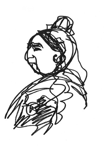
My copy of the complete Thomas Wyatt has the drawn Holbein portrait on the front cover, and I remember thinking when I got it that if you’re going to be a famous poet, it’s a good idea to get a portrait you’d like to be remembered by. My edition of Keats has a distinctly ham-fisted portrait by a mate of his which makes him look very inconsequential. The drawing above isn’t Wyatt; it’s the other early sonneteer, Henry Howard, Earl of Surrey.

Holbein seems to have produced very fine likenesses, although there’s a logical problem somewhere with looking at a portrait of someone you’ve never seen and concluding it’s a good likeness. Certainly his pictures all look different from each other, apart from that slight sense of period similarity that comes from all of them having the same hairstyles and frocks. And indeed facial expressions; although we’re not aware of it, I’m sure that our culture shapes the way we arrange our faces more than we think. Certainly Americans of European descent have different faces to people from whichever Old Country.

Anyway, he’s a fine portraitist and one of the pleasures of the show is a sense of being introduced to Tudor society; you ‘meet’ dozens of people from Tudor London. It’s not exactly a cross section — they’re all wealthy — but they are courtiers, bishops, merchants, poets, royalty, young, old, and each seems like an individual.

It’s quite a big exhibition and if there is a problem with it, it can get a bit same-y. It’s almost all bust-length portraits, and he doesn’t seem to have made much technical progress during his career. He was excellent when he reached London (aged 31) and was consistently excellent for the 17 or so years he lived here until he died, but if his worked changed stylistically in that period it’s not obvious to me. I don’t think I could tell whether a painting was early or late. Some of the finest portraits in the exhibition are among the earliest: studies for a group portrait of Thomas More’s family, painted soon after reaching London for the first time (the finished work doesn’t survive).

More was his first contact in London, thanks to a letter of introduction from Erasmus, and there’s some suggestion he may have stayed for a period with More in Chelsea. So he knew the family well, which may be why his portraits of them seem so good. Also, despite my comments about lack of change during his career, it’s worth noting that at this stage he’s working just in chalk without any ink touches, so that makes the pictures softer; that may be part of the appeal. Still, its hard to see that any of his later work improves on the famous portrait of Thomas More, or this study of Anne Cresacre, a ward of More’s.

If you’re interested and can’t easily get to Pimlico, do check out the exhibition website (linked to above), because the Tate always makes an admirable effort to include as many photos of the work as copyright allows. What proportion of the works are available online depends on who they are mainly borrowed from, but at least they make the effort.

Categories
Culture

Adam Elsheimer at DPG

There’s an exhibition of Adam Elsheimer paintings at the Dulwich Picture Gallery. From the DPG site:

On hearing of Elsheimer’s early death Rubens wrote ‘Surely, after such a loss our entire profession ought to clothe itself in mourning. We will not easily succeed in replacing him; in my opinion he had no equal in small figures, in landscapes, and in many other subjects’. This exhibition is a unique opportunity to re–discover this painter ‘without equal’.

I admit I’d not heard of Elsheimer, but apparently he was an important influence on Rembrant, Rubens and Claude Lorrain. He makes an excellent choice for an exhibition at a small gallery, because he wasn’t very prolific and his paintings were small. That (and the fact that he’s not so well known) has allowed them to exhibit effectively his entire output: 30 of 34 accepted surviving paintings.

The paintings are small because they’re on copper, and apparently copper sheets had to be small for practical reasons. I found myself wondering whether he did small paintings because he liked working on copper or he worked on copper because he liked doing small paintings. I know that it’s not the most sophisticated aesthetic response to get fixated on the size, but I do think there’s quite a profound division between people who are miniaturists by inclination — in painting, poetry or whatever — and those who like the grand sweep.

The distinction is brought out in Elsheimer because many of his paintings have the kind of complex, dynamic compositions that you can imagine being painted ten foot tall by his contemporaries. This picture, The Stoning of Saint Stephen, which normally lives in the National Gallery of Scotland, is one of his larger works, but it’s still only 34.70 x 28.60 cm:

The size means they have less immediate impact, but there’s an intimacy in viewing these paintings; there’s only really room for one person in front of each, and you find yourself standing with your nose practically touching them. And the execution of tiny details is fascinating in itself. Still, I found there was something weirdly constrained about them, as though the practical explanation for why they were small wasn’t quite enough to explain it.

Categories
Culture

Velazquez at the National Gallery

Well, I went to the Velazquez. Of course I spent most of the time finding angles to see the paintings between all the people, but I’m used to that. It was a good show, tracing his career from a couple of early paintings at age 17 (which were reassuringly stiff and clumsy) to his late paintings – mainly but not exclusively court portraits. Like a lot of artists he seemed to start by developing almost photographic accuracy — water drops trickling down the side of earthenwear jars and so on — and then developing a progressively a progressively looser and sketchier technique. A few silver daubs would evoke a richly embroidered fabric where earlier he would have painted every stitch.

I was expecting slightly more wow factor, possibly because about the most impressive picture I’ve ever seen in the flesh could well be Las Meninas (which unsurprisingly is still in the Prado). I find it hard to pick out single paintings which were absolute show-stoppers. What there were, though, were a lot of very fine paintings indeed.

Velazquez had the slight misfortune to be court painter to perhaps the ugliest royal family Europe has ever had. It was a branch of the Hapsburgs, and looking at Philip IV, it’s hard not to have uncharitable thoughts about inbreeding:

As well as Philip IV, Velazquez painted some fine pictures of younger members of the family, including annual portraits of the Infanta Margarita which were were sent to her uncle, the Holy Roman Emperor Leopold I, to whom she’d been betrothed from infancy. The one in the National shows her at eight. There are also a couple of paintings of her sister, the Infanta Maria Teresa, at fourteen, which were painted so she could hawked around the courts of Europe as a marriage prospect. She ended up as Queen of France, so I guess someone was able to see past the Hapsburg chin:

Categories
Culture Other

One Day In History and At Home In Renaissance Italy

I think this is quite a fun idea — One Day In History.

Make history with us on 17 October by taking part in the biggest blog in history.

‘One Day in History’ is a one off opportunity for you to join in a mass blog for the national record. We want as many people as possible to record a ‘blog’ diary which will be stored by the British Library as a historical record of our national life.

Write your diary here reflecting on how history itself impacted on your day – whether it just commuting through an historic environment, discussing family history or watching repeats on TV.

Anyone who reads Pepys online will know that the interest lies as much in the minutiae – what he ate, the plays he went to, and just recently (or at least at this time of year 343 years ago), his doctor’s attempts to cure his constipation. So the material collected today genuinely might be of interest to future historians. There was a somewhat similar thing done over a longer period in the UK during the 40s and 50s called the Mass Observation Project, where people were encouraged to keep diaries, and the results have been made into a couple of books that I know my father enjoyed.

I’m afraid that any historians of the future wanting to know what people had for breakfast in the carefree days before the Great Squid Wars will have to manage without my input, though. But if any HotF is reading this: I had marmite on toast. ‘Marmite’ is a brand name for yeast extract sold as food. ‘Toast’ is what we call a slice of bread which has been grilled or ‘toasted’ in a special-purpose machine called a ‘toaster’. ‘Bread’ is a foodstuff made by powdering the seeds of a species of grass, mixing the powder with yeast and water, and…

In all seriousness, there would have to have been a truly mammoth cataclysm for some future historian not to know what bread is. Perhaps if the squid win the war and we all end up living underwater. Who knows what other things might seem interesting, though. It’s tempting to pick on stuff which seems shiny and new and typical of our age, like the internet, but actually it would take almost as profound a cataclysm to destroy the internet as to eradicate bread. Of course even if there’s still a network of connected computers, I daresay the user experience will be radically different. One of these days someone is going to get a working 3D display, for a start. Internet Explorer 36 will no doubt still be lagging behind the competing browsers in terms of implementing the latest technology. Sorry, that’s a very lame joke. In fact, it would be amazing if Microsoft was still a dominant company in 30 years, let alone a few centuries. By that time, Microsoft and Bill Gates will only survive as a faint memory as synonymous with money, like Standard Oil and Rockefeller and Carnegie.

The idea that the stuff of everyday life is sometimes more interesting than the Big Historical Events makes a neat connection with the exhibition I went to see at the V&A today, called At Home In Renaissance Italy. I vaguely had it in my mind before I went that it was going to be about everyday life for ordinary people. It wasn’t, of course; it was about everyday life for the mega-rich. ‘Home’ sounds so cosy, but in this case it refers to huge palazzos (palazzi?) full of all the most fabulous and luxurious stuff that money could buy. For example: the exhibition was divided up according to the different rooms of the Renaissance house, and the scrittoio (study) was illustrated using stuff from the study of Lorenzo de’ Medici. Apparently Lorenzo distanced himself from the family business, but his grandfather really was the Gates or Rockefeller of his day. Although Gates, bless him, doesn’t strike me as much of an aesthete, so I doubt if his own mansion is full of the kind of beautiful objects on display here.

The reason they focussed on Lorenzo for that part of the exhibition is that the V&A owns the ceramic panels from the ceiling of his study, although they’d borrowed stuff from other collections to complement it, including a lavish copy of Pliny’s Natural History which must be the most elaborately decorated secular text I’ve ever seen. Not surprisingly, a large proportion of the stuff in the show comes from the V&A collection, but the act of curating it into a well-organised exhibition easily justifies an entrance fee to see stuff that would be on show in the permanant display anyway. And there are lots of things which they’ve borrowed from elsewhere as well.

I felt that the exhibition made a bit of a statement when you walked in and were confronted by a pair of grand Veronese portraits, displayed together for the first time since they were moved from the room where they originally hung, and in front of them is a case with a sword like the one carried by the husband and a gold marten head like that carried by the wife (above). Which seemed a bit like saying ‘we’re so grand we can use a Veronese just to illustrate a sword’. And on the other side of the room was a Botticelli which served to illustrate the layout of a Renaissance house. This is presumably the curatorial equivalent of name-dropping. As well as some other fine paintings, including a couple of Lippis and a Crivelli, there was loads of interesting stuff — fireplaces, furniture, ceramics, glassware, board games, instruments, clothes, inkwells, spectacle frames, wafering irons — and I thoroughly enjoyed it.

Categories
Culture Other

FSotW: Fibre “Quick on the Draw” Drawings

Flickr set of the week is actually two sets; Fibre “Quick on the Draw” Drawings and Fibre “Quick on the Draw”. ‘Quick on the Draw’ was “Fibre’s stall at the 2006 V&A Village Fete. Each artist had one minute to draw a picture of Queen Victoria without taking their pen of the paper.” As usual, you can click on any picture to get to the relevant Flickr page.

Categories
Culture Nature

Modigliani at the RA

I went to see Modigliani and his models at the Royal Academy today. In a sense, there was nothing very surprising about the exhibition since Amedeo Modigliani only really seems to have painted rather stylised portaits and very pink nudes, including this one of Joan Collins from 1917:

It (she?) looked pinker in real life.

The stylised portraiture is intriguing, because although the basic characteristics were fairly consistent — long neck, rounded shoulders, elongated face — and the paintings all have the Modigliani look about them, the overall effect varied considerably. Some came across as caricature, including this one:

Others have a rather impersonal quality that suggests that the particular model is almost irrelevant, that the subject is just a generic woman. This portrait of his lover/common law wife, Jeanne Hébuterne, seems to me to tend to fall into that category, although not as much as some of his other pictures of her:

To get a sense of how stylised the portraits are, this is a photo of Jeanne Hébuterne:

Many of the portraits did manage to look like portraits — like they showed a real personality rather than a caricature or a blank —but I didn’t note down any titles in the exhibition and haven’t managed to track down good pictures on the web to use in this post. Which is a bit unfair on Amedeo, but them’s the breaks. I did enjoy the exhibition; the best of the paintings have a real presence to them, and they’re never less than likeable.

The most intriguing of his stylisations is perhaps the blank eyes. Some of his portraits have irises, but most have blank eyes. I can only guess that he chose to leave the eyes blank because otherwise they were too distracting. In that sense they unbalance a portrait.

In Green Park (the nearest tube station) I was amused to see that someone had scratched out the eyes on a movie poster in what I would like to believe was a reference to Modigliani, but was probably just because they were bored. I didn’t have a camera, but here’s a reconstruction:

And finally, a bonus picutre. When googling Modigliani, I discovered Cyclommatus modigliani:

I assume the beetle is named after some other Modigliani — an entomological relative — but you never know, perhaps it was named by an art-loving beetlist.