Categories
Culture

British Orientalist Painting at Tate Britain

The Lure of the East: British Orientalist Painting is an exhibition of ‘the responses of British artists to the cultures and landscapes of the Near and Middle East between 1780 and 1930’. So the East here is Cairo, Jerusalem and Constantinople, and not Bombay, Singapore or Nagasaki.

Unknown artist, Sir Robert Shirley, Envoy from Shah 'Abbas of Persia to the Courts of Europe, before 1628

You can hardly touch on the subject without a name-check for one of the few bits of cultural theorising that’s so famous that even I’ve heard of it, and the Tate mentions it right up front:

In the 1970s the Palestinian-American academic Edward Said published his treatise on Orientalism, initiating a global debate over Western representations of the Middle East. For many, such representations now appeared to be a sequence of fictions serving the West’s desire for superiority and control over the East.

So I went round with that argument somewhat in mind, and I had a yeah-but-no-but reaction to it. The Tate’s one-sentence summary of the argument — a sequence of fictions serving the West’s desire for superiority and control — makes it sound like a coordinated propaganda effort to push a particular agenda, and it clearly isn’t that; but then I imagine that Said’s original book was rather more nuanced anyway.

Yes, there’s a focus on the picturesque and the exotic, and a certain superficiality in the images, and some particular subjects which bring out the worst in the artists, like the slave markets and the harem. And I’m sure they did travel around with a bone-deep sense of their own culture’s superiority. But to offer a couple of points in lukewarm defence: firstly, this is tourist art. Most of the artists travelled in the region for a year or two, so it’s a rather more immersive kind of travel than most modern tourism, but still, these are visitors painting for the British market. I think much of the picturesqueness can be explained simply by their tourist status, without the need to invoke some kind of deep cultural agenda. Not that the two ideas are mutually exclusive.

The other point is this. The bulk of the work here is C19th, and when you look at C19th paintings on other subjects — scenes from Shakespeare, or the Bible, or British history, or even contemporary life — you see a similar tendency towards the picturesque, the colourful, the sentimental and the didactic. These were not people keen on ambivalence and self-doubt.

Arthur Melville, An Arab Interior, 1881, National Gallery of Scotland

The one subject where cultural differences collide most spectacularly is the harem. Obviously, none of the male artists had ever been inside a harem — there’s not much point in sequestering your women if you let a load of nosy foreigners come in and paint them — and the idea of them came to occupy a rather sweaty part of the artists’ imaginations. The harem paintings in this exhibition are relatively tame (apparently French versions had rather more flesh on display), but they are clearly an opportunity to paint some exotic totty, rather than a sensitive and nuanced exploration of cultural difference. There’s one painting by a woman who had actually been inside a harem, and apparently it caused a minor sensation at the time for revealing what the harem was really like: not in fact a rich, tapestry-draped, incense filled hothouse full of scantily clad odalisques, but a rather plain domestic interior full of woman doing boring domestic stuff.

Other paintings were perhaps not exotic enough. There’s a great scene in Brideshead Revisited, where Charles Ryder, having established his reputation as a painter of country houses and English scenery, has been on a trip to South America, and has been getting rave reviews for an exhibition of South American scenes when Anthony Blanche turns up, takes him to a seedy gay bar and precedes to eviscerate the pictures.

“Oh, the pictures,” they said; “they’re most peculiar.” “Not at all what he normally does.” “Very forceful.” “Quite barbaric.” “I call them downright unhealthy,” said Mrs Stuyvesant Oglander.

‘My dear, I could hardly keep still in my chair. I wanted to dash out of the house and leap in a taxi and say, “Take me to Charles’s unhealthy pictures.” […] and what did I find? I found, my dear, a very naughty and very successful practical joke. It reminded me of dear Sebastian when he liked so much to dress up in false whiskers. It was charm again, my dear, simple, creamy English charm, playing tigers.’

There was certainly something of that about the exhibition: a failure, for example, to communicate any sense of heat.

I chose the two paintings here because I like them, rather than because they’re typical. In fact, I like them because they’re not typical. Most of the paintings left me underwhelmed, and that’s my real problem with the show; it’s fairly interesting, but it didn’t excite me very often as art.

» The paintings, both taken from the exhibition website, are Sir Robert Shirley, Envoy from Shah ‘Abbas of Persia to the Courts of Europe, painted by an unknown artist before 1628, from the collection of R.J. Berkeley; and Arthur Melville’s An Arab Interior, 1881, from the National Gallery of Scotland.

Categories
Culture

Cy Twombly at Tate Modern

I went to the Twombly exhibition at Tate Modern today. What a fabulous name, btw: I tried climbing the Eiffel Tower but the height made me go all twombly.

He’s not someone I knew much about beforehand, and I don’t know how excited I would have been if I had known; he does what you might describe as scribbly abstracts. In fact with some of the the early ones, white covered with scrawly pencil marks, you wouldn’t be totally surprised if you were told they were taken from the wall of a particularly chaotic primary school. Or perhaps, given the presence of crudely-drawn genitalia and thick gobs of turd-brown paint smeared on with the fingers, a nineteenth-century lunatic asylum.

The paintings in the exhibition, which covers his whole career, are nearly all large whitish canvases with various kinds of roughly-applied scrawls, smears and squiggles. The colours, the media used, and the arrangement of the marks all vary, but there’s a clear continuity through the work. Despite the brief outbreak of genitalia they are overwhelmingly abstract; only the titles and a few scrawly bits of text give you a hint of what they are ‘about’. The two main themes seem to be classical myth and particular places, mainly I think in Italy where he works.

'Quattro Stagioni: Autunno' by Cy Twombly

When I say I might not have been excited to see the show had I known what the work was like, it’s because I find myself increasingly unsympathetic towards non-representational art. Which is a bit philistinic, I know, and I don’t want to get too Daily Mail about it — I do know there’s a baby somewhere in the bathwater — but I think it’s just a sense that when abstract art doesn’t work it’s really exceptionally dull, and I’m not sure even the most successful stuff can ever reach the heights, or have the richness, of representational work.

Having said all that, I did actually enjoy this exhibition. Twombly has the knack of producing charismatic objects. Even the paintings which appear most messy and haphazard have a kind of presence to them. I was going to say that they are more than the sum of their parts, but perhaps it’s that they don’t seem like the sum of parts at all: they come across as organic wholes. Why that is true strikes me as a deepish mystery. The sheer size of them helps give them authority: the painting above, which is perhaps 8’×5′, is typical. There’s a room of much smaller works, about 18 inches square, and although I quite liked those too, they were that much easier to ignore.

» The painting, Quattro Stagioni: Autunno, is © Cy Twombly; the picture is taken from the exhibition website.

Categories
Culture

Cranach at the Royal Academy

Now this is my kind of exhibition. I don’t what it is I find so appealing about the Northern Renaissance; obviously, artists like Dürer, Van Eyck and Breugel are among the all-time greats of European art, but I love it all: van der Weyden, Memling, Bosch, Holbein, and indeed the star of this show, Lucas Cranach the Elder.

I like the Italian stuff as well, but there’s something about these northern painters I can’t get enough of. Maybe, as someone with a soft spot for the medieval, it’s because the continuity with the medieval is in some ways more obvious in the north. Maybe it’s because I am myself northern European; maybe there really is a northern sensibility — a gothic sensibility, if you like — which runs a great deal deeper than one might imagine. Or not.

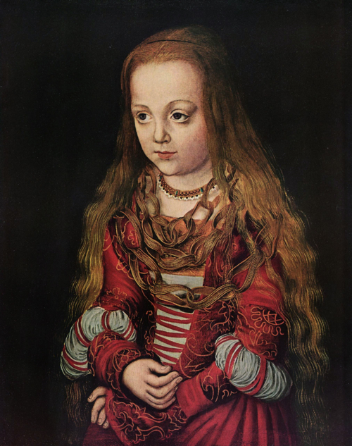
portrait of a Saxon Princess, Lucas Cranach the Elder

Whatever the reason for them, it’s amazing how much difference these preferences can make. The other day I went up to see the Cranach, but the ‘From Russia‘ exhibition was still running at the Royal Academy and the queues were horrendous, so I popped in to the Pompeo Batoni at the National instead. Batoni was an C18th Italian artist who did history paintings and portraits, many of them English aristos doing the Grand Tour. I didn’t bother to blog about it because I just found it so boring. In the Cranach, on the other hand, I liked every single work, even the ones were it didn’t seem like he was really trying.

And there are a few like that; apparently he was famous at the time as a quick man with a brush, the person to go to if you’d just built a new castle and needed a dozen paintings on assorted themes to brighten up the place. He had a big workshop and churned out lots and lots of work, including many repetitions of the same themes. Compare, for example, these portraits of Martin Luther, all in different galleries: 1, 2, 3, 4, 5.

Cranach was a friend of Luther’s, and as well as portraits of Luther he painted biblical scenes illustrating Protestant themes, illustrations for Luther’s German translation of the bible, and other Protestant propaganda material; yet that didn’t stop him taking commissions for prominent Catholics. There was a marvellous portrait of Cardinal Albrecht of Brandenburg who was working on a Catholic version of the bible in German, painted as St Jerome, the man who translated the bible into Latin. He’s sitting in his suitably German-looking study, wearing his red cardinal’s robes, surrounded by animals, including a lion, a parrot, a squirrel and a family of pheasants.

Adam and Eve, Lucas Cranach the Elder

And I don’t suppose Luther would have approved of the sexy pictures of naked, pot-bellied, weaselly-faced blonde girls, who all look the same whether they are supposed to be Lucretia, Eve or Venus. One of these features on the posters for the exhibition, and the National managed to gain a bit of free publicity when it was initially rejected by London Underground as being too racy for them.

As you can tell, I give the show a big thumbs-up. I just don’t understand why it should be so much less popular than ‘From Russia’. It’s just as well it was, though, because these are the kind of paintings you want to get right up to, and take in the details.

» The RA’s exhibition website is pretty rubbish, as usual. Both the paintings above featured in the exhibition but I got the images from Wikimedia Commons. The portrait of a Saxon princess (they know she’s a princess by what she’s wearing, but don’t know which one) is from the National Gallery in Washington. Adam and Eve are in the Courtauld in London.

Categories
Culture

Peter Doig & the Camden Town Group at the Tate

I went to Tate Britain today, mainly to see the Peter Doig, but while I was there I also had a quick look round the Camden Town Group exhibition.

Doig is a contemporary painter, born in Edinburgh in 1959 but brought up in Trinidad and Canada, who went to art school in London and now lives in Trinidad. So he certainly qualifies for an exhibition at Tate Britain — he’s at least as British as Greg Rusedski and a lot more British than Kevin Pietersen — but many of his paintings feature Canadian or West Indian landscapes. Or at least most of them are apparently composite scenes rather than pictures of anywhere in particular, but the influence is there.

Jetty, Peter Doig

He does large, rather beautifully coloured paintings which are largely landscapes, using that term broadly. The earlier ones are built up of lots of layers of different paint textures: washes, speckles, a few big globs, dry brushwork and so on. But each layer is very light; they’re not encrusted with paint, and in fact the texture of the canvas tends to show through. The total effect is subtle and atmospheric; almost kind of misty and ambiguous. The paintings really don’t translate well to small jpegs, so it doesn’t do it justice, but fwiw, the picture above is Jetty.

His more recent paintings tend to be much less elaborately textured, and overall I didn’t like them quite as much, but the best ones are still lovely. It’s always nice to go an art exhibition where most of the works are attractive objects. I’m not suggesting that it’s either necessary or sufficient that art is attractive, but the basic pleasure of looking at beautiful things is worth celebrating.

Country Rock, Peter Doig

The exhibition website is full of stuff — yay for the Tate, who always do a good job of that — and there’s a nice little video interview by the artist. I found it froze a couple of times when I tried to watch it online, but there’s a link to download it at the top-right of the page.

The Camden Town Group were less exciting, for me. They were a group of Edwardian artists, with Walter Sickert the most famous, who lived in Camden (obviously) and were interested in urban subjects: cityscapes, the music hall, working class life. They painted rather drab Impressionisticky pictures which are sort of interesting but without much in the way of snap, crackle or pop. I think if I found one of these pictures in a second-hand shop, I’d think it was by one of the many many fairly talented but conventional painters who still churn out Impressionisticky landscapes all over the place. Obviously the work was a bit more radical at the time, but still… it didn’t do much for me. Here’s one of the few I really did like, a painting by Sickert of pierrots performing on an outdoor stage in Brighton in 1915.

Brighton Pierrots, Walter Sickert

Generally, though, it was most interesting as history and sociology rather than for the art itself. I think the gallery almost admitted as much by the amount of contextual material included: archive film, Suffragette pamphlets, music hall fliers, advertisements for the Underground. Perhaps that’s unfair.

» All pictures are taken from the Tate’s exhibition websites and are © accordingly.

Categories
Culture

Coming of Age: American Art 1850-1950

This is a touring exhibition of paintings from the Addison Gallery of American Art in Andover, Massachusetts that is currently at Dulwich Picture Gallery. Though it will be going to Venice and then Fort Lauderdale later in the year, if that’s more convenient for anyone.

The West Wind - Winslow Homer

I didn’t have hugely high expectations, because the DPG exhibition space is fairly modest in size for a review of a whole century of art, but actually the show works well. It may not be the definitive exhibition of late 19th and early 20th century American art, but it has enough material to suggest an overall narrative, including plenty of enjoyable work. With a very few exceptions it’s one painting per artist, so there’s a kind of lucky dip feeling about the whole thing; especially since it’s hung without too much editorial commentary. It’s like: here’s a load of paintings; see what you think.

Wave, Night - Georgia O'Keeffe

There are plenty of big names represented — Winslow Homer, Sargent, O’Keeffe, Hopper, Whistler, Pollock — but with the one-painting per artist thing, they are very much in the context of other peoples’ work. I don’t know enough to judge how representative that context is, but it worked pretty well for me.

Acrobat in Green - Walt Kuhn

Here and there on the walls between paintings there are quotes from the artists about art and, often, Americanness. I think it’s quite a nice device: it provides some context, some connection to the painters, but again without too much curatorial commentary.

So all in all, not a life-changing exhibition, but well worth popping in and having a look.

» The Addison website has photos of all the work in the exhibition. Those I’ve picked out are The West Wind by Winslow Homer, Wave, Night by Georgia O’Keeffe and Acrobat in Green by Walt Kuhn.

Categories
Culture

‘Breaking the Rules’ at the British Library

I realised that Breaking the Rules: The Printed Face of the European Avant Garde 1900 – 1937 was about to close, so I popped in today for a quick gander. As ever at the BL, the range of material was impressive: they really do own a lot of stuff. Eliot, Bretton, Man Ray, Lorca, Mayakovsky, Ernst, Rodchenko… you name it, they’ve got it.

I started out carefully reading all the labels and conscientiously looking at each item, because I thought it was probably the kind of exhibition where background information and context would make all the difference. And it was interesting, but I still started to speed up fairly soon. There were some items that were nice pieces of design in their own right and had an immediate appeal even for the non-specialist; but rather more that didn’t. Particularly as they were all in languages I don’t read.

Mayakovsky's For The Voice

The material was mainly grouped by city; Paris and Moscow/St Petersburg had the biggest displays, but 30 cities were included, from all over Europe — Milan, Belgrade, Vienna, Barcelona, Brussels, Warsaw, Kiev, and so on — which did give a strong sense of this as a genuinely widespread movement. Or group of movements. Mind you, I didn’t pay that much attention to the dates, but they weren’t all active simultaneously. The exhibition covered a 37 year period, which is plenty of time for artistic fashions to sweep from one side of Europe and back again several times over.

They even made a case for London as an avant garde city, but it wasn’t completely convincing, somehow. For example, there were successful exhibitions of the Surrealists and the Futurists in London: but that’s not the same as producing the stuff ourselves. Perhaps I’m being unfair. Perhaps I just find it easier to take all these Frenchmen and Russians seriously because they’re French and Russian. Still, there was a good gag from Wyndham Lewis: apparently he supported his application for a British Army commission by saying that he had masterminded the Cubist invasion of Britain ‘without losing a single cube’.

» The picture is the cover of Для голоса (‘For the Voice’) by Mayakovsky, designed by El Lissitzky.