Categories
Culture

Grayson Perry: The Tomb of the Unknown Craftsman

Grayson Perry has curated an exhibition at the British Museum that combines his own work — ceramics, textiles, ironwork — with objects from the museum collection. Which must have been *the most fun ever*. I mean seriously, I’ve spent hours browsing the BM’s collection online, looking for things to post to Tumblr, but how much more fun to actually wander around the stores, talking to the experts, poking around in drawers and cabinets, and actually handle everything, with an open-ended brief to find anything which is beautiful, or interesting, or funny.

In fact, if it had just been stuff from the collection with some commentary from Perry, that would be enough to make a very interesting exhibition, because he always writes well and interestingly about art and he clearly has an excellent eye.

But the inclusion of his own work does work well. His work always combines a seriousness with humour and absurdity, and its presence affects the way you look at the other objects. Human beings often are absurd, after all, and museums aren’t always the best places to bring that out. For that matter, museums don’t always do seriousness very well. I mean, they’re good at dry, academic seriousness, but they don’t necessarily create the environment for human seriousness.

And in turn it gives you some insight into how he sees his own art to see the things he’s chosen to show alongside his work, and the themes he arranged the exhibition around: pilgrimage, magic, sexuality, maps and so on. And since I haven’t said so explicitly yet: Perry’s work is interesting and attractive in its own right.

So, yeah, a playful, entertaining exhibition full of striking, interesting and beautiful things. Go and see it.

» The image is of a painted wooden figure of a dancing Bes holding a tambourine, standing on a lotus. It’s Egyptian, from about 1800BC. It is from the BM, but it wasn’t in the exhibition.
Categories
Culture

On The Ice, London Film Festival

The London Film Festival is going on at the moment, and I went to see the first of the four films I’ve booked, which was On The Ice, set in Barrow, an Alaskan town which is the most northerly in the US. It focuses on a pair of Inuit teenagers, and in some ways it’s your classic conflict-between-tradition-and-modernity setup. The film equivalent of a lot of the books I’ve been reading for the Read The World challenge. So they’re living in a world of drugs and hip hop, but also seal hunting and whaling.

The plot revolves around a drunken fight which gets out of hand, and the unfolding consequences. And generally I thought it was very effective. There was a moment in the middle when I thought it was in danger of losing its way, but it pulled itself together and finished strongly.

There’s a particular appeal to these kind of films, made on a microscopic budget with no real prospect of making any money. Not that I have anything against commercial cinema; on the contrary, I tend to think that when an art form ceases to have a real popular following, it dies as an art and becomes a heritage activity, like calligraphy, or hand-weaving, or jazz. Nothing wrong with those things, but their golden ages are behind us.

But still, it seems like there’s a kind of clarity of purpose when a film isn’t even trying to be commercial. It can just focus very straightforwardly on the characters and the story. And while the lack of budget presumably brings its own set of compromises, at least it helps keep the director from being distracted by all the bells and whistles.

Anyway, it’s a good movie, worth checking out if you get the chance.

Categories
Tumblr

Tumblr roundup, Oct 12th

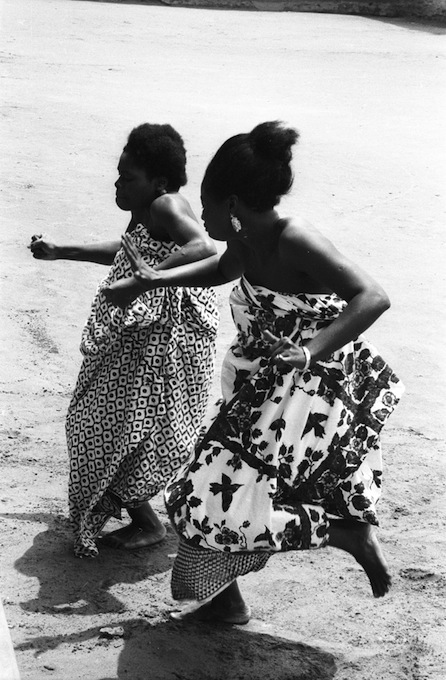
I spent some time in the Smithsonian collections this week, browsing a load of photos from Benin and Nigeria, mostly from about 1970. They all turned out to have been taken by Eliot Elifoson on various journalistic assignments in Africa. This is women dancing at the royal palace in Abomey:

Other Elifoson: appliqué workers in Abomey — the dance of the women warriors — John Adetoyese Laoye I, Timi of Ede — cutting down a tree — a football match between Dahomey (i.e. Benin) and Nigeria.

Captain Scott’s biographer makes a plausible case that we should remember the Antarctic explorer not as a heroic failure, but as someone whose reckless incompetence resulted int he entirely avoidable deaths of five people.

Mike Konczal runs the numbers on the We Are The 99% Tumblr to find out what the posters are mainly talking about, and reaches some (gloomy) conclusions about what it implies.

Devil’s Flower Mantis — a truly remarkable looking crustacean, Galathea pilosa — something that looks like a cross between a gorilla and a donkey, but is actually a chalicothere — a super-cute stoat video — a camouflaged lizard.

Soviet cotton-picker fabric design — a segmented tree — collage by Juan Gatti.

The Annunciation, Gerard David, 1506 — Young Woman with Ibis, Edgar Degas — Bowery, Paul Himmel — Night: Izcuchaca aqueduct, Arequipa, Peru. Carlos Vargas and Miguel Vargas, 1922.

Categories
Me

Belated France follow-up, French civic geekery edition

I know I’ve been back for a while now, but there was one thing I’ve been meaning to blog about. The place we were staying was only a village, really, but in the best French manner it had a town square with a handsome town hall, in front of which was an obelisk-shaped monument that looked like it might be a memorial to the dead of the Great War, or just an ornamental drinking fountain.

But when I wandered over to look at a face carved into the top of the obelisk, it turned out to be Galileo. Which seemed a bit odd. Surely the great man had no connection to this little village in Languedoc? And on the other side was a portrait of Isaac Newton. But it gets better:

Yup, as a nearby sign explained, this is a monument in honour of the metric system, erected by the mayor of St-Victor La-Coste in 1888 for the centenary of the French Revolution.

Admittedly, given that the French revolution was, among other things, a brutal, blood-drenched clash of social classes competing for the chance to wield power, it might be seen as whitewashing to memorialise it as a rationalist Enlightenment project typified by a sensible reform of the system of measurements. But the French are hardly alone in being selective about the bits of their history they choose to celebrate.

And you know what, the metric system is a pretty great idea. Hurrah for the C19th French provincial bourgeoisie and their civic pride in the ideals of the Enlightenment.

On the other three sides of the obelisk, there are a list of the mayor and local council members who erected it, and some further details about the town. But my favourite bit is this:

I love that boast: ‘The metre adopted in France in 1795; the rest of Europe in 1872’. I’m just surprised they resisted the temptation to add a line saying ‘England: still in the dark ages’.

Originally there were also a thermometer and a barometer attached to the monument, but they have sadly gone.

Incidentally, I just love the typography.

The numerals and the Q are particularly pleasing, but the whole effect is very good; it’s a pretty standard Roman-style inscription but it has a bit of character. Perhaps it’s just the extra personality that comes with being hand carved by a real craftsman; we are surrounded by too much bland computer-generated signage these days. I miss hand-painted shop signs.

Categories
Other

Steve Jobs and William Morris

In my post about Steve Jobs I quoted William Morris’s famous dictum ‘Have nothing in your houses that you do not know to be useful or believe to be beautiful’.

I just wanted to say: yes, I am aware of the irony of quoting a socialist and anti-industrialist in praise of a great capitalist, a titan of industry who sold products by the hundreds of millions, each one assembled by low-paid workers in vast, sterile, soulless factories in China.

But then Morris’s vision of handmade, artisan production was quixotic even when applied to things like furniture and books; he couldn’t uninvent the industrial revolution. It certainly wouldn’t work for smartphones.

And to leave the politics to one side for a moment; aesthetically the Arts and Crafts movement was a reaction against the way that mass production cheapened and coarsened material culture. It was a reaction to all those second-rate industrially produced imitations of traditional craftsmanship. Well, Apple’s best products have also fought against the shoddy and second-rate; but instead of rejecting mass production, Jobs wanted to do it right.

I suppose Morris would argue that was little consolation to those workers in their factory in China.

» The wallpaper is Morris’s ‘Fruit’ pattern. I picked it because it includes some apples.

Categories
Other

Steve Jobs RIP

On the desk in front of me are a computer and an external hard drive for backup. The computer is a 24″ aluminium iMac from 2007, and the hard drive is a Western Digital My Book Pro from about the same time.

The iMac is 4 years old, so the novelty value has long worn off, but I still get a degree of satisfaction from looking at it: it’s an obviously high quality object, well-made and well-proportioned. The design, with the whole computer and screen suspended from an angled metal foot, might be precarious if it was done badly; but in fact it is solid as a rock, and the angle of the screen adjusts easily but stays where you put it. The Apple logo on the front is the same glossy black as the screen surround and contrasts with the soft, non-glossy brushed aluminium of the body.

The hard drive is designed in broadly the same style: it’s a plain metal box formed out of rounded rectangles, with a simple glowing blue ring on the front. But the metal doesn’t have the same quality of finish as the computer: it’s greyer and slightly shinier, and it’s held together by an ugly plastic rim that immediately makes the whole thing look cheap. And it’s flimsier, and it’s been manufactured via a cheaper process; I think the iMac was machined out of a block of aluminium, whereas the hard drive looks like it was made by bending sheets of metal into shape. And the logo etched onto the side is a bit ugly. And the grille on the top is cut with an odd pattern of square holes and slots which is presumably intended to be attractive but just looks like design for the sake of design. And having managed to find, download and install the right driver to make the button on the front work, it now communicates with me via an arbitrary and completely unintuitive system of flashing lights: if the light is going round in a circle, that means one thing; flashing means something else; a steady light means something different again. If I ever need to know what they mean, I look it up in the manual, then immediately forget again.

Don’t get me wrong, the Western Digital drive is entirely good enough for my purposes and I would cheerfully recommend it to a friend. And despite my nitpicking, it’s not a hideous object, it’s a normal-looking bit of consumer electronics. I’ve seen much worse. But when Apple made the iMac, they didn’t settle for ‘good enough’, ‘not hideous’ and ‘normal looking’. They made something excellent.

I know Steve Jobs didn’t personally design my iMac. The credit for that has to go to Jony Ive and his team. But Jony Ive was already at Apple before Jobs came back, and the company wasn’t winning any design awards. And I bet there are talented designers working at Samsung and Nokia and Sony and even Microsoft. But what Jobs did was create the environment where design is able to survive. He made sure that the good work of designers was not always being undermined by the pressure to ship products quicker, to make them cheaper, to include badly-executed features so you can list them on the box. I bet there are amazing, beautiful prototypes sitting in labs at HP and Sony and Samsung; but at Steve Jobs’s Apple they were still beautiful when they reached the customer.

William Morris said ‘Have nothing in your houses that you do not know to be useful or believe to be beautiful’. Under Jobs, Apple made products that were more beautiful — something that seemed to irritate a lot of technology people, who apparently regard the quest for beauty as suspicious and potentially subversive. But they also made products that were more useful, because Jobs understood that it doesn’t matter how many things a device can do; it only becomes more useful if you actually use it, and you only use it if it’s easy enough to use.