Categories
Culture

‘Treasures of Heaven’ at the British Museum

So I went along to see the BM’s exhibition of medieval reliquaries. Which was a pretty amazing display of medieval craftsmanship: rock crystal, enamel, ivory, glass, and lots and lots of gold.
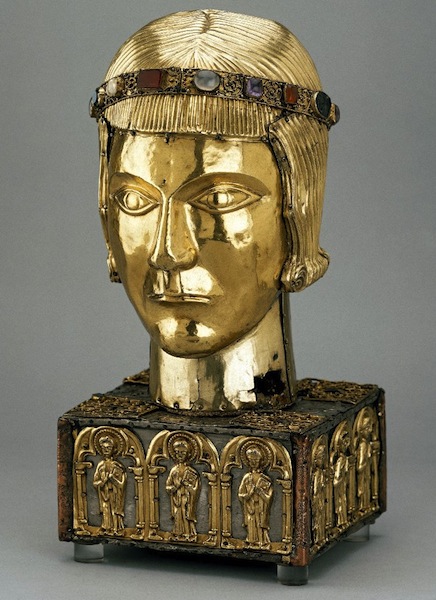
I didn’t enjoy it as much as I might have, though, because by the time I got there I had a bit of a headache. And it really didn’t help to be peering at lots of spotlit, shiny gold, trying to make out all the exquisitely worked detail. When I came out I had to take shelter in a dark quiet pub and nurse a pint of orange and soda for a bit.

I actually think gold is a slightly unrewarding material for this kind of thing. The overall effect is spectacular; particularly, presumably, in a dark church lit only by candles: bright, shiny, warm, glowing. But the very shininess makes it much harder to pick out the fine details of the craftsmanship; it was more rewarding, I think, looking at the fine work in materials like ivory and alabaster.

Apart from the sheer quality of the exhibits, it was anthropologically interesting. The scale is staggering, apart from anything else; there was apparently one church [I think somewhere in central Europe, from memory] which had 19,000 relics. It must have been a huge industry; not just the relics themselves, but the reliquaries, altars, altarpieces. And that was just the start of it. All that religious paraphernalia — the chalices and patens and thuribles — the ecclesiastical robes, the figures of saints, the murals, the stained glass windows; the whole business must have provided employment for thousands and thousands of workers. Goldsmiths, carpenters, stonemasons, painters, embroiderers, all employed primarily to produce religious objects, either for the church or for private devotion. The Reformation must have been economically catastrophic for them: it was effectively a whole economic sector disappearing.
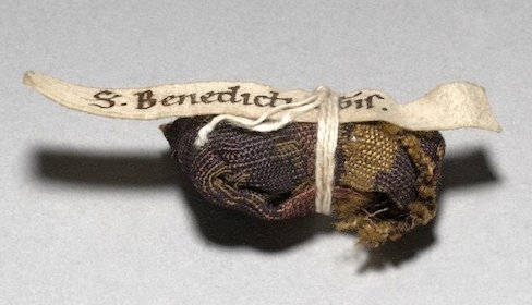
The other striking thing, and I know it’s not exactly an original observation, is how ludicrous the relics often are. The foreskin and umbilical cords of Christ probably win the prize in that respect, although all the other relics directly associated with Christ also tend to strain credulity: fragments of his manger, bits of True Cross, thorns from the crown, the spear that pierced his side, the sweat band, the magic sponge, all of which were claimed as relics. If you don’t believe in miracles, it’s very difficult to get into the mindset of a society that sees them everywhere; but even so, surely people must have been dubious about this stuff? Perhaps the idea was that the genuineness of the prayer was more important than the genuineness of the relic, although they certainly didn’t act that way.
Going to this exhibition soon after going to the Horniman Museum exhibition Bali: dancing for the gods, I was left thinking how ritually impoverished my own life is as a (somewhat culturally protestant) atheist. Apart from the occasional weddings and funerals, just about the only festival I regularly celebrate is Christmas — and that only consists of gift-giving and turkey. I don’t even usually do anything about Guy Fawkes Night or Halloween, let alone Easter or saints’ days or whatever. I can’t say I feel I’m missing out on an important part of life, but maybe I am. It’s hard to tell how often these events were genuinely spiritual in nature, and how much they were a kind of entertainment in a society without novels, TV, cinema and computer games to keep them amused.

» The images are all from the British Museum collection, because those are conveniently online, although the exhibition has many items borrowed from other institutions.

Top is the St Eustace Head Reliquary, German, ca. 1210.

Then a reliquary cross in cloisonné enamel and gold, Constantinople, early C11th. The Virgin is flanked by busts of St Basil and St Gregory Thaumaturgus.

The little bundle is a relic of St Benedict, one of over 30 relics in a single German portable altar from 1190-1200.

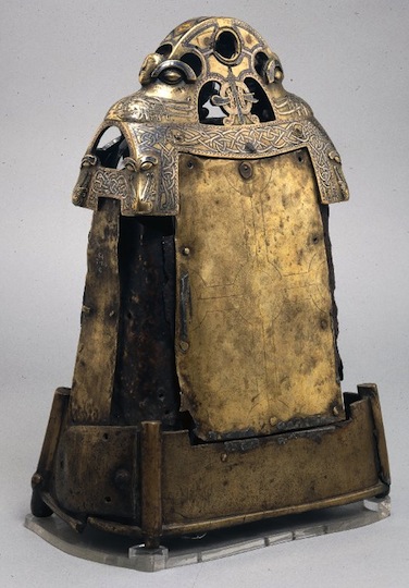
Last is the iron bell of St. Cuileáin in a copper alloy shrine, from Ireland, a C7th-C8th bell in a C12th shrine.
Categories
Culture

Twombly, Poussin, Emin and Hungarian Photographers

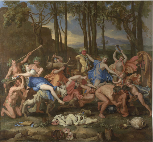
A bit of an exhibition round up. This is not, as you might think, four exhibitions, because at Dulwich Picture Gallery at the moment they have a combined Cy Twombly/Nicolas Poussin exhibition. Which might seem like a rather odd choice at first glance, since they lived 330 years apart and one of them painted highly controlled classical paintings and the other did scrawly abstracts.

But there is a kind of logic to it. Both of them moved to Rome at the age of about 30, both use lots of classical references in their work, and Twombly specifically referenced Poussin in several paintings, most notably by painting a large group of four paintings called the Four Seasons, a subject Poussin painted 300 years earlier.

And while I don’t think it was exactly revelatory to see them together, it’s always interesting to explore these kind of comparisons, as an intellectual parlour game if nothing else. I guess you could argue that the Poussins brought out a controlled, restrained quality in the Twombly, for example, but it’s rather an elaborate way to make such a straightforward point. I did find myself warming to Poussin more than usual, though. Clearly he’s a great painter, but generally I find his work a bit sterile. But being displayed among modern paintings did at least make the paintings seem a bit fresher.

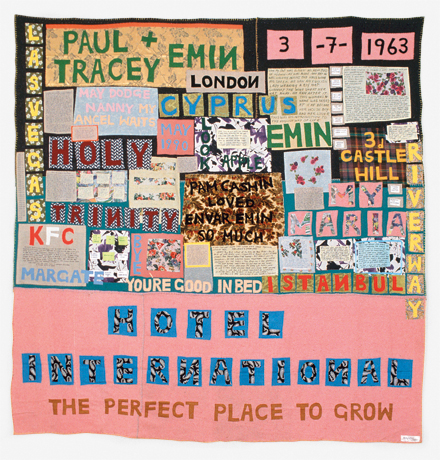
Meanwhile the Hayward is holding a retrospective of Tracey Emin. I went into it with mixed feelings. She has attracted so much bone-headed mockery from the media over the years that I’ve always felt the need to stick up for her… despite not actually liking her work that much. But seeing it all together it does hold up pretty well. The caricature is that she just splurges her personal life uncontrollably into her work for shock value; and that’s not completely unfair. But of course the execution is what matters, just as a confessional memoir could be good or bad could be good or bad depending on who wrote it. And at her best — some of the appliqué blankets, the video work — Emin’s work is sensitive and intelligent. On the other hand, by the time I had gone all the way round the exhibition, it was also starting to feel a bit repetitive. So she’s still not exactly my favourite artist, but I enjoyed the show well enough.

And at the Royal Academy is an exhibition of C20th Hungarian photography. Why Hungarian photography? Well, because five of the most notable photographers of the C20th — Brassaï, Robert Capa, André Kertész, László Moholy-Nagy and Martin Munkácsi — were all Hungarian. So they provide the core of the exhibition, but other, less famous people are included as well. In some ways the exhibition is about Hungary, with striking photographs recording the various wars political upheavals that engulfed the country, but it also includes many taken in other countries: Brassaï photographs of Paris nightlife, or Kertész shots of New York.

If there is anything distinctively Hungarian about the work, I couldn’t particularly see it. It did feel very European, somehow, and it reminded me again how much my idea of Europe was shaped by the Iron Curtain growing up. Austria ended up on one side of it and was therefore a ‘real’ European country; Hungary was on the wrong side and was part of some shadowy other Europe. And 20 years after the fall of communism, that sense of them not being part of the European mainstream still lingers. I don’t know how much that’s just me showing my age; people just out of university now, who were two three when the Berlin Wall came down, hopefully see the continent rather differently.

Anyway, geopolitics aside, the exhibition is definitely worth going to because it has some very fine photographs in it.

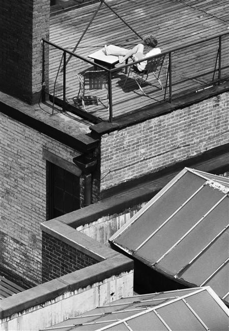
» The Triumph of Pan is by Nicolas Poussin; Hotel International, 1993, © Tracey Emin; Greenwich Village, New York, 30 May 1962 is by André Kertész.

Categories
Culture

‘The Cult of Beauty’ at the V&A

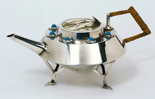
The Cult of Beauty: The Aesthetic Movement 1860-1900. I’m tempted to sum up the exhibition as ‘The Pre-Raphaelites and their furniture’, given my recent post about how much I dislike the Pre-Raphaelites. But actually the exhibition is rather broader than than that. The Pre-Raphs do feature heavily, but it’s also the Arts and Crafts movement, Japonisme and so on; lots of Whistler, William Morris, a bit of Aubrey Beardsley, and designers like Christopher Dresser and Edward William Godwin.

And although most of this stuff is not to my taste, the V&A does this kind of exhibition superbly well. The quality of the exhibits is extremely high (I would expect nothing less), and it is always interesting to see fine art and decorative art from the same cultural moment displayed together; so often we see paintings hanging in plain, austere galleries, with no context but each other.

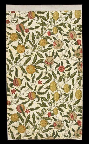
All the things that annoy me about the Pre-Raphaelites annoy me much less when it comes to furniture and ceramics and wallpaper. My problem with them, essentially, is that they are superficial: flashy, decorative, overly obvious. And the way that the paintings tend to pick other ancient or exotic cultures and reduce them to a stylistic quirk actually offers a clear parallel with the ‘Japanese’ furniture of the time. But it doesn’t bother me because after all, the decorative arts are, well, decorative. The moment you make a table which tries to do anything other than provide a stable flat surface, or a pot which does anything other than hold water, you are in the world of decoration and surface. Which isn’t intended to belittle those things: I’m fascinated by design, I love beautiful objects and I think that anyone who works to make sure that the objects around us give us pleasure is doing something very important.

But it says something about my different relationship with ‘fine art’ that I actually find Pre-Raphaelite paintings almost offensive. They irritate me in a way I can’t say I’ve often been irritated by a wardrobe or a candlestick, however ugly or ill-conceived I might think it is. I might be similarly annoyed by an object which doesn’t work properly because of bad design, but not usually by simple ugliness. What exactly that says about me… I’m not sure.

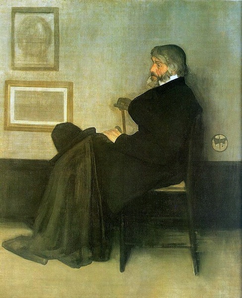
The figure who sits slightly oddly at the centre of this exhibition is Whistler. He seems stylistically apart the other artists; his paintings are exercises in understatement and control, and instead of scenes from myth and legend, he mainly paints people in houses. There’s a painting in the show (no doubt called something like Symphony in White) of a girl in a white dress. Apparently, when other people offered ingenious interpretations he insisted that, on the contrary, it was just what it looked like: a girl in a white dress standing in front of a white curtain.

So it’s tempting to see him as out of place in this exhibition, to think that really he should be over in some other gallery, maybe with the Impressionists. But clearly he is part of the same movement. There’s a room he designed for someone’s house (or at least a projection of it you can walk into) and it is full of the typical aesthetic motifs: peacocks, sunflowers, bamboo, blue and white porcelain. In his hands it’s rather lovely, I think; a lot of the interiors in the exhibition look like they would be claustrophobically busy — decorative knickknacks arranged on decorative furniture in front of elaborately patterned wallpapers and richly coloured patterned fabrics. Whistler uses the same motifs and while the result is still pretty full-on, with lots of strong colours and decoration everywhere, it is relatively cohesive and elegant. Even so, it’s hard to reconcile the richly decorative style with the simplicity of his paintings.

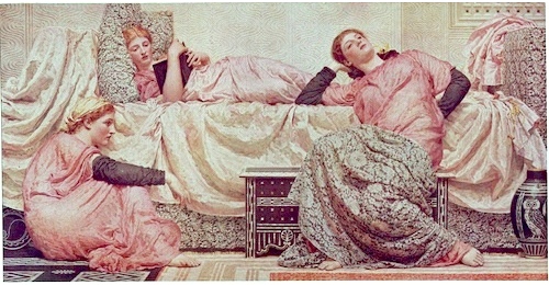
Although, having said all that, the exhibition did provide a good example of why the whole concept of ‘good taste’ should be treated with suspicion. In about the second or third room there was a group of paintings by Albert Joseph Moore. In some ways they are fairly typically Pre-Raphaelite: blank-eyed women with indistinguishable faces lounging around wearing ‘classical’ robes in a generically exotic interior. But the palette is all restrained pastels, and composition is carefully balanced and designed around a strict grid system. And I found myself thinking that’s a bit more like it, because they were more ‘tasteful’. But that seem like a pretty dismal way of thinking. To prefer the anaemic, milquetoast, decaffeinated version because it’s more restful: well, it’s not exactly going to produce art which is ambitious and interesting.

It is a fascinating conflict: I do think our lives would be hugely improved if more of the things around us showed evidence of good taste. Buildings, household appliances, packaging, signage, clothes, websites, books, posters, furniture… we are surrounded by things which are ugly or just mediocre. Which make our lives just slightly worse rather than better. But I also think that good taste is the great enemy of creativity and individuality, a stifling force that needs to be continually pushed back against. Especially since it is very difficult to separate an even somewhat objective idea of ‘good taste’ from simple social conformity.

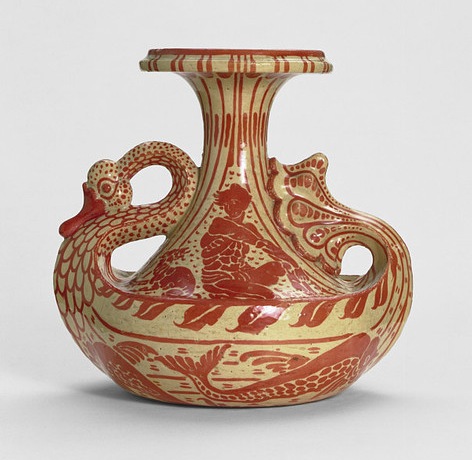
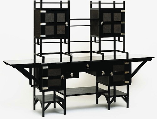
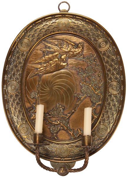
» The vase is designed by Walter Crane, the sideboard by E.W. Godwin, the sconce by Thomas Jekyll, the wallpaper by William Morris, and the teapot by Christopher Dresser. The two paintings are Arrangement in Grey and Black, No. 2: Portrait of Thomas Carlyle by Whistler, and Reading Aloud by Albert Joseph Moore.

Categories
Culture

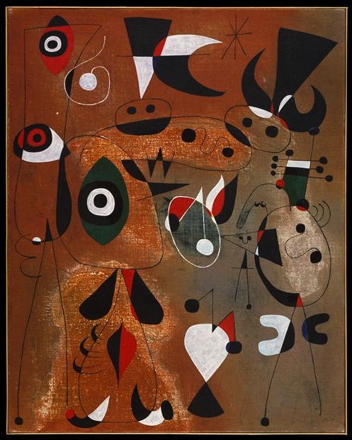
Miró at Tate Modern

Without knowing a lot about Joan Miró, I’ve always liked his work when I’ve seen it. It’s interesting the way that the work of one artist will speak to you and another won’t… so I’ve aways liked Miró, never liked Chagall.

Or at least I say the work ‘speaks to you’ but that’s not the right metaphor; I don’t think it’s because the paintings are making some sort of intellectual or emotional connection. Or at least I don’t think that’s primarily what it is; it’s more to do with a basic visual aesthetic. I tend to like controlled, precise, carefully composed paintings with strong clear colours: so I like Vermeer, but find it hard to like Rubens. It’s suppose it’s a graphic design sensibility, really.

Articulating it like that does make me feel a bit shallow; taking great painters and sorting them into sheep and goats according to the most superficial and basic elements of their visual style, well, it doesn’t exactly make me a sophisticated judge. But there you go. It’s not the only factor which decides which work I like, but it certainly makes a difference.

So I was predisposed to like this exhibition. Which I did. I thought it was fabulous. Mainly because I liked all paintings, of course; but also because I didn’t know much about Miró, so it was interesting to see the chronological development of work. There was also quite a lot of biographical context, much of it related to Spanish politics — Miró’s Catalan identity, the Spanish civil war, WWII and so on. So that was all quite interesting.

But mainly I just love the paintings. I want to own all of them and have them on my walls.

» Women, Birds, and a Star, 1949. Which is in the Met, although I got the image from RMN.

Categories
Culture

Watercolour at Tate Britain

I actually went to see this exhibition about a week or so ago, but I’ll just jot down some belated impressions. It is, as the title suggests, a historical survey of watercolour painting, from the medieval to the present.

There are only a handful of medieval pieces, bits of illuminated manuscript, which just serve as a reminder that, although they are not what we usually think of as ‘watercolour’, that is technically what they are.

The exhibition makes the interesting point that originally watercolour was mainly seen as an adjunct to drawing: a work would be drawn in pencil or ink and then effectively coloured in, sometimes just with a few hint of colour to liven the drawing and sometimes in a more thorough way. So many of the early pieces are technical works of one kind or another: costume designs for Elizabethan masques, maps, plans of fortifications, as well as a few specific uses like portrait miniatures.

That technical aspect leads on to what is probably my favourite room of the exhibition, a room of scientific illustrations; especially botanical illustrations but also birds and mammals. Many of these were lent by the Natural History Museum or Kew, which is a clear sign that they were not originally created as Art, but they are gorgeous things. It even included some lovely C19th paintings of rock types — each one is a lump of rock on a plain white background, and they look like an elegantly minimalist conceptual art project.

After that we get into watercolour as an artistic medium in its own right. This includes plenty of ‘typical’ watercolours — landscapes, basically — but also a variety of paintings chosen at least partially to challenge that stereotype. So we have a room of war paintings, a room of ‘visionary’ paintings, a room of exhibition watercolours (i.e. large-scale C19th narrative paintings designed to compete with oil paintings for gravitas), and a room of contemporary work using watercolour.

My single biggest problem with the exhibition is that C19th British painting is not something I particularly enjoy. And that was the golden age of watercolour. So the aesthetic of the paintings was more off-putting than anything to do with watercolour as a medium. The exhibition watercolours seemed particularly pointless. I don’t like Victorian narrative painting and find the Pre-Raphaelites exceptionally noxious; seeing them painted in watercolour instead of oils didn’t make them any more likeable. Especially since there was no obvious attempt to make a virtue of the different medium: rather they seemed to be straining to make watercolours look as much like oil as possible.

And some of the paintings had clearly faded, which is the great technical problem of watercolour as a medium. There’s nothing much you can do about that, but it is a pity. There was a painting of some sun-drenched imperial outpost (Egypt? India?) which just didn’t look very hot, and I think it had probably faded a bit. So the shadows weren’t as dark, and the tones weren’t as warm.

As you can tell, I wasn’t blown away. But every room had something of interest and something covetable. And every so often there was a painting which was gorgeous and which could only have been done with watercolour: liquid and light and translucent. So it’s well worth a visit.

» The painting of the Lion-haired macaque, Macaca silenus, is by an unknown Chinese artist working for John Reeves, who employed locals to paint the specimens he was collecting while working in Canton from 1812-1831. That particular work is not in the Tate, though they do have a different monkey from the Reeves collection, lent by the NHM.

Categories
Culture

Jan Gossaert at the National Gallery

I went along to this with little knowledge and few preconceptions and on the whole was pleasantly surprised. I’ve said before I particularly like the Northern Renaissance for its more medieval aesthetic compared to the Italians. That’s actually less true of Gossaert; a lot of his figures have that contorted quality that I associate with, say, Michelangelo; of being posed in rather uncomfortable-looking positions with pronounced foreshortening. They also have a kind of fleshiness which relates to the Italians but also seems to make him a precursor of painters like Rubens and Jacob Jordaens.

The portraits stood out for me; which, come to think of it, is often the case in these exhibitions. I guess that’s partially because of their human interest — they are the most gossipy kind of painting — and partially because the relatively constrained format strips away many of the things modern audience find off-putting about older paintings. I think there are various reasons why religious paintings and history paintings are not to modern taste, some of it to do with the subject matter, but also the style. Whereas a straightforward head-and-shoulders portrait, the subject looking out of the canvas, is probably the single genre of painting which carries through most directly from the Renaissance to now.

So there was certainly stuff to enjoy — not least some fantastic Dürer engravings and woodcuts which were in there for context — but I can see why Gossaert’s not as well known as some of his contemporaries. He was clearly a wonderful painter, but he just lacks the extra something to make him stand out. And the ways in which he is different from his contemporaries probably make him less to modern taste rather than more. Certainly less to my taste.