Categories
Culture

Voices from Chernobyl by Svetlana Alexievich

Voices from Chernobyl was written in 1996, ten years after the reactor meltdown. It is an oral history of the disaster; that is, it’s presented as a series of ‘monologues’ by people who were involved in some way, with titles like ‘Monologue about War Movies’, ‘Monologue about the Shovel and the Atom’, ‘Monologue about Expensive Salami’. I’m actually a bit curious about exactly how they were collected; they are presented as verbatim transcripts, although I’m sure they’ve been tidied up somewhat. What you don’t get is any idea of what questions or prompting came from the interviewer. It’s quite an effective device, keeping the journalist out of the spotlight and letting the voices speak for themselves, but I assume there’s an element of artifice to it. I don’t think it detracted from the book, I’m just curious about the process.

The result is, anyway, an extraordinary book. The stories come from all kinds of perspectives: local farmers, soldiers, scientists, officials, construction workers, wives, children. And the material is fascinating: people’s accounts of being evacuated, of working on the reactor site, of nursing dying relatives. There are people who refused to leave, and people who came back because it was home, and people who, having fled conflicts elsewhere, moved to the area because there were houses lying empty. And overlying it all is the extraordinarily inept and chaotic government response, which included, for example, failing to distribute iodine or breathing masks because they thought doing so might cause panic.

And as well as the material being so interesting, it has a very literary quality; bleak and fatalistic, but laced with dark humour and absurdity, sometimes earthy, sometimes poetic. That poetry comes both from the real poignancy of the human situations and the surreal quality of many things that happened: the soldiers sent into the Zone to kill all the cats and dogs; the people whose job it was to dig up soil and bury it in pits; the fact that they were told that drinking vodka would help fight radiation poisoning, so everyone seems to have been rolling around in an alcoholic haze.

It really is a fabulous book. Here’s a little excerpt, from a man who has moved to live in the evacuated zone:

It’s easy to find books here. Now, an empty clay pitcher, or a spoon or fork, that you won’t find, but books are all over. The other day I found a volume of Pushkin. “And the thought of death is sweet to my soul.” I remember that. Yes: “The thought of death.” I am here alone. I think about death. I’ve come to like thinking. And silence helps you to prepare yourself. Man lives with death, but he doesn’t understand what it is. But I’m here alone. Yesterday I chased a wolf and a she-wolf out of the school, they were living there.

Question: Is the world as it’s depicted in words the real world? Words stand between the person and his soul.

And I’ll say this: birds, and trees, and ants, they’re closer to me now  than they were. I think about them, too. Man is frightening. And strange. But I don’t want to kill anyone here. I fish here, I have a rod. Yes. But I don’t shoot animals. And I don’t set traps. You don’t feel like killing anyone here.

And here’s a bit by someone else, who moved back:

Sometimes I turn on the radio. They scare us and scare us with the radiation. But our lives have gotten better since the radiation came. I swear! Look around: they brought oranges, three kinds of salami, whatever you want. And to the village! My grandchildren have been all over the world. The littlest just came back from France, that’s where Napoleon attacked from once—”Grandma, I saw a pineapple!” My nephew, her brother, they took him to Berlin for the doctors. That’s where Hitler started from on his tanks. It’s a new world. Everything’s different. Is that the radiation’s fault, or what?

Voices from Chernobyl is my book from Belarus for the Read The World challenge. If you’re thinking ‘hang on, Belarus, that doesn’t sound right’, well, you’re right, the plant itself is in Ukraine, but it’s just by the border with Belarus and so Belarus was one of the worst affected places.

A quick namecheck for the translator, Keith Gessen, who I’m sure deserves a lot of credit for how well the book reads in English; and just to reiterate, I think this is a really good book and I strongly recommend it.

» There’s a whole load of photos around the web taken by tourists to the contaminated zone. Lots of pictures of the deserted town of Pripyat, particularly of peeling, empty schoolrooms. But after reading the book, they just seem too unpleasantly voyeuristic, so instead I grabbed a map of the contaminated area from Wikipedia.

Categories
Culture

Open City by Teju Cole

I ordered this novel because I’d read and enjoyed various bits of Cole’s writing around the internet. I’ll keep this short because I’ve been getting pins and needles in my hands which I suspect is down to spending too much time typing, so I’m trying to rest them a bit.

So suffice to say it’s a delicately written, nuanced novel set mainly in New York which is about, among other things, migration and identity. I really liked it.

Categories
Culture Nature

Tumblr round-up, July 18th

I may try to find a way, later, of incorporating the stuff I’ve posted to Tumblr more closely into this site, but until then I think I’ll start with a weekly round-up. The idea is to post a summary of the previous week, but since I’ve got a backlog, I’ll start by ranging a bit more widely. So here’s a selection of stuff from the past month or two.

That’s a Persian priest, by the C16th Danish/German artist Melchior Lorck. In the 1550s he was part of a diplomatic mission to the court of Suleiman the Magnificent in Constantinople, and he was working on a book of woodcuts from his travels when he died in 1583. I stumbled across them when browsing through the British Museum collection. There are a lot more where that came from: just search for ‘Print made by Melchior Lorck‘. Apart from the historical interest, he has a real graphic designer’s eye.

Parrots have names. Or at least they have ‘signature calls that are used to recognise individuals’, and birds imitate the signatures of others to get their attention. And researchers have found that these names are given to the chicks by their mothers before they are old enough to call for themselves.

Of all the thousands of words I’ve read about the News of the World hacking scandal, I thought this Reuters article about the culture of the newsroom at the NotW under Rebekah Brooks was one of the most striking.

Some ceramics: a delftware wine bottle from C17th London; a Chinese wine-cup; another Chinese wine-cup, this one decorated with auspicious fruits; one of my favourites, a stoneware jug from C12th Korea. And I think this is gorgeous, a tin-glazed earthenware jug from Fez, ca. 1870:

A snail tongue; an amazing mineral; the head of a honey bee; some octopus tattoos; an extraordinary fish; a poisonous newt; a spotty squid [I think]; the newly-discovered world’s smallest orchid.

An icon of St George; a portable figure of Jagannatha (‘Lord of the World’); a guardian figure from Cameroon; a stamp; a watercolour of a stormy landscape by Penry Williams; a Chinese Francis Bacon; a C15th Swiss wild man and wild woman in stained glass.

Categories
Culture

Twombly, Poussin, Emin and Hungarian Photographers

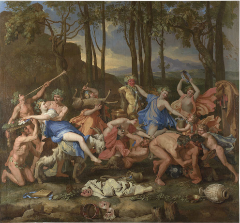
A bit of an exhibition round up. This is not, as you might think, four exhibitions, because at Dulwich Picture Gallery at the moment they have a combined Cy Twombly/Nicolas Poussin exhibition. Which might seem like a rather odd choice at first glance, since they lived 330 years apart and one of them painted highly controlled classical paintings and the other did scrawly abstracts.

But there is a kind of logic to it. Both of them moved to Rome at the age of about 30, both use lots of classical references in their work, and Twombly specifically referenced Poussin in several paintings, most notably by painting a large group of four paintings called the Four Seasons, a subject Poussin painted 300 years earlier.

And while I don’t think it was exactly revelatory to see them together, it’s always interesting to explore these kind of comparisons, as an intellectual parlour game if nothing else. I guess you could argue that the Poussins brought out a controlled, restrained quality in the Twombly, for example, but it’s rather an elaborate way to make such a straightforward point. I did find myself warming to Poussin more than usual, though. Clearly he’s a great painter, but generally I find his work a bit sterile. But being displayed among modern paintings did at least make the paintings seem a bit fresher.

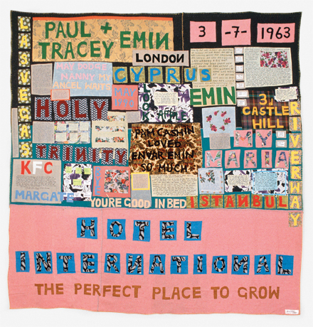
Meanwhile the Hayward is holding a retrospective of Tracey Emin. I went into it with mixed feelings. She has attracted so much bone-headed mockery from the media over the years that I’ve always felt the need to stick up for her… despite not actually liking her work that much. But seeing it all together it does hold up pretty well. The caricature is that she just splurges her personal life uncontrollably into her work for shock value; and that’s not completely unfair. But of course the execution is what matters, just as a confessional memoir could be good or bad could be good or bad depending on who wrote it. And at her best — some of the appliqué blankets, the video work — Emin’s work is sensitive and intelligent. On the other hand, by the time I had gone all the way round the exhibition, it was also starting to feel a bit repetitive. So she’s still not exactly my favourite artist, but I enjoyed the show well enough.

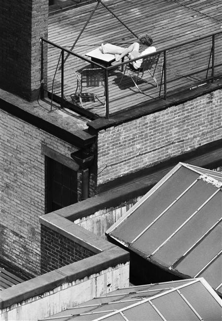
And at the Royal Academy is an exhibition of C20th Hungarian photography. Why Hungarian photography? Well, because five of the most notable photographers of the C20th — Brassaï, Robert Capa, André Kertész, László Moholy-Nagy and Martin Munkácsi — were all Hungarian. So they provide the core of the exhibition, but other, less famous people are included as well. In some ways the exhibition is about Hungary, with striking photographs recording the various wars political upheavals that engulfed the country, but it also includes many taken in other countries: Brassaï photographs of Paris nightlife, or Kertész shots of New York.

If there is anything distinctively Hungarian about the work, I couldn’t particularly see it. It did feel very European, somehow, and it reminded me again how much my idea of Europe was shaped by the Iron Curtain growing up. Austria ended up on one side of it and was therefore a ‘real’ European country; Hungary was on the wrong side and was part of some shadowy other Europe. And 20 years after the fall of communism, that sense of them not being part of the European mainstream still lingers. I don’t know how much that’s just me showing my age; people just out of university now, who were two three when the Berlin Wall came down, hopefully see the continent rather differently.

Anyway, geopolitics aside, the exhibition is definitely worth going to because it has some very fine photographs in it.

» The Triumph of Pan is by Nicolas Poussin; Hotel International, 1993, © Tracey Emin; Greenwich Village, New York, 30 May 1962 is by André Kertész.

Categories
Culture

Read The World: new country shock!

I’m actually surprised that I’ve spent three years trying to read a book from every country in the world without any new countries being created… but it looks like that’s about to change. Kosovo seemed like the favourite to join the list, but it looks like South Sudan have beaten them to it.

They’re not quite members of the UN yet, but they’ve been recognised by Sudan and the UN, so presumably it’ll be a relatively quick process.

Given the appallingly brutal recent history of Sudan, I’m not about to begrudge them a peaceful separation, but I don’t think it’s going to be easy to find a South Sudanese author to read. Ho hum.

» The flag of South Sudan is taken from Wikipedia.

Categories
Culture

‘The Cult of Beauty’ at the V&A

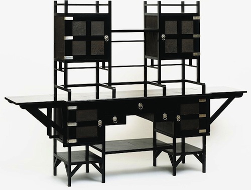
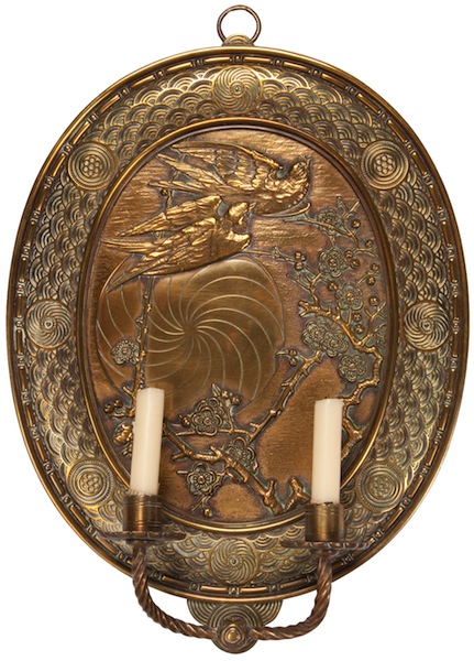
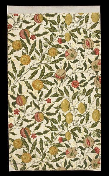
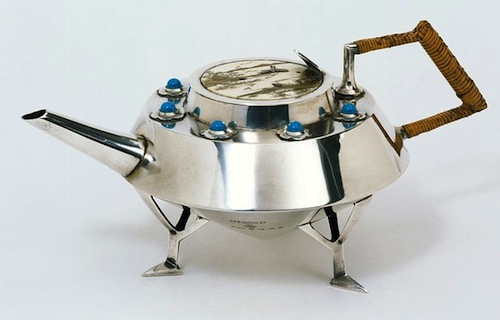
The Cult of Beauty: The Aesthetic Movement 1860-1900. I’m tempted to sum up the exhibition as ‘The Pre-Raphaelites and their furniture’, given my recent post about how much I dislike the Pre-Raphaelites. But actually the exhibition is rather broader than than that. The Pre-Raphs do feature heavily, but it’s also the Arts and Crafts movement, Japonisme and so on; lots of Whistler, William Morris, a bit of Aubrey Beardsley, and designers like Christopher Dresser and Edward William Godwin.

And although most of this stuff is not to my taste, the V&A does this kind of exhibition superbly well. The quality of the exhibits is extremely high (I would expect nothing less), and it is always interesting to see fine art and decorative art from the same cultural moment displayed together; so often we see paintings hanging in plain, austere galleries, with no context but each other.

All the things that annoy me about the Pre-Raphaelites annoy me much less when it comes to furniture and ceramics and wallpaper. My problem with them, essentially, is that they are superficial: flashy, decorative, overly obvious. And the way that the paintings tend to pick other ancient or exotic cultures and reduce them to a stylistic quirk actually offers a clear parallel with the ‘Japanese’ furniture of the time. But it doesn’t bother me because after all, the decorative arts are, well, decorative. The moment you make a table which tries to do anything other than provide a stable flat surface, or a pot which does anything other than hold water, you are in the world of decoration and surface. Which isn’t intended to belittle those things: I’m fascinated by design, I love beautiful objects and I think that anyone who works to make sure that the objects around us give us pleasure is doing something very important.

But it says something about my different relationship with ‘fine art’ that I actually find Pre-Raphaelite paintings almost offensive. They irritate me in a way I can’t say I’ve often been irritated by a wardrobe or a candlestick, however ugly or ill-conceived I might think it is. I might be similarly annoyed by an object which doesn’t work properly because of bad design, but not usually by simple ugliness. What exactly that says about me… I’m not sure.

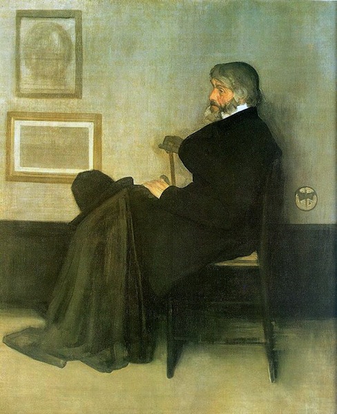
The figure who sits slightly oddly at the centre of this exhibition is Whistler. He seems stylistically apart the other artists; his paintings are exercises in understatement and control, and instead of scenes from myth and legend, he mainly paints people in houses. There’s a painting in the show (no doubt called something like Symphony in White) of a girl in a white dress. Apparently, when other people offered ingenious interpretations he insisted that, on the contrary, it was just what it looked like: a girl in a white dress standing in front of a white curtain.

So it’s tempting to see him as out of place in this exhibition, to think that really he should be over in some other gallery, maybe with the Impressionists. But clearly he is part of the same movement. There’s a room he designed for someone’s house (or at least a projection of it you can walk into) and it is full of the typical aesthetic motifs: peacocks, sunflowers, bamboo, blue and white porcelain. In his hands it’s rather lovely, I think; a lot of the interiors in the exhibition look like they would be claustrophobically busy — decorative knickknacks arranged on decorative furniture in front of elaborately patterned wallpapers and richly coloured patterned fabrics. Whistler uses the same motifs and while the result is still pretty full-on, with lots of strong colours and decoration everywhere, it is relatively cohesive and elegant. Even so, it’s hard to reconcile the richly decorative style with the simplicity of his paintings.

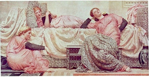
Although, having said all that, the exhibition did provide a good example of why the whole concept of ‘good taste’ should be treated with suspicion. In about the second or third room there was a group of paintings by Albert Joseph Moore. In some ways they are fairly typically Pre-Raphaelite: blank-eyed women with indistinguishable faces lounging around wearing ‘classical’ robes in a generically exotic interior. But the palette is all restrained pastels, and composition is carefully balanced and designed around a strict grid system. And I found myself thinking that’s a bit more like it, because they were more ‘tasteful’. But that seem like a pretty dismal way of thinking. To prefer the anaemic, milquetoast, decaffeinated version because it’s more restful: well, it’s not exactly going to produce art which is ambitious and interesting.

It is a fascinating conflict: I do think our lives would be hugely improved if more of the things around us showed evidence of good taste. Buildings, household appliances, packaging, signage, clothes, websites, books, posters, furniture… we are surrounded by things which are ugly or just mediocre. Which make our lives just slightly worse rather than better. But I also think that good taste is the great enemy of creativity and individuality, a stifling force that needs to be continually pushed back against. Especially since it is very difficult to separate an even somewhat objective idea of ‘good taste’ from simple social conformity.

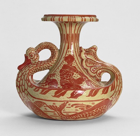
» The vase is designed by Walter Crane, the sideboard by E.W. Godwin, the sconce by Thomas Jekyll, the wallpaper by William Morris, and the teapot by Christopher Dresser. The two paintings are Arrangement in Grey and Black, No. 2: Portrait of Thomas Carlyle by Whistler, and Reading Aloud by Albert Joseph Moore.